
Outbreak scenario exercise

Here is another short exercise. Look at the data on use of meropenem or third generation cephalosporins in Dunswood Hospital featured in the outbreak scenario.
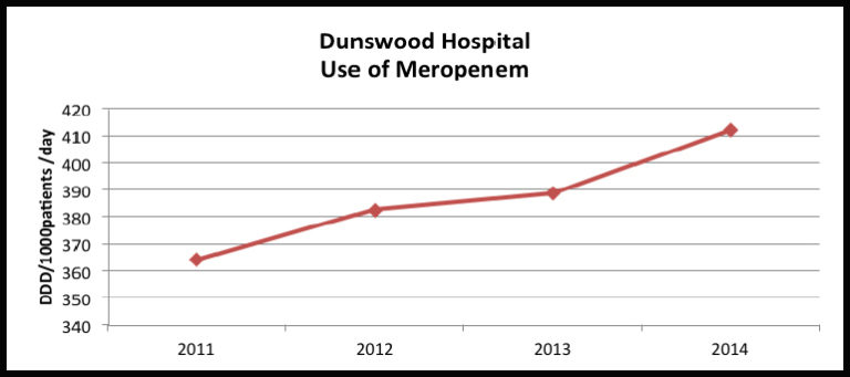
What does this show?
Could this be contributing to the current outbreak?
What would you do with this data?
Post your thoughts in the comments section
Here is a free Antimicrobial Consumption Tool which is designed for the calculation of data on antibiotic use into DDD. If you have your own data on antibiotic use, you may want to try the application out (available for Windows only).
A good resource for further reading is the Introduction to Drug Utilization Research from the WHO.
Antimicrobial Stewardship: Managing Antibiotic Resistance

Antimicrobial Stewardship: Managing Antibiotic Resistance
Reach your personal and professional goals
Unlock access to hundreds of expert online courses and degrees from top universities and educators to gain accredited qualifications and professional CV-building certificates.
Join over 18 million learners to launch, switch or build upon your career, all at your own pace, across a wide range of topic areas.


