Skip main navigation

What can we do with a plot?

What can we do with a plot?
© Coventry University. CC BY-NC 4.0

We have seen that the Matplotlib Python library makes it easy to produce some basic graphical plots. So what makes for a good plot and how can a graphical plot be used to communicate more complex information?

The purpose of visualisation is insight, not pictures.
(Ben Shneiderman)
Data visualisation is the use of graphical plots to summarise, communicate and analyse data. Producing a good graphical plot helps us to discover patterns and trends in our data, which can then be investigated more deeply by using specialised statistical methods such as regression analysis and hypothesis testing. Once we are confident that a conclusion can be safely drawn about some data, we often design a graphical plot to highlight that particular aspect.
Modern business intelligence dashboards (from companies such as Tableau, Qlik and others) combine different plots to give a snapshot visual view of data without the need for the user to write any code.
Example of a business intelligence dashboard, showing various plot types. ©growthlakes/wikimedia
Given that we now know a little Python, we can quickly put together our own customised plots, rather than use commercial dashboard software. Even better, these plots can be built using the output from other Python data analysis tools.

What makes a good plot?

All plots should clearly state what is being plotted. Usually, this takes the form of an informative title, clear axis labels (with units if appropriate), and a legend if several colours or plotting symbols are used.
Tufte (1983) introduced the ideas of minimising chartjunk (all the unnecessary or distracting elements of a plot) and maximising the data-ink ratio (as much of the ink in the plot as possible should show data, not decoration). These are examples of a ‘less is more’ philosophy where we let the data do the talking.
For example, the plots in the article How the BBC Visual and Data Journalism Team Works With Graphics in R have a consistent style that you will see across BBC News.
Another key to good plots is a good use of colour and awareness of colour-blind friendly colour schemes.

Where can we look for inspiration?

Looking at graphical plots made by others can help you decide how to communicate our own insights.
The Matplotlib gallery has examples of many types of graphical plots – and Python code is supplied for each.
Similarly, there are useful guides online as to what type of plot is appropriate to communicate different types of data.

Daily news

Given that television, newspapers and websites only have a small amount of time or page space to communicate complex information, they often use graphical plots. For example, in recent UK elections, each electorate is represented as a hexagon on a map of the United Kingdom and coloured according to the party of the winner. It also gives insight into the geographical trends in voting.
Graphical plot showing electoral results on a map of the UK. Each electorate is represented as a hexagon on the map, coloured according to the party that has won. 
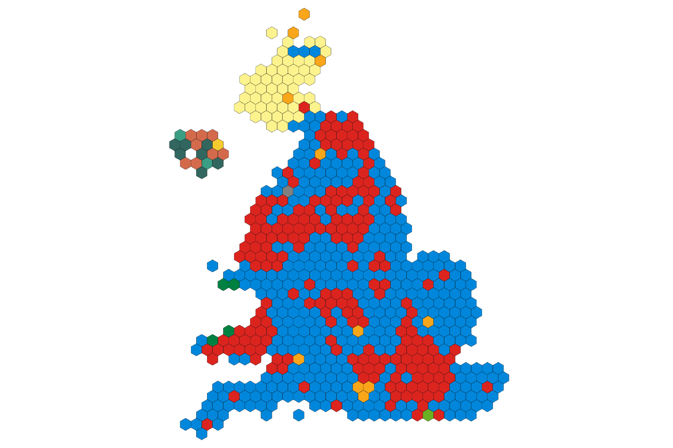
©Bellezzasolo,odileeds.org/wikimedia, licensed under the Expat License

Historical examples

In 1869, Charles Minard produced a famous plot showing details of Napoleon’s invasion of Russia in 1812 (Mason, 2017). In particular, it shows the location, number of surviving troops and the temperature as the army marches towards Moscow and back to France.
Charles Minard plot showing details of Napoleon's invasion of Russia in 1812. It shows the location, number of surviving troops and the temperature as the army marches towards Moscow and back to France.
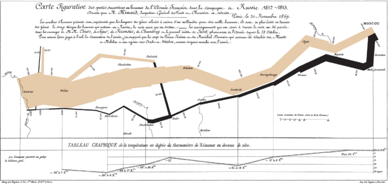
Charles Minard (1781-1870) / Public domain

Competitions

A good source of inspiration is to search the web for ‘data visualisation competitions’. One example is the plotting competition at the annual SciPy conference.
Data visualisation is often the first and last step in data analysis, helping us to both explore a dataset and communicate our conclusions. In between, we apply specialised statistical and machine learning tools to dig more deeply into our questions and data.

Your task

We have seen that data visualisation is very useful for communicating insights from data. Hans Rosling (1948-2017) was a master storyteller using data visualisation, for example, to raise awareness of trends in global health. To see an example of Hans Rosling’s innovative storytelling, watch 200 Countries, 200 Years, 4 Minutes – The Joy of Stats video (hosted on YouTube).
View the Trends interactive plots in the GapMinder website. It explores life expectancy from the 1800s to now, correlated with income.
In the comments area below, note anything that you observe in the data presented in GapMinder since 2009.
Tip: beware of the axis scales.

Further reading

The Office for National Statistics (ONS). (n.d.). Data visualisation. https://style.ons.gov.uk/category/data-visualisation/.

Jordan, C. (2017, July 7). Make your data speak for itself! Less is more (and people don’t read). Towards Data Science. https://towardsdatascience.com/data-visualization-best-practices-less-is-more-and-people-dont-read-ba41b8f29e7b

References

BBC. (2017, June 7). From swingometers to 3D simulations: A pictorial history of general election TV graphics. The Telegraph. https://www.telegraph.co.uk/tv/0/history-british-tv-election-graphics-pictures/2015-election-graphics-map/

BBC Four. (2010, November 26). Hans Rosling’s 200 countries, 200 years, 4 minutes – The joy of stats – BBC Four [Video]. YouTube. https://www.youtube.com/watch?v=jbkSRLYSojo

BBC Visual and Data Journalism. (2019). How the BBC visual and data journalism team works with graphics in R. Medium. https://medium.com/bbc-visual-and-data-journalism/how-the-bbc-visual-and-data-journalism-team-works-with-graphics-in-r-ed0b35693535

Gapminder. (n.d.). Bubbles. https://www.gapminder.org/tools/#$chart-type=bubbles

Mason, B. (2017, March 16). The underappreciated man behind the “best graphic ever produced”. National Geographic. https://www.nationalgeographic.com/news/2017/03/charles-minard-cartography-infographics-history/

Matplotlib. (2020). Gallery. https://matplotlib.org/gallery/index.html

SCiPy. (2019). Plotting contest. https://www.scipy2019.scipy.org/plotting-contest

Tufte, E. (1983). The visual display of quantitative information. Graphics Press.

© Coventry University. CC BY-NC 4.0
This article is from the free online

Get ready for a Masters in Data Science and AI

Created by
FutureLearn - Learning For Life

Reach your personal and professional goals

Unlock access to hundreds of expert online courses and degrees from top universities and educators to gain accredited qualifications and professional CV-building certificates.

Join over 18 million learners to launch, switch or build upon your career, all at your own pace, across a wide range of topic areas.

Start Learning now