
Long-term preparation: risk maps
We have thought about what where and when hazards occur and how this forms the basis of preparing ourselves for future hazards.
By using the data we have on the frequency and magnitude of past events, we can create hazard maps that show the locations with the highest chances of a hazard occurring.
Earthquake hazard maps
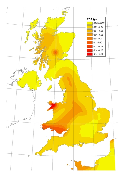
These maps are usually created based on something called peak ground acceleration or PGA.
This is a measure for how hard the ground shakes during an earthquake. Based on a compilation of all known earthquake sources, their size and frequency, and other seismological and geological information. Scientists are able to project PGA for any given location.
The zones with the highest PGA on the map are then the ones where we expect the highest earthquake hazard.
The British Geological Survey has created such a map for United Kingdom. The map shows that the area of the UK with the highest seismic hazard is Snowdonia in North Wales.
This is due to the regular occurrence of significant earthquakes in this area throughout the historical record. The next most hazardous location is South Wales, which has also experienced notable earthquake activity over the last few hundred years.
Global earthquake hazard map
Globally the earthquake hazard is mapped out in a digital map from the Global Earthquake Model Foundation.
Compare the hazard between the United Kingdom and Turkey? Do you notice the difference?
We have established a way to visualise earthquake hazards in the world, but what about the risk?
As we know, high earthquake hazard does not necessarily mean high earthquake risk.
Now we have created maps, we need to assess what is actually exposed to these hazards. For example, what is the population density or number of buildings in a certain region?
The digital, global map from the Global Earthquake Model Foundation shows the density of buildings.
For example, if we look at Wales, we see a relatively low density of buildings except near the larger cities of Cardiff and Swansea.
Which other regions stand out to you?
Global risk map
A risk map can be built by combining the projected hazard with the exposed buildings and population density or related information.
Explore the global earthquake risk map.
Over to you
- Which areas in the world have the highest earthquake risk?
- Can you identify an area in the world that has a high earthquake hazard, but a low earthquake risk?


Reach your personal and professional goals
Unlock access to hundreds of expert online courses and degrees from top universities and educators to gain accredited qualifications and professional CV-building certificates.
Join over 18 million learners to launch, switch or build upon your career, all at your own pace, across a wide range of topic areas.


