
Looking at type design
In the last step we looked at the people and materials involved in printing books in the 15th century. The invention of movable type (i.e. a metal casting of each individual alphabetic character) was a vital part of the process.
Making movable type
Gutenberg’s equipment no longer survives but the Dialogues francois pour les ieunes enfans (Antwerp, 1567) describes the process of making movable type:
- ‘First they make the punch, a long piece of steel with whatever letter is wanted cut or engraved on the end.
- When it is finished they strike it in copper and so make a matrix, which is simply an impression of the letter that has been struck in, like the mark made by a seal in sealing wax.
- The metal for making type, lead or tin, is poured into the matrix in a mould’.
- This produces a rectangular piece of metal type (a ‘sort’), which at one end has the reversed letter in high relief (see below).
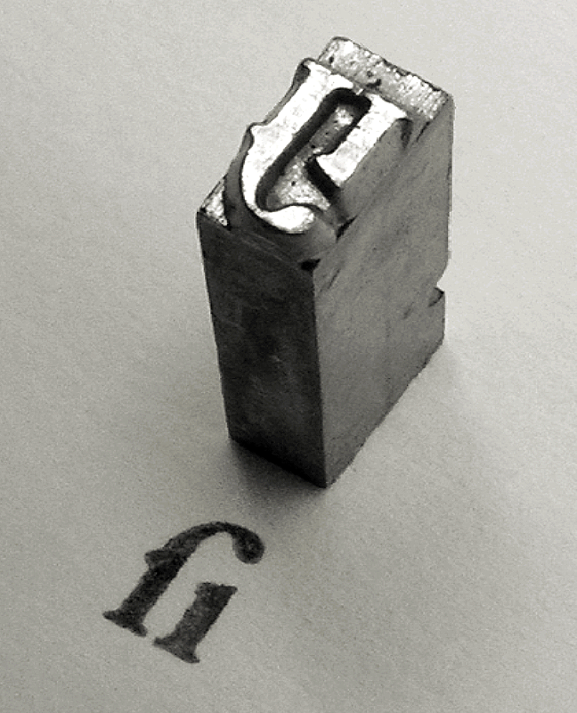 Fig. 1. A ligature of long S and I. Photo: Daniel Ullrich, CC BY-SA 3.0.
As Harry Carter reminds us, early modern type is ‘something that you can pick up and hold in your hand’. A complete set of type is called a font (or fount) and a group of fonts which have the same design is called a ‘typeface’. In practice, the terms ‘type’ and ‘typeface’ are often used interchangeably.
There were two main forms of type in the fifteenth century: blackletter (also known as gothic), and roman.
Blackletter type
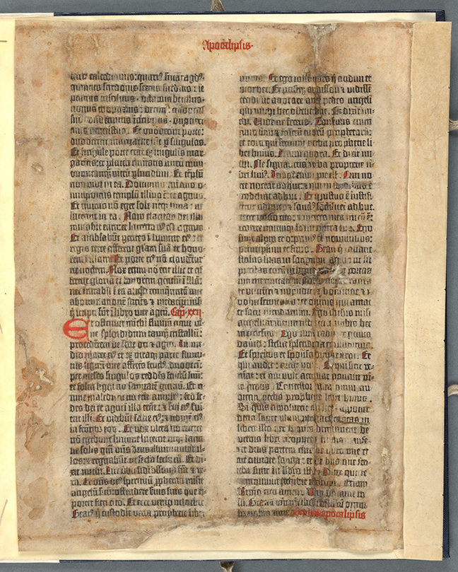 Fig 2. An example of blackletter type: Gutenberg Bible, fol. 317v. © The Board of Trinity College Dublin.
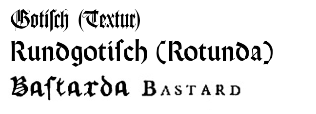
For his famous 42-line Bible Gutenberg deliberately created a large blackletter type which copied the style of handwriting with which his readers would be familiar. Blackletter typefaces are generally divided into three principal groups:
- The angular textura (see above in Fig 2.) usually used for Bibles
- A rounder rotunda used for scholastic and legal texts in Latin
- A cursive bastarda used for books printed in the vernacular
These typeface groups show how three criteria governed the choice of blackletter type: the style of handwriting found on manuscripts in the locality, the subject of the book, and the language in which it was printed.
Roman type
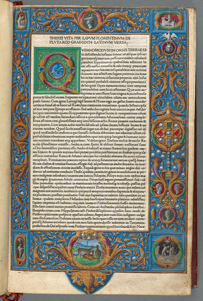 Fig 3. An example of roman type: Plutarch, Vitae Virorum Illustrium (Venice, 1478), i, fol. 1r. © The Board of Trinity College Dublin.
Roman typefaces were likewise based on contemporary handwriting styles: one of the most famous was designed by Nicolas Jenson (d. 1480), an example of which is visible above. It is likely that Jenson used the hand-writing of Battista Cingulano, a parish priest in Friuli, as the basis of his roman typefaces. The clarity of Cingulano’s hand-writing, coupled with the precision of Jenson’s translation of it into metal type, ensured the success of the new typeface.
Increasing demand for different types
The alliance of renaissance humanism (which focused on the study of classical antiquity) and the emerging print trade led to a demand for different alphabets of type, more suited to the ancient Latin and Greek sources which humanists hoped to publish.
Jenson used the hand-writing of the humanist Francesco Filelfo (1398-1481) as a model for his Greek font while Aldus Manutius (1449/50-1515), based his first Greek typeface on the hand-writing of the calligrapher Immanuel Rhusotas. This became known as the ‘Aristotle typeface’ because it was designed for Manutius’ ambitious multi-volume edition of Aristotle’s work. Manutius designed no less than four Greek typefaces, each time trying to improve on legibility.
 Fig 4. The Aldine ‘Aristotle’ typeface. Aristotle, Eis Organon Aristotelous (Venice, 1495), vol. 1. Sig. A2r. © The Trustees of the Edward Worth Library, Dublin.
Motivations for type design
Nicolas Jenson and Aldus Manutius were undoubtedly the best-known printers and type-designers in fifteenth-century Italy. Both clearly were devoted to book design and produced texts of great beauty. In reality though, they had different motivations:
Jenson, always a businessman, followed the market, while Manutius believed in the humanist ideal, surrounding himself with fellow humanists in a project to produce deluxe Greek editions of ancient writers. But even he was forced to recognise that printing in Greek did not lead to massive sales. As a response, he decided to switch to printing Latin classics in an octavo format (the size of a paperback), which he hoped would be cheaper to produce and attract a larger market. As part of this project, in 1501, he designed a new type: the italic.
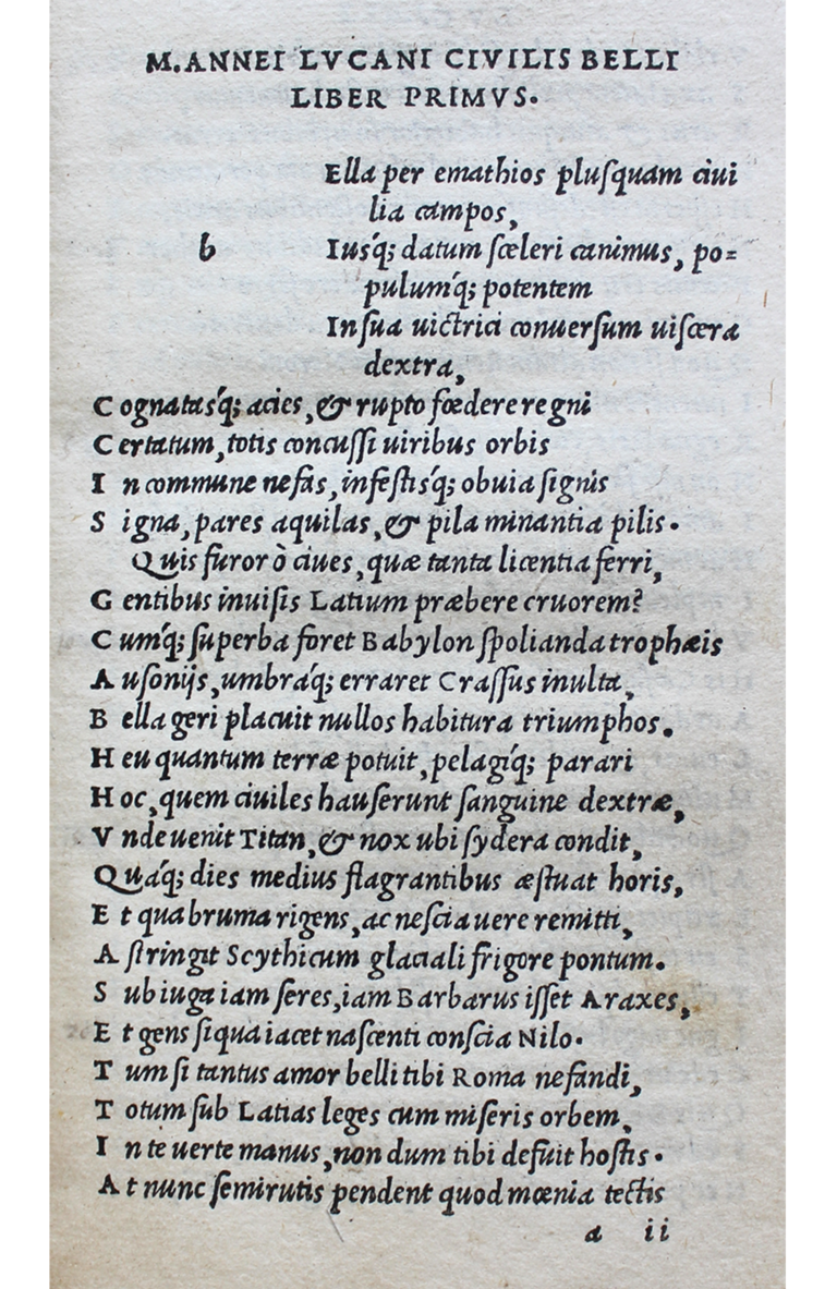 Fig 5. An example of the Aldine italic type in Lvcanvs (Venice, 1502). © The Trustees of the Edward Worth Library, Dublin. (Click to expand)
Sacred scripts
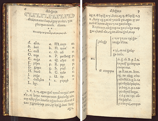 Fig 6. John Kearney, Aibidil Gaoidheilge agus caiticiosma (Dublin, 1571), pp 6-7. © The Board of Trinity College Dublin.
The sixteenth century witnessed not only different variations of the above types but also a new form, sacred scripts, which were a response to the reformation. As in the examples above, these were also based on hand-writing and, as we can see in this Irish version, they used both the roman and italic letters as a basis. This type is named the ‘Queen Elizabeth Irish Type’ because Elizabeth I (1533-1603) was eager to have Irish type cast so that the message of the reformation might be spread in Ireland through the Irish language. The first book to appear in the new type was the Aibidil, which was printed in 1571 at Dublin. It included an alphabet (see above), simple prayers and a catechism.
- What factors do you think influenced the spread of a particular type?
Dr Elizabethanne Boran, Librarian of the Edward Worth Library, Dublin.
The History of the Book in the Early Modern Period: 1450 to 1800


The History of the Book in the Early Modern Period: 1450 to 1800
Reach your personal and professional goals
Unlock access to hundreds of expert online courses and degrees from top universities and educators to gain accredited qualifications and professional CV-building certificates.
Join over 18 million learners to launch, switch or build upon your career, all at your own pace, across a wide range of topic areas.


