
Illustrating Aesop
Aesop’s Fables are among the most enduringly popular stories. These Fables are a collection of short moral stories, many of them involving animals, attributed to a man named Aesop (sometimes recorded as Esop or Isope), a slave who lived in Greece between 620 and 564 BCE.
The details of Aesop’s life are not clear but a biography by Planudes, Aesop’s Fables with His Life, was translated into English in 1687, describes him as an enslaved Ethiopian. By the mid-eighteenth century, it was widely accepted that Aesop was an enslaved Ethiopian and the Chelsea Porcelain Factory even produced figurines of Aesop to decorate the houses of wealthy fans of his work, connecting the ancient fables with the early modern slave-trade.
Versions of Aesop’s Fables have been in print since 1484 when William Caxton produced his own translation of the stories with woodcut illustrations. These woodcuts are simple and lively and establish a tradition of printing Aesop’s Fables with complementary illustrations beside almost every story. The number of illustrations, along with the moral tone of the stories, made the book very attractive for a range of readers.
In 1722, an Anglican churchman Samuel Croxall (1688/9–1752), produced a new translation of Aesop’s Fables. His book was enormously popular and ran to many editions and remained in print for well over a century. If we examine the illustrations that were used through these editions, we can track the changes made to the book over time. Many of the cuts that were used for the original book – probably designed by Elisha Kirkall (1681/2–1742) – were used again and again, even when they are almost worn out.
I have selected three of the fables – “The Cock and the Jewel”, “The Ant and the Fly”, and “The Crow and the Pitcher” to compare across editions. As we will see, the same illustrations continued to be used even when the book changed publishers. This could indicate that either the new publishers bought up the old business in its entirety, taking not only the right to print these books but also all the printers’ materials.
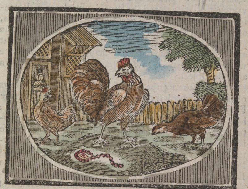
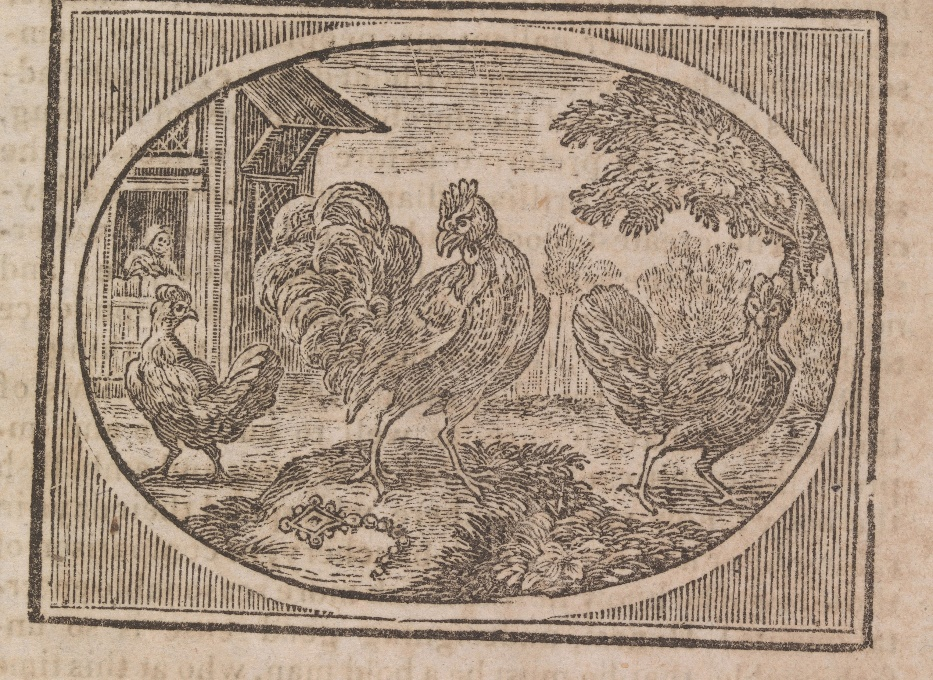
“The Cock and the Jewel” is the first fable within Croxall’s collection and it is accompanied by a particularly handsome illustration. Kirkall’s closely-observed details of the cock and the hens in the farmyard lend a sense of realism to the fable. You can see that the same basic illustration is used in each of these four editions though if you look closely, there are some clear differences. In the 1787 edition, the hen on the right-hand side of the picture has changed position and the chain around the jewel changes shape. The 1789 edition seems only loosely based on Kirkall’s image, with bolder, and blockier lines.
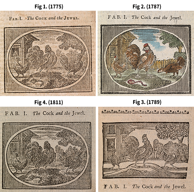 Clockwise from left: Fig 1. Samuel Croxall, Aesop’s Fables (London, 1775), p. 1. (Click to expand) Fig 2. Samuel Croxall, Aesop’s Fables (Dublin, 1787), p. 1. (Click to expand) Fig 3. Samuel Croxall, Aesop’s Fables (Dublin, 1789), p. 1. (Click to expand) Fig 4. Samuel Croxall, Aesop’s Fables (London, 1811), p. 1. (Click to expand) All © The Board of Trinity College Dublin.
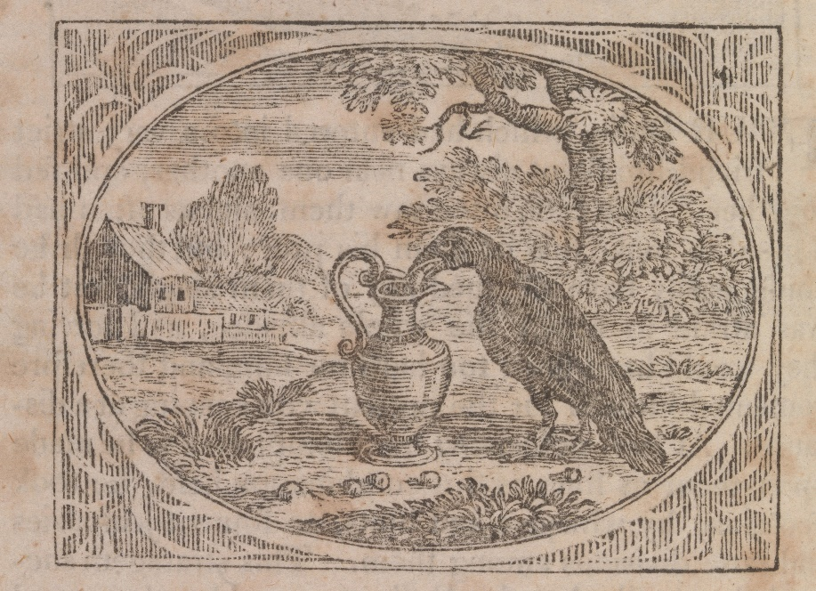
Making a fresh set of cuts was time-consuming and expensive and printers used several other strategies to keep the older cuts in service. One of these techniques is to replace or renew only part of the image. If we examine the images of “The Crow and the Pitcher” we can see how printers refreshed sections of the images.
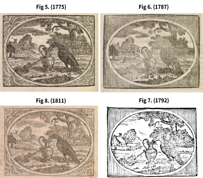 Clockwise from left: Fig 5. Croxall, Aesop’s Fables (London, 1775), p. 94. © The Board of Trinity College Dublin. (Click to expand) Fig 6. Croxall, Aesop’s Fables (Dublin, 1787), p. 94. © The Board of Trinity College Dublin. (Click to expand) Fig 7. Croxall, Aesop’s Fables (London, 1792), p. 94. © Google Books. (Click to expand) Fig 8. Croxall, Aesop’s Fables (London, 1811), p. 94. © The Board of Trinity College Dublin. (Click to expand)
In the edition published by A. Millar, W. Law, and R. Cater in 1792, the borders – previously highly decorative – have been replaced with simple hatched lines. In the 1811 edition, we can see that someone, possibly John Lee, has put great effort into restoring and refreshing the illustrations.
By contrast, the image accompanying “The Ant and the Fly” appears to become cleaner and clearer over time – this is because there is more white space within the image (look closely at the way the branches of the trees change in these images). A block or engraving could wear down and almost become flat after repeated use. As the blocks have become smoother, the surface of the block does not make full, complete contact with the paper and the ink does not transfer, leaving more white space on the page.
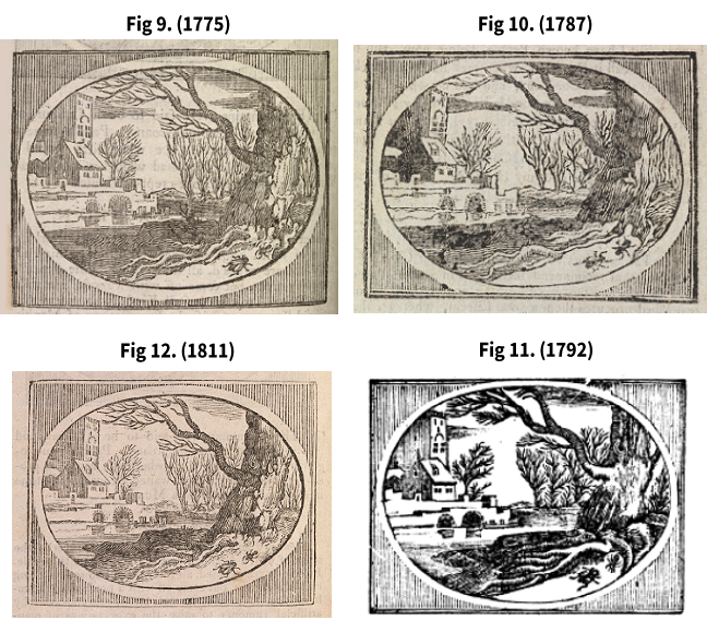 Clockwise from left: Fig 9. Croxall, Aesop’s Fables (London, 1775), p. 48. © The Board of Trinity College Dublin. (Click to expand) Fig 10. Croxall, Aesop’s Fables (Dublin, 1787), p. 51. © The Board of Trinity College Dublin. (Click to expand) Fig 11. Croxall, Aesop’s Fables (London, 1792), p. 48. © Google Books. (Click to expand) Fig 12. Croxall, Aesop’s Fables (London, 1811), p. 48. © The Board of Trinity College Dublin. (Click to expand)
In the 1787 edition printed in Dublin by John Exshaw (d. 1827) you can see how worn the images have become. The printers have cropped the central oval tighter to show less of the edges of the image (which were more easily damaged than the middle sections). By contrast, the image from the 1792 edition appears starker and clearer, though somewhat simplified.
The illustrations allow us to trace the history of Croxall’s Fables, and gives us insight, not merely into the number of different editions printed, but also into the ways different editions have borrowed from earlier books. The illustrations show how the cuts are subject to wear and give us some insight into the strategies printers used to refresh and renew them in order to keep them – and the book – visually attractive to readers for more than one hundred years from its first publication in 1722.
- Why do you think printers kept reusing the same illustrations for so long?
Dr Jane Suzanne Carroll, School of English, Trinity College Dublin.
The History of the Book in the Early Modern Period: 1450 to 1800


The History of the Book in the Early Modern Period: 1450 to 1800
Reach your personal and professional goals
Unlock access to hundreds of expert online courses and degrees from top universities and educators to gain accredited qualifications and professional CV-building certificates.
Join over 18 million learners to launch, switch or build upon your career, all at your own pace, across a wide range of topic areas.


