
Modelling Test-and-Isolate
The WHO’s policy for defeating the pandemic is to test-and-isolate. This step investigates how this might work. Based on a simple model our tentative conclusion is that this is an excellent policy.
On4 th May Health Secretary Matt Hancock explained the UK’s test-track-and-trace policy. At the new conference he urged people on the Isle of Wight to download a new app to test-track-and-trace and lead the way in fighting the virus.
We have done some experiments using a very simple Agent Based Model and the results are very surprising. The headline result is that in our simulation test-and-isolate reduced the number of infections from almost a hundred percent to a few percent and the number of people which would need to be isolated could be less than ten percent.
Figure 17.1 shows this. On the left there is no intervention and the epidemic spreads to the whole population with a high peak of about 50% of the population infected after 366 ticks of the clock. Eventually almost all the agents are infected. In comparison the right screenshot shows an intervention after 2% of the population has become infected. After this for each tick of the clock 5% of the population are tested and if necessary isolated. Now the infection dies out almost immediately.
Figure 17.1. Test-and-isolate has a dramatic effect in the simulation 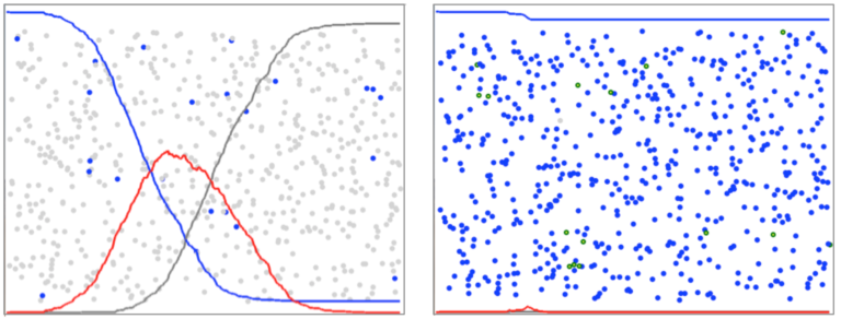
This dramatic result suggests test-and-isolate could be a good policy. But care is required because this is a very simple model and its output could be very misleading.
The model works by waiting until a specified percentage of the population is infected before policy enactment is triggered. It would be unrealistic to be testing all the time when there was no known infection in the community.
In Figure 17.2 10% of the population is infected before the intervention is made. On the left, with 10% of the agents infected the epidemic is about to enter the exponential phase. On the right the test-and-isolate policy has been implemented and the exponential growth stops immediately. In the model the testing rate was a random 1% of the population per tick of the clock.
The green circles are the agents who have been tested-and-isolated and recovered. As can be seen there are a lot of them – the program showed 51% of the population. This is a lot of people to isolate and at this level the policy would be very disruptive, expensive and unpopular.
Figure 17.2. After 10% are infected, 1% per tick are tested-and-isolated 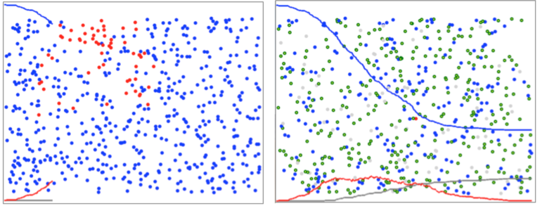
Figure 17.2 shows test-and-isolate interventions after 10% of the population has been infected. On the left the 2% population is tested per tick. Although this reduces the peak of the curve the program gives the number of people isolated as 37%. On the right the testing rate is increased to 5% of the population per tick. Now the number of people to be isolated is reduced to 15%.
Figure 17.3. Test-and-isolate after 10% are infected. Left: 2% sample tested-and-isolated per tick. Right: 5% tested-and-isolated per tick 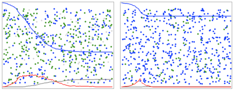
Figure 17.4 shows the simulation after 5% of the population have become infected. When the population is sampled at 2% per tick the infection curve reduces but this involves isolating 35% of the population. Increasing the testing rate to 5% of the population per tick makes a significant difference to the infection curve and only 8% of the population needs to be isolated.
Figure 17.4. Test-and-isolate after 5% are infected. Left: 2% sample tested-and-isolated per tick. Right: 5% tested-and-isolated per tick 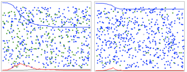
From these results a pattern emerges. First, beginning the test-and-isolate policy early reduces the number of people who have to be isolated. Second, increasing the testing rate also reduces the number of isolations. In summary this analysis supports the policy of testing early and testing as many people as possible.
Critique
This model is incomplete. It does not trace and test the people who interacted with the people who tested positive. An updated version with this feature gives stronger results. This will be added soon. Also the model itself is very simple. From a scientific perspective, the results of the model justify further work but the results should not be used for policy purposes.
What do you think?
Can we draw any conclusions from this analysis? Is it a good start worthy of more work? Or is too simplistic to be useful? Would you like a simulation program to investigate this for yourself?
Reference
The Sun Newspaper, ‘Matt Hancock explains NHS Test, Track, Trace app launching on Isle of Wight’, Youtube video. 4th May 2020. https://www.youtube.com/watch?v=21M_F-1N6PI
COVID-19: Pandemics, Modelling, and Policy

Reach your personal and professional goals
Unlock access to hundreds of expert online courses and degrees from top universities and educators to gain accredited qualifications and professional CV-building certificates.
Join over 18 million learners to launch, switch or build upon your career, all at your own pace, across a wide range of topic areas.


