
Fitting curves to data

Many systems can be usefully modelling by fitting curves to historical data. This well established scientific method can be very useful when used well.
Figure 9.3(a) shows the UK deaths data from 1st March to 17th April. As can be seen, after the exponential part of the curve the pink line becomes quite straight. This part of the data can be fitted by the equation estimated deaths = (number of days) x 820 – 24700 (the mathematical details of how these number are calculated from the data are not important here).
This suggests that our model can be changed to a composite with the exponential function modelling the data to 4th April and a linear function modelling the data from 5th to 17th April:
1st March – 4th April: estimated deaths = 10 (number of days – 1) x 0.104
5th April – 17th April: estimated deaths = (number of days) x 820 – 24700
Figure 9.3. The composite model fits the data very well 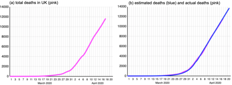
As can be seen in Figure 9.3(b), this model fits the data remarkably well. The errors for the linear part of the curve are given in Table 9.3 which confirms that the model fits the data well.
Table 9.2. Composite model errors 5th April – 17th April 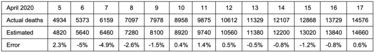
To test the composite model, today is 20th April 2020 so data will be available for the last two days. Before looking at the new figure let us make a forecast. The composite model forecasts 15,480 deaths for 18th April and 16,300 for 19th April.
By checking the www.worldometers.info website the actual numbers or deaths are 15,464 for 18th April and 16060 for 19th April. Thus the composite model forecasts were within 0.1% and 1.5% of the actual figure.
Although the composite model has done very well forecasting one and two days ahead, it is important to understand the assumptions that have been made and to avoid the very real danger of being over-confident that it is giving reliable forecasts. Before reading on, make a note of any criticisms might you have of the way the model was built and used to make forecasts.
Update 21st April 2020
The linear formula above effectively models the death rate as plateauing at 820 deaths per day. Of course that can’t go on forever and sooner or later the death rate must decrease. As Table 4.4 shows, in this case it was sooner. On 19st April the UK death rate dropped to 596 and on 20st April it was 449.
Figure 9.4. UK death rates to 20th April 2020 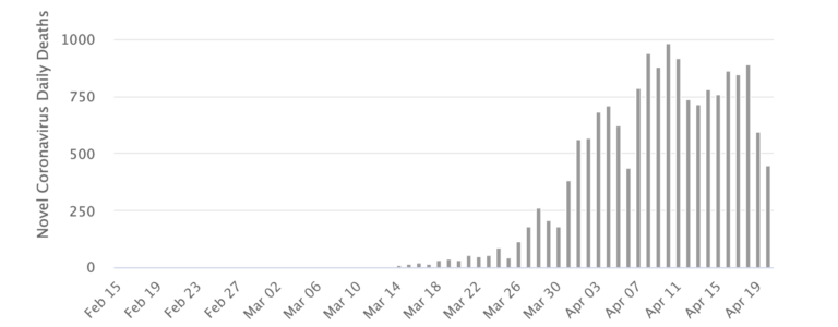
What do you think?
If you never worked with models before did this and the previous step enable you to understand them better? Do you agree that models and modelling are essential for making policy? Do you think that in the current crisis we have heard too much from modellers and too little from other experts? Do you have your own ideas on how the COVID-19 epidemic could be modelled.
COVID-19: Pandemics, Modelling, and Policy


Reach your personal and professional goals
Unlock access to hundreds of expert online courses and degrees from top universities and educators to gain accredited qualifications and professional CV-building certificates.
Join over 18 million learners to launch, switch or build upon your career, all at your own pace, across a wide range of topic areas.


