
Logically organising Describe Image

In the previous step, you learnt about structuring your answers to the Re-tell Lecture item type. In this step, you will learn about structuring your answers for Describe Image item types.
You are asked to describe a range of different types of images in the speaking section of PTE Academic. The structure that we will look at in this step is applicable to all these image types.
Reading the image and taking notes
Before you speak, you have 25 seconds to look at the image and organise your ideas.
It is important that you use this time to identify the main features of the image to include in your retelling. Remember that it is not possible to describe everything so you must carefully select which parts you describe.
It is useful to take notes as you do this. This can help you organise your ideas more clearly.
Firstly, look at the type of image and the overall topic of the image. Is it a graph or multiple graphs, a map, a process, or an image? Try to answer the question. What is this image showing? For this, look at the title of the image.
Look at the example image below and answer the following questions:
- What type of image is it?
- What is the image showing?
As you are looking at the image, also think about the relationships between parts of the images or details in the image. This is important as you should show an understanding of the relationships between the information in the image. If it is a graph, is it showing change over time or is it showing amounts at one point in time?
Look again at the image and take notes on what you think are the most important key ideas in the image. Focus on details such as the largest, the smallest, the most common, the largest change or the most similar or the most different aspects.
Lastly, identify a conclusion or implication that you can draw from the image.
Structuring your reply
Now that you have analysed the image and identified the key areas, you can use the information that you have identified to describe the image. Structure your reply in three sections.
Section 1: Introductory overall statement
In this statement, state the general idea of the image. For the image you recently looked at, you might say:
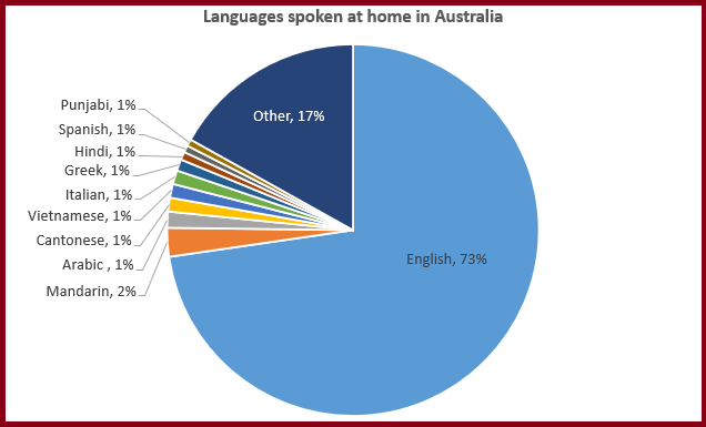
The pie chart shows the amount of people who speak different languages at home in Australia.
Section 2: Description of elements of the graph
The most commonly spoken language at home is English which is spoken in 72% of households. The next most commonly spoken language is Mandarin which is spoken in 2% of households. A number of languages are spoken by around 1% of households including Arabic, Spanish, Cantonese and Vietnamese. Finally, 17% of households speak other languages which are smaller percentages than those shown in the graph.
Section 3: Implications or conclusion
In conclusion, Australian households speak a range of languages at home due to migration but English is by far the most common.
Vocabulary
Different types of images require you to use different vocabulary. We will look at some of this vocabulary now.
Movement
If the image that you need to describe is a line graph or two graphs at different times, you need to describe the changes that occur over time. To do that you can either use verbs or nouns:
Verbs
- The number of people who rode bicycles to work increased from 1980-2002.
- The number of families with more than two children decreased.
Nouns
- There was an increase in the number of people who rode bicycles to work from 1980-2002.
- There was a decrease in the number of families with more than two children.
Quantity and speed
As well as describing the movement, you should also include descriptions of how much and/or how quickly these changes occurred. This can be done with adjectives or adverbs.
If you use a noun to describe the movement, you need to use an adjective to describe the amount:
- There was a dramatic increase in the number of people who rode bicycles to work from 1980-2002.
- There was a significant decrease in the number of families with more than two children.
If you use a verb to describe movement you need to use an adverb to describe the amount:
- The number of people who rode bicycles to work slightly increased from 1980-2002.
- The number of families with more than two children rapidly decreased.
These can describe how much something decreased or increased (slightly, dramatic) or how quickly something decreased or increased.
Place and location
Some of the images in the speaking section of PTE Academic are maps. This may be the map of a country, a continent or a smaller area. If this is the case, you may need to be able to describe the locations of different parts of the map.
Comparison and contrast
This language is also useful for graphs. You will study this in Step 3.9 Grammar Week 3.
Practise your PTE Academic Speaking Skills


Reach your personal and professional goals
Unlock access to hundreds of expert online courses and degrees from top universities and educators to gain accredited qualifications and professional CV-building certificates.
Join over 18 million learners to launch, switch or build upon your career, all at your own pace, across a wide range of topic areas.


