
Example investigation

To provide a little bit of scaffolding, we will work through an example data investigation in this article. If you go through similar steps with your data set (or you could use our data set as a minimum piece of work), then you should be able to use some of your exploratory data analysis techniques.
We are going to explore a lab population monitoring dataset. At the University of Glasgow, Jeremy recently installed some Raspberry Pi boards with bluetooth sensors. He set up a script to count the number of bluetooth devices broadcasting within range of each sensor. The Pi records the data in a CSV file which we have saved. You can download a copy of the CSV file at the bottom of this page, if you like.
First, we want to see what the raw data looks like. Let’s read in the data file first, and see how many lines there are.
data = pd.read_csv('file.csv')
print(len(data))
OK, so there are 80,000 lines of data. This is a lot. What does each line look like?
print(data.head(5))
This shows us the first few lines of the file. We can see that each observation is simply a timestamp followed by a location id, then an integer count of the number of detected bluetooth devices.
14/10/2019 08:44:12,BO715,11
14/10/2019 08:46:11,BO715,11
14/10/2019 08:48:12,BO715,23
14/10/2019 08:50:11,BO715,26
14/10/2019 08:52:11,BO715,41
Right, let’s start asking a research question now:
- which day of the week is the busiest?
Busy means higher bluetooth device counts, in this context. This is an explicit assumption we have to document. (Sometimes people wheel around trolleys full of mobile phones trying to trick Google traffic navigation and other sensing platforms.)
First we need to transform our data so we have actual weekday names as a column.
data['Date'] = pd.to_datetime(data['Time'])
data['Day'] = [date.day_name() for date in data['Date']]
Now we can group the rows by day, and sum the counts for each day. This assumes there is a set sampling rate for data observations, and that all days are sampled equally. We can check this in the data set.
grouped_days = data.groupby('Day')['Count'].sum()
df = grouped_days.to_frame()
df['Day_id'] = df.index
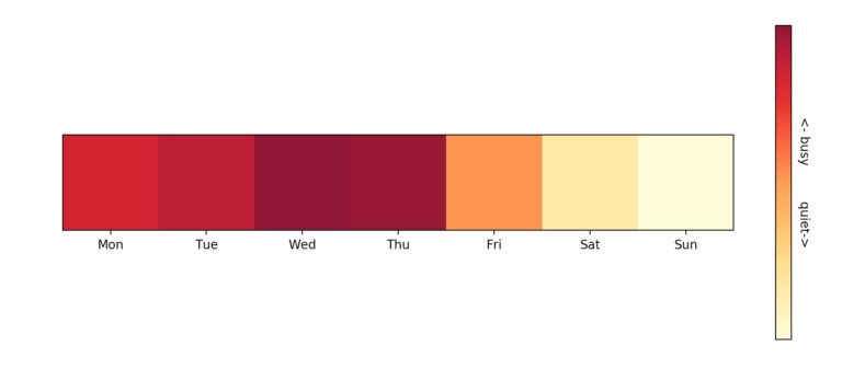
Now we have a dataframe with the per-day counts, we can visualize this. Jeremy chose a colour map visualization, with more intense red colours indicating busier days.
sums = np.array(df['Count'])
hist = np.expand_dims(sums, axis=0)
plt.imshow(hist, cmap=plt.get_cmap('YlOrRd'))
plt.show()
This produces the graphic shown below, which can be sent to students and staff as a clear indicator of days when the lab is busy. It seems Wednesdays and Thursdays are the most busy; also we discover students like a nice long weekend!
The full analysis code is available in a Jupyter notebook for you to download below, along with the CSV data file.
Getting Started with Teaching Data Science in Schools


Getting Started with Teaching Data Science in Schools
Reach your personal and professional goals
Unlock access to hundreds of expert online courses and degrees from top universities and educators to gain accredited qualifications and professional CV-building certificates.
Join over 18 million learners to launch, switch or build upon your career, all at your own pace, across a wide range of topic areas.


