
Choose the right visualization

There is a massive range of visualization techniques. Information visualization is a complete academic field in itself. In this short course, we will introduce a few straightforward visualization techniques and describe when it is appropriate to use each of them.
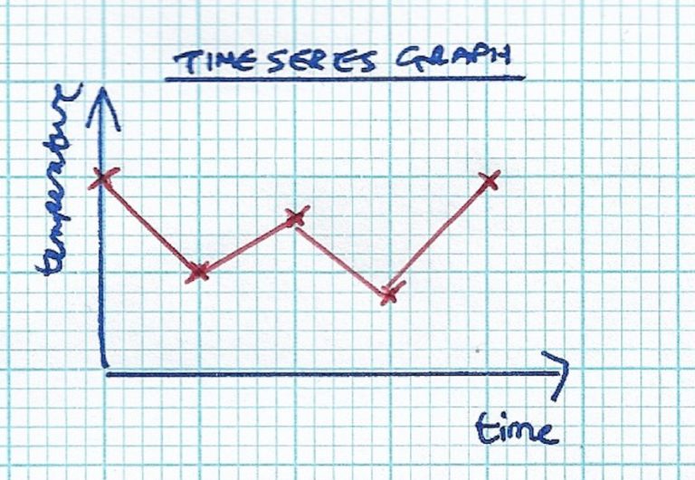
If you are looking at a continuous variable, like temperature, that changes over time, then a time series graph is ideal. Time is plotted on x, with the continuous value on y. It is a two-dimensional line graph.
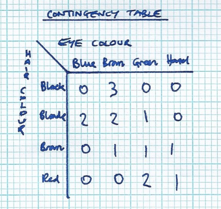
If you are looking at the relationship between two categorical variables, like hair colour and eye colour, then a contingency table may be suitable. Row headings are for distinct values from one categorical variable, and column headings are for distinct values from the other categorical variable. Each cell in the table has a count, which records the number of observations where the two categorical values occur together.
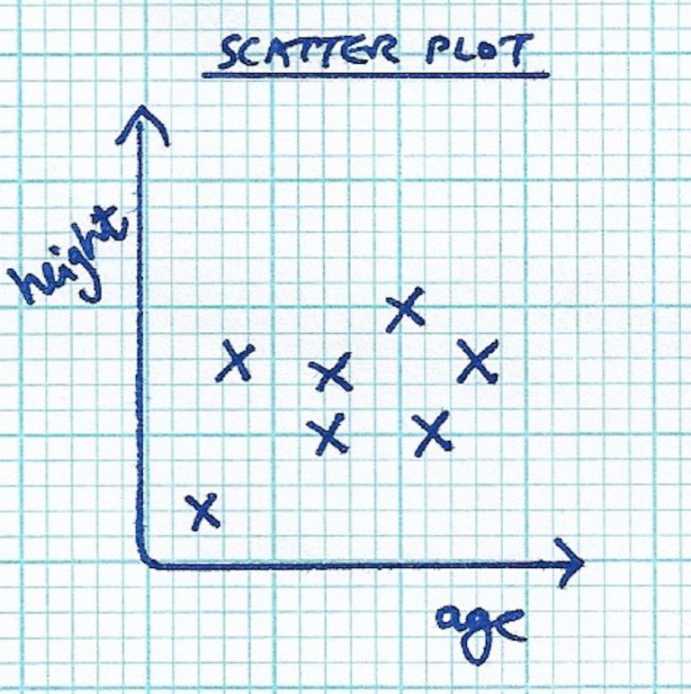
For charting two continuous variables, such as age vs height, you might consider a scatter plot. One variable goes on each of axis. You can draw a best-fit line if a clear linear relationship is apparent.
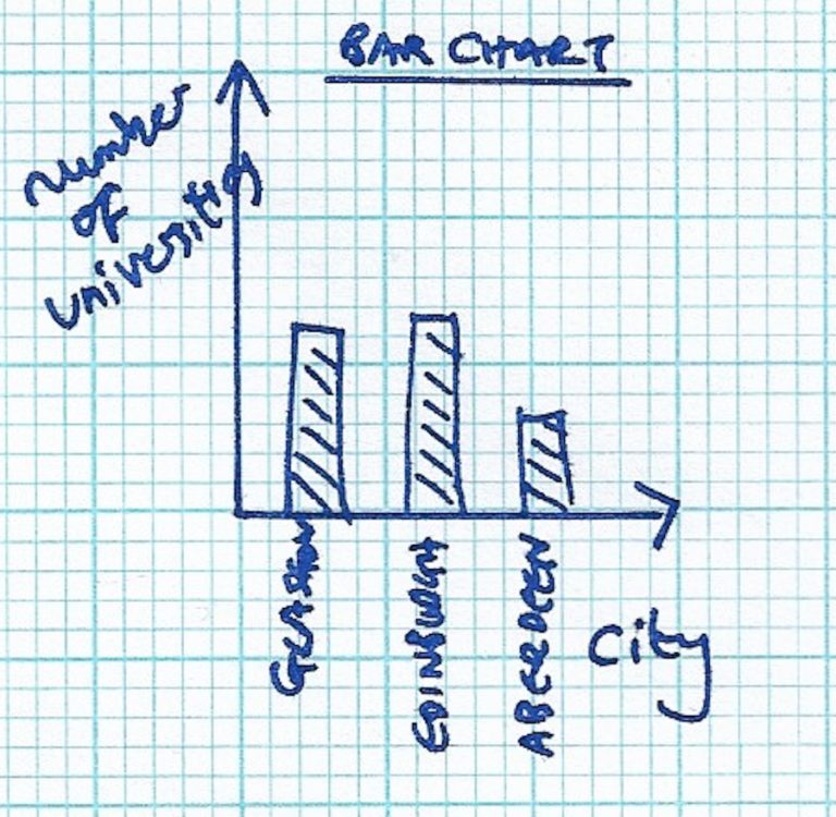
There are several choices for visualizating the relationship between a numerical variable and a categorical variable. For instance, you might use a bar chart to plot the number of universities in each Scottish city. Do larger cities have more universities? Generally the categorical variable goes on the x axis and the numerical variable goes on the y axis.
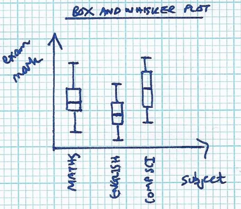
More information-rich visualizations include the box-and-whisker plot, which records the spread of the distribution in each category. For instance, consider the distributions of student exam marks for different subjects.
There are plenty of other options. Geo-spatial data might be visualized with a heat map, e.g. median wage in different council wards. Connected elements might be linked with lines of different thicknesses, e.g. strength of friendship graphs on social media.
Is there a systematic way of selecting the best technique for visualizating a data set? It’s certainly an imprecise science, but some organizations have tried to come up with sensible taxonomies.
- The Financial Times has a visual vocabulary to assist journalists in selecting the best visualization for their stories.
- There is a periodic table of visualizations, although this classification is highly subjective.
Do you use these or other visualization techniques with school-age learners? Which data visualizations are easier for learners to understand?
Getting Started with Teaching Data Science in Schools


Getting Started with Teaching Data Science in Schools
Reach your personal and professional goals
Unlock access to hundreds of expert online courses and degrees from top universities and educators to gain accredited qualifications and professional CV-building certificates.
Join over 18 million learners to launch, switch or build upon your career, all at your own pace, across a wide range of topic areas.


