
The production possibility frontier
Another tool, which helps to explain opportunity cost, is the production possibility frontier (PPF). As well as illustrating opportunity cost, this tool helpfully highlights the trade-offs between different resources.
A side note on economic models
Before we go any further, it’s important to note that economic models come with the provision that only the assumptions stated matter. Often, some factor has been accidentally overlooked that can mean the model will not work as described. Economists like to state their assumptions when using these economic models that ‘all else remains equal’ (known as ceteris paribus). It’s like saying this car will only achieve an efficiency of 50 miles a gallon when driven at 30mph on a straight, flat road or a leopard is the fastest accelerating land mammal as long as it’s running on flat, dry land rather than in a swamp.
The PPF graph
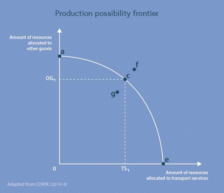
The graph axes below represent the allocation of resources to the production of two different products: transport services on the horizontal axis and other goods on the vertical axis.
The sloping curve between them both is the PPF and is representative of the optimum use of all resources. This graph assumes a stark trade-off of resources – only two things can be produced (transport services and other goods) and putting resources towards one removes those resources from the other.
Adapted from Cowie (2010, p. 4)
Point e on the horizontal axis represents 100% of resources being used for transport services, where the opportunity cost is 100% of other goods. Point a is the opposite, representing 100% of resources being used for the production of other goods, and the opportunity cost is 100% of transport services.
The sloping line (the PPF) between points a and e represents the maximum use of the available resources on each axis, and acts as a boundary of what is possible to produce based on the existing resources. Put simply, the PPF tells us that point f is unattainable with current technology and resources because it is outside the boundary. Unless some new technology arises which allows production for fewer resources, or if the number of resources changes, we cannot achieve that level of production in both transport and goods.
Point g is beneath the PPF curve, which shows it is attainable, but demonstrates inefficient use of resources and technology.
Moving along the PPF
 Adapted from Cowie (2010, p. 4)
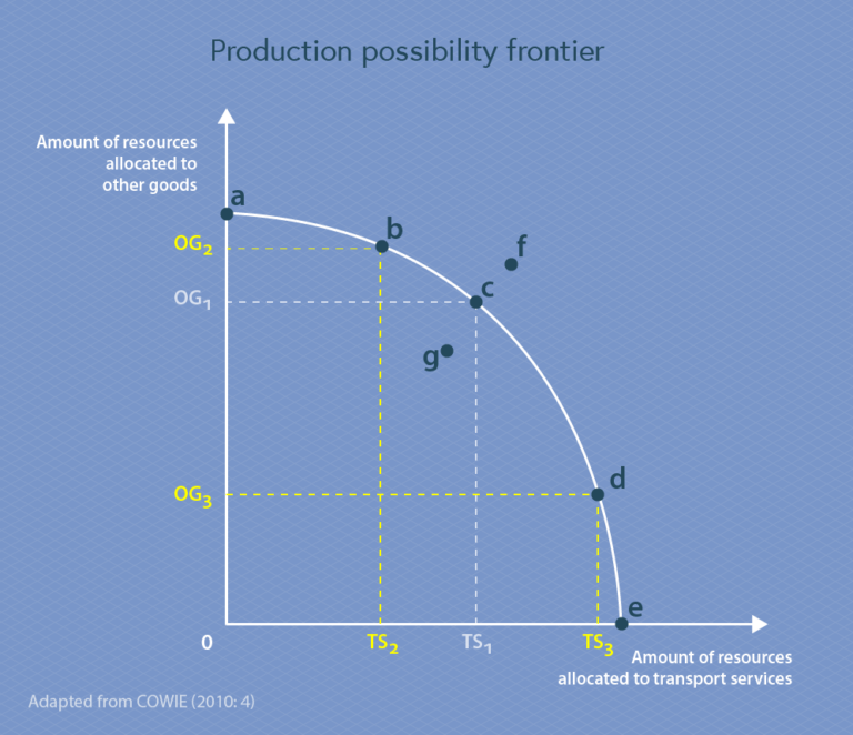
The other points along the PPF curve (b, c, d) represent what is possible to produce, while making the most efficient use of the technology and resources, by allocating your available resources differently.
Moving along the PPF curve represents a change in the use of resources from one product to another. This is known as the marginal rate of transformation which describes the cost of forgoing the alternative in the form of quantity of output. This means that to produce extra transport services (moving from point b to point c) we increase the amount of transport services we produce (TS2 to TS1) but the opportunity cost is the drop in production of other goods (OG2 to OG1). We will be exploring the importance of marginal changes in more detail later in this course.
Moving position on the PPF (boundary) means deciding how to allocate resources – but who makes this decision and how? To answer that, we need to revisit the key scarcity questions from the last section:
What to produce? This depends on opportunity cost of allocating resources – more resources towards other goods means an opportunity cost of transport services and where they are in relation to the PPF.
How to produce it? This depends on what combination is the best use of resources.
Whom do we distribute production to? This depends on the market mechanism for deciding who gets what – a concept coming up shortly.
Your position on the PPF (and therefore your chosen way to allocate resources) will depend on how you answer these three questions.
Your task
For this task, you’re going to produce a PPF. You can do this however you like – you might like to use software you have access to, or draw it by hand and take a photo.Part 1: Produce a PPF graph for the trade-off between transport and other goods, like the one above, and annotate key parts of it with explanations of what it represents. For example:
- Where the line crosses the axes
- What different points (a-f) mean
Part 2: Imagine you have £1,000 extra in your operating budget at CV1Logistics. What effect does this have on the PPF graph? Draw these changes in, and add explanations of how it affects the points you labelled.Part 3: Upload your PPF to this Padlet wall. For help using Padlet, see below.
Help using Padlet
By following any of the links to Padlet, you will be taken to a third-party website. On this website, you may be asked to submit some information about yourself. Please make sure you are familiar with the terms and conditions and privacy policy of the third-party website before submitting your information.Whether you follow the links and submit your personal information or not, your course progress will in no way be affected.
Please remember to:
- Have a look at the contributions of your fellow learners and post any comments if you wish to
- Ensure that any material you share respects both copyright and the wider audience
References
Beveridge, T. (2013). A Primer on Microeconomics. Business Expert Press. https://locate.coventry.ac.uk/permalink/f/gr8698/COV_ALMA5183238700002011
Cowie, J. (2010). The Economics of Transport. Routledge. https://locate.coventry.ac.uk/permalink/f/1r06c36/COV_ALMA2135810780002011


Reach your personal and professional goals
Unlock access to hundreds of expert online courses and degrees from top universities and educators to gain accredited qualifications and professional CV-building certificates.
Join over 18 million learners to launch, switch or build upon your career, all at your own pace, across a wide range of topic areas.


