Building our first pattern library
We recently redesigned and rewrote our pattern library to help us build the FutureLearn site. Here, our Interaction Designer, Alla Kholmatova, and one of our Front-end Developers, Nicky Thompson, share the story of this project and the lessons we learnt while working on it.
 It started over a year ago, when we built our first styleguide. We couldn’t afford to invest too much time in it then (it was the beginning of FutureLearn and the team had many other priorities!), so we created a simple single page layout, to list some of the commonly used UI elements.
The expectation was that the styleguide would prevent CSS bugs creeping into our code and allow us to view modules in isolation. Remembering that famous anecdote about CSS properties walking into a bar, we were determined to make sure that unrelated elements weren’t affecting each other’s display. However, when these things inevitably happened, we wanted to be able to rely on the styleguide to help us with debugging.
Why the first styleguide didn’t work
It was a great starting point but in the long run the styleguide didn’t work, for a few reasons.
Finding specific information was often time-consuming, as the elements were listed in one (very!) long list. We didn’t apply a methodology to the way we organised the styleguide, so there wasn’t a specific pattern on how we create individual parts and how all the parts fit together.
We saw the styleguide mainly as a front end tool, so designers weren’t involved in creating it. As a result, a lot of the terminology used was different, so the styleguide wasn’t helping to facilitate a shared understanding across the team. It also meant that design rationale wasn’t documented in the styleguide – it didn’t explain why the elements were the way they were and didn’t provide guidance on how and when to use them.
There wasn’t a lot of live code either, so it got out of date quickly. Very soon we had mismatches between UI elements on the platform and their documented versions. Contrary to our expectations, it didn’t serve as a reliable reference for fixing front end bugs. It also wasn’t effective at helping us to maintain and improve consistent use of elements on the platform.
As the FutureLearn site was growing, the need for a better reference point for designers and developers became more apparent. So we started working on the pattern library. And this time, designers and developers were both involved in the project.
Interface inventory
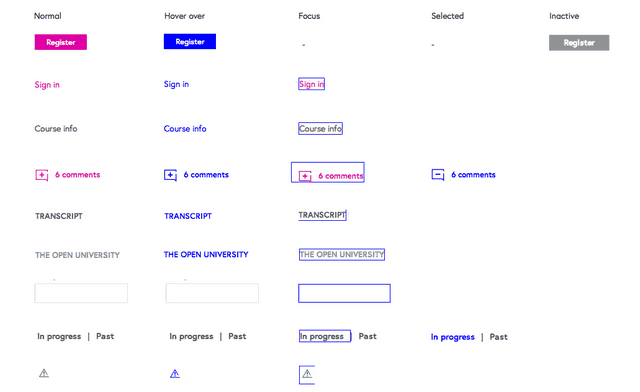
We started by creating a comprehensive interface inventory of the Futurelearn site – it was a simple Google Doc containing screengrabs of all the bits and pieces that make up the interface of our product. We did this exercise to make sure that all the components were accounted for, and that inconsistencies and redundancies were visible at a glance. (Fortunately, thanks to our first styleguide, there weren’t as many inconsistencies as you’d normally see in a similar scale project).
Once we had the full inventory, we went on to categorise the elements – starting from the smallest parts, such as colours, typography and interactive elements, to larger, more complex parts, such as navigation and page layouts. Here’s a small selection of the inventory, showing interactive states of some of the elements:
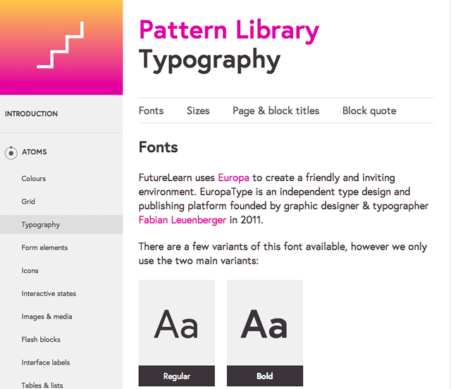
 Atomic design
At this point, however, it became apparent that categorising those elements without some sort of principle or a methodology would be difficult. We looked at what others do, but there seemed to be as many ways to organise a styleguide as there were styleguides.
 While looking for a categorising method that would suit us, we came across the atomic design methodology, pioneered by Brad Frost. It’s a method of creating and documenting design systems by breaking entire interfaces down into fundamental building blocks – or “atoms” – and then working up from there.
It was a solid and simple way of thinking. It answered most of the questions we had about organising the elements. Most importantly, it worked for us – our plan was to move away from designing pages, towards designing systems, so this modular, “atomic” approach was ideal.
 At this point we agreed that it no longer made sense to call what we were creating a styleguide – we’d moved beyond the presentation layer, and were covering some of the interaction patterns and UX rationale on building and using the elements.
Organising the content
Now that the content and structure were in place, what we needed was a good layout to navigate around it quickly and efficiently. A simple list wouldn’t work. We looked at using tabs and drop down menus, but the idea that became our favourite was inspired by the amazing Mailchimp pattern library. The simple, non-intrusive sidebar allows you to navigate quickly between content areas, while the page tabs provide easy anchor points to get to individual components.
Sharing with the team
Many people were involved in working on this project – designers and developers worked very closely together, to make sure the new tool we were building was useful for all of us. But of course it was also important to share the work with those who weren’t directly involved. We knew that for the pattern library to be used effectively, it had to become part of our culture and workflow.
We gathered the rest of the product team and presented the principles of atomic design by drawing an analogy with Lego pieces (we actually brought in a Lego Duplo train, to demonstrate modular design in action!)
We also added a step to our internal induction course on FutureLearn, with fun quizzes and bite-size lessons, to introduce new employees to the pattern library.
Creating a living styleguide
As we’re building the library we, as a team, are learning more and more about the proper use of the elements. We’re now much better at spotting inconsistencies and explaining how certain elements should look and behave.
In the process of designing and building this project, we fixed countless styling bugs and inconsistencies across the site. Most importantly, we kept talking about the patterns as we were documenting them, which helped us improve the shared language and understanding between designers and developers.
As our brand evolves, so will the pattern library. Existing design patterns will change and new patterns will emerge. But we hope that this “living” document will help us to keep the shared understanding we gained while working on it, and unify our sense of the FutureLearn brand.
To help us with the “living” part, we initially wanted to follow a much more “living styleguide” form of development. This means that the code that produces a module on the website, and on the styleguide, are one and the same. This idea was borrowed from the brilliant Ian Feather’s maintainable styleguide post, for which we owe him our thanks!
But of course, this (in addition to the interface inventory and a complete re-design) couldn’t all be done overnight. So we focused on getting all the content in first, while experimenting with turning some of the elements into “living” components. This is still very much work in progress – we’re considering making other changes to improve the way we work on our CSS – on which, more to follow!
Want to learn more about the way we work at FutureLearn? Take a look at all of our “Making FutureLearn” posts.


