Why is brand so important to experience?
Creative Director Lucy Blackwell gives an insight into how the FutureLearn brand – and pink colour palette – was formed.
A newborn baby learns instinctively without planning or practice, it is born with the innate ability to discover. Somewhere between birth and adulthood, learning becomes formalised, education becomes required, expectations defined, and success determined. And during that process our original instinctive need to learn can become slightly buried. FutureLearn attempts to reawaken that instinct and stimulate one’s natural curiosity with life.
And what does this have to do with brand you wonder? Everything! Great brands are built upon a simple promise, a foundation from which everything evolves. Our promise is ‘To welcome everyone on a journey of learning, by telling stories, provoking conversation and celebrating progress.’
FutureLearn is a brand in its infancy; two weeks out of the gate with our first courses, we’re just about learning to walk. Our ability to run will be hugely dependent on you, our learners. We’re learning as much from you, as we are from our own areas of expertise – we’re on this journey together.
At the same time as delving deep to understand our learners’ needs, we strive to balance this with something less tangible, something that makes FutureLearn simply ‘feel’ delicious, addictive, delightful and enjoyable. Feelings can easily be overlooked in product development, where rational planning and analysis often rule the decision-making process. After all, left-brain logic is far easier to manage, organise, and see results from than feelings, which can be messy, subjective and hard to articulate. But feelings are actually the thing that motivates us, the driving force behind our actions, as suggested by Dan Pink and others.
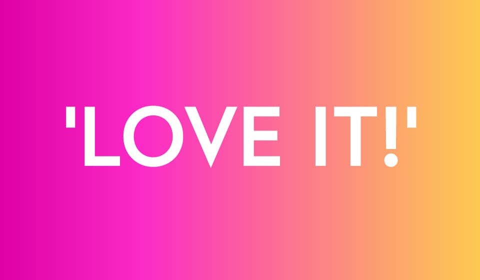
With this awareness, we know that the ‘feeling’ that pervades from a brand is equally important to its success and adds significant value to the product. It’s been proven time and again that it’s not always the most functional version of something that wins public affection. Take for example the tiny Aston Martin Cygnet made by Toyota: the exact same vehicle is now offered directly from Toyota for a third of the price with slightly fewer cosmetic trimmings – a practice that has become known as ‘badge engineering’. So why do people still spend more to buy the Aston Martin Cygnet? Because they simply ‘love it’!
Our courses are free, so we don’t have to convince learners to spend more, but it’s still important that our learners really ‘love’ FutureLearn. So how are the FutureLearn design team creating that ‘good feeling’ that keeps learners returning, hungry for more? We’re focusing our attention on our brand promise, and making consistent design decisions that follow some simple principles: welcoming, inspiring, intuitive, engaging, fresh, honest, optimistic and celebratory.
Some of our design choices follow standard digital design patterns, such as the simple responsive layout, whilst others are a little more adventurous, like our navigation pattern within the product. Our goal is to strike the right pitch between encouraging exploration whilst not excluding those who are less adventurous online.
And lastly, in a post about brand, it seems important to raise the hot topic of colour. We’ve had lots of feedback about our colour palette, from learners and academics alike. “Why pink?” “It looks like rhubarb and custard!” “It’s very bright!” So to put this in context first, I recognise that we are developing a product that fits squarely into the world of education, a field that quite frankly, has not always been particularly brave from a branding perspective, especially when compared to other industries like music or entertainment. However FutureLearn, as reflected in its name, is about the future of learning. It’s about engaging with people who may not have had the luxury of time, money or confidence to explore the world of education previously, and so we’re celebrating their learning journey. We believe the best celebrations come in full radiant colour!
We’ve used the gradation of colour to demonstrate the learning journey, where blue sits in the past, moving to pink for the present, and yellow for the future. We’ve created buttons and sliders that follow this rule, so if you’re in the present on a step it will be highlighted pink, and if you’ve completed the step it shifts to blue, showing the passing of time within the user interface.
Whilst I don’t think it’s required that our users understand or realise the whole philosophy behind our colour palette, we believe that these underlying ideas will affect how they ‘feel’ about using FutureLearn, which is essential. I think Maya Angelou really sums up what I’m trying to say: “People will forget what you said, people will forget what you did, but people will not forget how you made them feel.”
The branding agency Wolff Olins worked with FutureLearn to understand our needs and design our brand, and it has now teamed up with the University of East Anglia to create one of the first MOOCs on, you guessed it, branding! So if you want to learn more about this topic, just sign up for ‘The Secret Power of Brands’ course.