
Histograms and Pareto charts explained

In this article we will take a look at what is meant by a histogram and also a Pareto chart, and in both instances show you how to read them.
What is a histogram?
Histograms look very much like column charts but are in fact very different. This is because column charts show volume, whereas histograms show frequencies.
Histograms are often used to visualise central tendency – they are easy to understand and can tell you a lot about your data. The steps include grouping the data into ‘bins’ and plotting the number of occurrences within that bin.
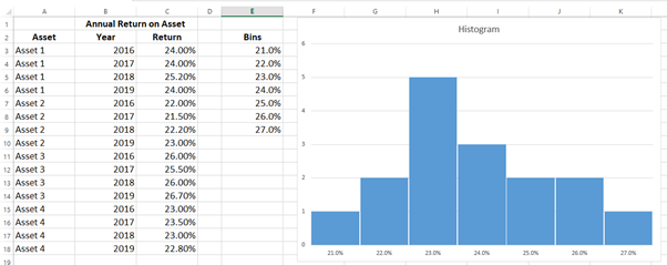
In the image above, we have a new bin for each 1% starting at 21% increasing to 27%. The values are placed in the bins and the count of each bin is charted. For example, in the data shown the bin for 23% has five values. The height of the bars in a column chart represents the frequency or count. Whereas the labels represent the bins.
If the histogram is symmetrical, i.e. cut it in half and each half be the mirror image of the other we can assume they mean to be the closest approximation of the centre.
If the histogram is not symmetrical then the median should be used to approximate the centre.
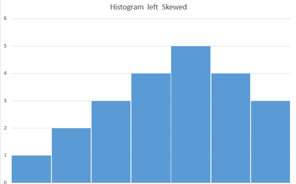
If the data is left-skewed on the histogram (thinner tail on the left side), then the mean is LESS THAN the median. This is known as negatively skewed.
If the data are right-skewed on the histogram (thinner tail on the right), then the mean is GREATER THAN the median. This is known as positively skewed. 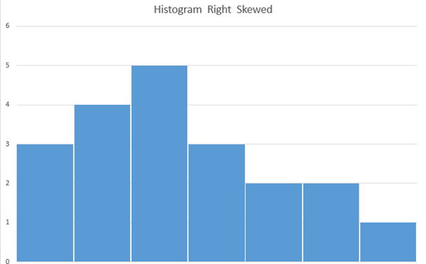
What is a Pareto chart?
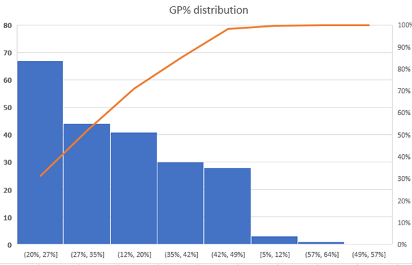
A Pareto chart is just like a histogram except the bins are organised from highest frequency to lowest. A Pareto chart also contains a line – this line shows the total cumulative frequency. It represents the Pareto philosophy, which is also known as the 80/20 rule. It does this by displaying events by order of impact.
A histogram may be used to represent the number of students who scored between a certain score range, such as 0 to 20%, 20 to 40%, etc.
A Pareto chart may be used to analyse the causes of customer dissatisfaction. The causes would be ordered by frequency of occurring, allowing the team to focus on the issues with the biggest impact on customer satisfaction.
Introduction to Excel Charts for Data Visualisation


Introduction to Excel Charts for Data Visualisation
Reach your personal and professional goals
Unlock access to hundreds of expert online courses and degrees from top universities and educators to gain accredited qualifications and professional CV-building certificates.
Join over 18 million learners to launch, switch or build upon your career, all at your own pace, across a wide range of topic areas.


