
Exploring data visualisation
As businesses and organisations around us increasingly focus on using data to support their decision-making, data visualisation plays a vital role in bridging the gap between data and decisions.
Being familiar with the principles, tools, and technologies to create visualisations can help organisations analyse the sheer quantity and complexity of information available to them.
What is data visualisation?
Data visualisation is part art, part science. As stated on the Tableau website:
. . . it’s not simply as easy as just dressing up a graph to make it look better or slapping on the “info” part of an infographic. Effective data visualisation is a delicate balancing act between form and function. The plainest graph could be too boring to catch any notice or it could make a powerful point; the most stunning visualisation could utterly fail at conveying the right message or it could speak volumes. The data and the visuals need to work together, and there’s an art to combining great analysis with great storytelling. [1]
What can data visualisation do?
| Month | Revenue | Cost |
|---|---|---|
| January | 97883 | 89452 |
| February | 77592 | 79293 |
| March | 85123 | 75859 |
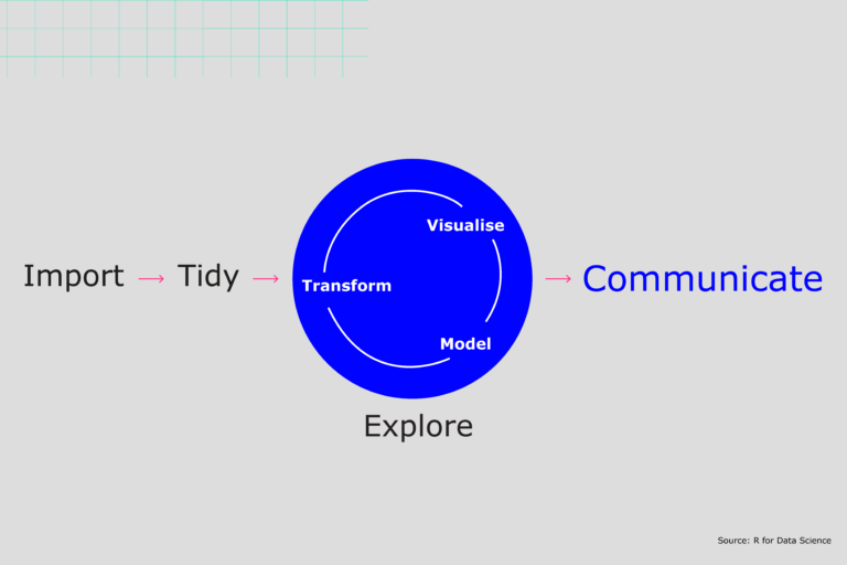 Adapted from Grolemund and Wickham, p. 3 [2]
Creating explanatory visualisations
It can be tempting to want to show your audience everything, as evidence of all of the work you did and the robustness of the analysis. Resist this urge. You are making your audience reopen all of the oysters! Concentrate on the pearls, the information your audience needs to know. [3]
Because explanatory visualisations serve a different purpose from exploratory visualisation:
- your approach to creating the visualisations will be different
- your approach to tooling, to an extent, will be different.
References
1. Data visualisation beginner’s guide: a definition, examples and learning resources [Internet]. Tableau. Available from: https://www.tableau.com/en-gb/learn/articles/data-visualization
2. Grolemund G, Wickham H. R for data science [Internet]. Available from: https://r4ds.had.co.nz/explore-intro.html
3. Knaflic CN. Storytelling with data: a data visualization guide for business professionals. Wiley; 2015. 288 p.
4. Stevens H. Why outbreaks like coronavirus spread exponentially, and how to ‘flatten the curve’. Washington Post [Internet]. 2020 Mar 14. Available from: https://www.washingtonpost.com/graphics/2020/world/corona-simulator/
Data Visualisation: Data Visualisation with Tableau Fundamentals


Data Visualisation: Data Visualisation with Tableau Fundamentals
Reach your personal and professional goals
Unlock access to hundreds of expert online courses and degrees from top universities and educators to gain accredited qualifications and professional CV-building certificates.
Join over 18 million learners to launch, switch or build upon your career, all at your own pace, across a wide range of topic areas.


