
An introduction to glyphs
Using Bokeh to output figures
Ahead of going into detail on what glyphs are, we first need to know about how Bokeh outputs the figures we draw.
Bokeh can output data to an HTML file, or, if it’s being used with Jupyter Notebook, can output its interactive plots directly into the notebook. This is done with the ‘output_file’ and ‘output_notebook’ functions, respectively.
In the upcoming step, after an introduction to glyphs, we’ll show how to output a figure using both these functions; but then, going forward through this activity, we’ll only be working within a Jupyter Notebook unless otherwise specified.
What are glyphs?
Glyphs are the ‘basic visual building blocks of Bokeh plots’ [1] and refer to vectorised graphical shapes or markers that are used to represent your data. This includes simple objects that can be categorised into the following:
- Marker: This refers to shapes like circles, diamonds, triangles, and squares and can be effective for bubble and scatter charts.
For example, the following image shows a series of Bokeh markers:
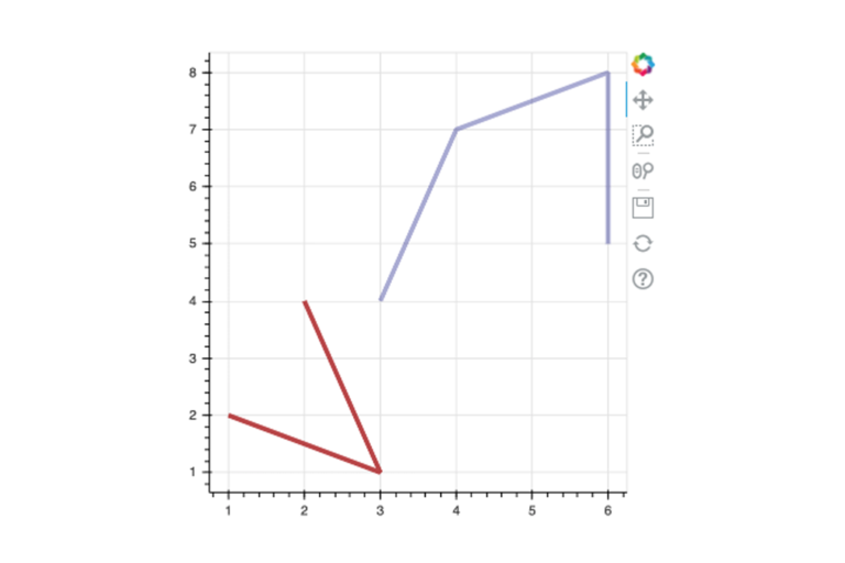
- Line: This refers to single, step, and multi-line shapes and can be useful for building line charts.
For example, the following image shows a plot with multiple lines at once:
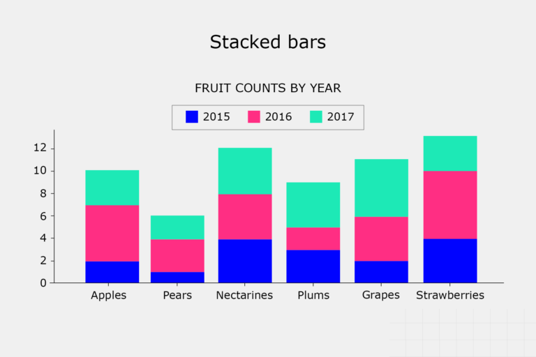
- Bar/rectangle: This refers to the traditional or stacked bar, column charts, waterfall, or Gantt charts.
In some instances, it could be useful to stack bars on top of one another. Here is an example of successive columns being stacked:
Using a basic glyph
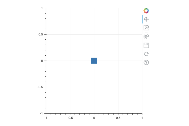
Let’s start with a really basic glyph: a square drawn in the middle of a plot. Follow the instructions below to get started.
Step 1
Import the functions we need for plotting the glyph:
Code:
from bokeh.plotting import figure, output_notebook, show
These functions are:
-
-
figure: This allows you to create a figure of a given size. A figure is a type of Matplotlib axes. Here, the name of the figure is p.
-
-
-
output_notebook: This function is called to instruct Bokeh to output its figures inside the Jupyter Notebook.
-
-
-
show: After setting up the figure(s), the show function is called to display them.
-
Step 2
Let’s see all three of these together:
Code:
output_notebook()
p = figure(plot_width=400, plot_height=400)
p. square (0, 0, size=20)
We can call output_notebook() once at the start of our Jupyter Notebook, all further show calls will be displayed inline.
Then, we create a figure. We pass in the plot_width and plot_height in pixels.
Step 3
Next, let’s draw a square with the Figure.square method. We pass in the x- and y-coordinates of the square as the first two positional arguments, and set its size as a keyword argument. Notice that this is analogous to Matplotlib’s axes plotting methods, like Axes.scatter or Axes.bar.
Finally, we can show the plot like this:
Code:
show(p)
Output:
Take a moment to see how you’re following along in the Jupyter Notebook. On your Jupyter Notebook, try panning around the plot by dragging it.
Notice that the toolbar on the right of the plot also allows you to zoom, reset the plot, and even download it as a static image to your computer!
The output file function
Before moving on, let’s review the output_file function. This is what you would use to output the plot and data into a self-contained HTML file (i.e. when you’re using Bokeh without a Jupyter Notebook).
Step 1
To use HTML output, just import the output_file function:
Code:
from bokeh.plotting import output_file
Step 2
Then, at the start of your file, call output_file(filename); for example:
Code:
output_file("output.html")
When you call the ‘show()’ function, the file will be generated and populated with the HTML, CSS, and Javascript necessary to view and interact with your plot.
Data Visualisation with Python: Bokeh and Advanced Layouts


Data Visualisation with Python: Bokeh and Advanced Layouts
Reach your personal and professional goals
Unlock access to hundreds of expert online courses and degrees from top universities and educators to gain accredited qualifications and professional CV-building certificates.
Join over 18 million learners to launch, switch or build upon your career, all at your own pace, across a wide range of topic areas.


