Quantitative Sound Analysis and the Visual Representations of Sound
This article introduces some basic techniques for quantitative sound analysis. Most importantly, we will have a look at three visual representations of sound: the waveform, spectrum and spectrogram.
We will only scratch the surface of the vast topic of sound analysis, and you don’t have to memorise the technical details given here. However, it is useful to have a conceptual idea of the ways in which sound is analysed and visualised.
Sound waves in the air
What happens if you throw a stone into water? As the stone hits the surface, waves spread from the point of impact. A sound in the air is quite similar. However, the waves are not variations in the water. A sound is variations in air pressure above and below the normal air pressure level. Just like the waves in the water, the sound waves spread out from the source, albeit quite fast; approximately 340 meters (1000 ft) every second. In the image below, the sound wave is displayed with dark areas where the air is more compressed, and light areas where the air is less compressed (the air molecules are more dispersed).

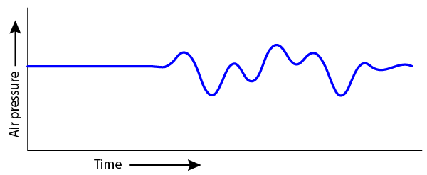
Imagine that you are standing on the blue “x” in the picture above. We can make a graph of the air pressure at your location, such as the example below. Notice that it starts with a steady air pressure (no sound), and then starts to vary once the sound waves hit you.

The variations in air pressure that we perceive as sound are very rapid. We call the speed of these variations the sound frequency. The lowest audible bass frequencies vary 20 times per second (20 Hertz) and the highest audible frequency to a young person without hearing loss is around 20 000 times per second (20 000 Hertz). The amplitude of the sound wave describes how large its pressure variations are. A quick demonstration of frequency and amplitude is shown in this video.
Waveform
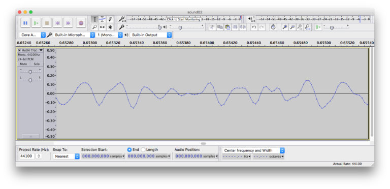
The most common way of representing sound is the one you will meet in most types of sound recording software: the waveform. The waveform is actually quite similar to the previous figure. A waveform representation shows how the amplitude (y-axis) of a sound varies over time (x-axis). The figure below shows a waveform representation of a very short sound segment. Time is shown along the horizontal axis. Notice how the amplitude varies above and below the 0 line.

The figure above shows a very short (3 millisecond) excerpt of a sound file. If we “zoom out” of the image, these variations become so small that they “merge” into the blue solid areas in the figure below. We are now unable to see the individual fluctuations from the previous figure, but we can identify several “bursts” of sound.
Frequency content
Natural sounds contain a range of frequencies. Tonal sounds contain a fundamental frequency and a range of overtones which are multiples of the fundamental frequency. For instance a tone with a fundamental frequency of 220 Hertz (called small A), has overtones at 440 Hz, 660 Hz, 880 Hz, etc. Normally, we cannot hear the individual overtones. The fundamental frequency and the overtones fuse together, and their amplitude relationship plays an important role in determining the perceived timbre of the tone. Timbre, sometimes called tone colour, is what makes it possible to distinguish between for instance a flute and a violin who are playing the same tone.
Spectrum
A spectrum representation shows the frequency content of a sound recording. Here the frequency is shown on the horizontal x-axis, and amplitude on the vertical y-axis. The figure below shows a spectrum of a saxophone tone. The peaks in the spectrum are the fundamental frequency and the overtones of the saxophone sound.
Spectrogram
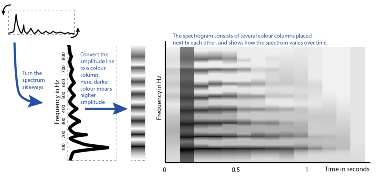
If we are interested in analysing how the spectrum varies over time, we may use what is called a spectrogram (or sometimes sonogram)
A spectrogram is created by dividing the sound file into many short segments, calculating the spectrum for each segment, and placing these next to each other. The picture below shows the conceptual construction of a spectrogram. Essentially, the spectrum of each segment is tilted sideways and colour-coded. The result of placing these colour-columns next to each other is an image showing the variation in frequency content over time.

The picture below shows a spectrogram of a saxophone melody.
Sound descriptors
Sometimes we need more precise descriptions of a sound file than we can get from a visual inspection of a waveform or spectrogram. We may then move over to quantitative analysis using sound descriptors. A sound descriptor is a numerical description of a single aspect of the sound. The descriptor may be global, describing an entire sound, or time-varying, describing variations within the sound.
Examples of descriptors
- In a sense, duration is a global descriptor. A sound has a duration which may be described globally with a single number.
- Sound energy as a global descriptor is a description of the total sound energy in the sound file. This is typically found by calculating the root-mean-square value of the waveform. Sound energy may also be a time-varying descriptor. Instead of calculating the energy of the entire sound file, the energy is calculated for a sequence of short time-windows. One number is calculated per time-window, resulting in a sequence of numbers.
- The spectral centroid is often explained as the “centre of gravity” of the spectrum. The time-varying spectral centroid usually reflects how the brightness of the sound evolves over time. The resulting sequence of numbers can be displayed in a plot such as in the picture below.
- Spectral flux describes how much the spectrum varies over time
- Roughness describes a dissonance in the sound that is the result of certain limitations in our auditory system (critical bandwidth)
Software
There exists a wide range of software for sound analysis. Here is a selection of free software that you may try yourself:
- Sonic Visualiser – Free and user-friendly tool for visualising audio files. (Windows / Mac)
- Audacity – Free software for recording and editing multitrack audio. (Windows / Mac)
- Praat – Free software for audio analysis. Mainly targeted at speech analysis but also useful for other types of musical sound. (Windows / Mac)
- Spear – Free software that lets you analyse and manipulate individual sinusoidal components of a sound file. (Mac)
- SpectrumView – Free iOS app producing a simple spectrogram from microphone input. (iOS)
In addition, there exists a range of tools that require a Matlab license. These tools are more advanced, and have a higher threshold to get started:
- MIR Toolbox – Advanced toolbox for audio analysis by Olivier Lartillot. (requires Matlab)
- Timbre Toolbox – Advanced toolbox for audio analysis by researchers from IRCAM and McGill University. (requires Matlab)
Share this
Music Moves: Why Does Music Make You Move?


Reach your personal and professional goals
Unlock access to hundreds of expert online courses and degrees from top universities and educators to gain accredited qualifications and professional CV-building certificates.
Join over 18 million learners to launch, switch or build upon your career, all at your own pace, across a wide range of topic areas.
Register to receive updates
-
Create an account to receive our newsletter, course recommendations and promotions.
Register for free


