Skip main navigation

New offer! Get 30% off your first 2 months of Unlimited Monthly. Start your subscription for just £35.99 £24.99. New subscribers only T&Cs apply

Find out more

Recommended reading

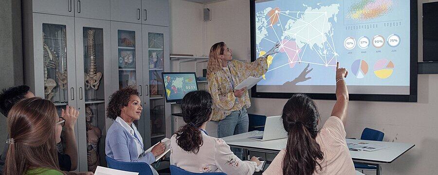
Many data visualization books are available. Watch Jeremy Singer and Rachel Menzies review some of their recommended textbooks.
3.7
JEREMY: Hello, Rachel. Nice to see you.
6.9
JEREMY: Could you please introduce yourself to our audience?
10.6
RACHEL: Of course I can. So my name is Rachel Menzies. I’m a senior lecturer in computing at the University of Dundee
16.7
RACHEL: And as part of that I have, in the past, taught data visualization as part of a first year class and now I kind of teach it to my students as they go along so that their projects can tell good stories. So that’s why it’s important.
30.4
JEREMY: Really nice. I think
33.6
JEREMY: The storytelling aspect of of data visualization is really important. And I know you’ve got some book recommendations for us and
44.1
JEREMY: One of them is very much about telling stories, isn’t it? Can you give us some some hints about what we might want to be reading, if we’re interested in data visualization?
54
RACHEL: Yeah, sure. So I think that where I come from, with data visualization is that data is everywhere. And you can tell whatever story you want from data.
64.8
RACHEL: And a lot of data is very personal. So people collect a lot of data about themselves. So we’ve got fitbits, we’ve got
71.7
RACHEL: things that track our homes, we’ve got things to track our cars, all these kind of things.
76.7
RACHEL: And it’s hard sometimes to take that out of the digital realm. So the first book that I want to recommend is a book called Dear Data.
84.9
RACHEL: And Dear Data is a book about two people who created postcards, so they live apart. One lives in Italy and one lives, I think, in America. I’m not sure, but they basically sent postcards to each other that
101.4
RACHEL: represented data about their weeks. So things like how many times did you cross the road? How many red cars did you see? So very simple things. But then they created a data visualization on a postcard. And this idea of just taking
116.1
RACHEL: all of that
116.7
RACHEL: data and putting it on just one small bit of cardboard is just so exciting. So they spent a year basically sending these postcards back and forth across the Atlantic, so Dear Data
127.7
RACHEL: has the very interesting idea of
129.7
RACHEL: Bringing in your own data to life. Is a really
133.3
JEREMY: That’s a very powerful idea isn’t it if you can somehow capture
138.8
JEREMY: data in such a compressed format, how big is a postcard just, you know,
145.5
RACHEL: Quarter of an A4.
146.6
JEREMY: Yeah, yeah, I suppose so. Yeah, that’s right. And presumably, they spent a fortune on stamps as well. Did they?
152.7
RACHEL: Presumably, what’s good about it is that they created them all. Just with pen and paper. So it wasn’t like it was a digital creation.
161.5
RACHEL: It was an art project in itself. So that’s really nice.
165.3
JEREMY: Yes, we’re encouraging our learners to use Python and Matplotlib
168.8
JEREMY: to do all their visualizations, but actually you could get away with just
173.6
JEREMY: using wax crayons.
174.9
RACHEL: Before that right.
175.8
RACHEL: There’s
176.2
RACHEL: A stage before you get to creating the digital version where you have to figure out what are the things I want to tell
182.9
RACHEL: What’s the story in there and sketch it out. And for me that sketching point is really important because if the sketch doesn’t work. Your Python is just an exploration. So
193.5
JEREMY: That’s interesting. Yeah. So you would suggest that we should actually
199.4
JEREMY: hand-draw or kind of draft our visualizations before you can think about
205.7
RACHEL: When you do that, that’s when you realize that, oh, maybe people may not understand this, or a misunderstanding becomes clearer when you’re trying to draw because often it’s to do with scale.
216.7
RACHEL: Like if you’re just drawing on a bit of paper, you have to really think about the scale on your axes and all this sort of stuff which is …
224
JEREMY: Different. Okay, thanks. So that’s first recommendation. Dear Data. What’s number two on your list?
231.7
RACHEL: Number two, on my list is books by a guy called David McCandless called Information is Beautiful and Knowledge is Beautiful. And again, this is about things that you might
243.9
RACHEL: See every day. You may see things in the news and it’s taking those and making them into really pretty pictures. So where the Dear Data stuff was kind of people sketched ideas.
256.4
RACHEL: These are complete.
257.9
RACHEL: Visualizations so some of them take like a page or two pages worth to show you the information. Things like how much coffee and milk are in different types of coffee.
270
JEREMY: Haha, I’m a latte man myself. Yeah.
274.2
RACHEL: Yeah, I’m usually an espresso.
277.6
RACHEL: I don’t waste time, right?
279.5
RACHEL: So, but that’s interesting because the concept behind that is just a stacked bar chart.
285.7
JEREMY: Yeah.
286.1
RACHEL: So if you can start if you’re learning about data. It’s a really good way to start thinking about what is the
291.5
RACHEL: basis behind all of these visualizations. There’s a really interesting one on the cover about the use of colour and what colour means in different cultures.
302.7
RACHEL: So like for in the Western world, black is a symbol that we associate with death and mourning, but in other cultures that colour is white.
311.8
RACHEL: So,
312.4
RACHEL: The Information is Beautiful cover is actually that visualization
317.2
RACHEL: Which is really, but it just looks like pretty art when you see it at first, but actually there is a meaning behind it. So.
324.5
JEREMY: Information is Beautiful. David McCandless. There’s a website to go with that as well. I think isn’t there. we should look that it.
330.8
RACHEL: Follow well
331.8
RACHEL: Just information is beautiful. I guess..
333.7
JEREMY: Okay, cool. We’ll Google that and find
335.8
RACHEL: Google that but yeah that contains a lot of the visualizations and a lot of stories behind
341.6
RACHEL: Thank you. So it’s quite nice.
343.8
JEREMY: So number three on your list, please, Rachel.
347.1
RACHEL: And number three is the final item on my list is going back to this idea from Information is Beautiful about how you take a basic concept and turn it into something really interesting
361.5
RACHEL: There’s a book called Handbook for Data Driven Design and it’s by Andy Kirk and that explores a lot of the kind of psychology or understanding that people have of different types of visualization
375.2
RACHEL: So, for example, people find it very difficult to tell the difference between sizes of circles, but you can tell very easily the difference between lengths of bars.
385.4
RACHEL: So it’s about how do you make your message clear so he had some information there about the psychology behind how people understand these things; he has information on how you tell the story. What do you want to tell? and lots of examples of where it goes wrong.
401.6
RACHEL: You know axes cut off to make it look like the difference is bigger than it is all that
405.9
JEREMY: Oh yes, that’s one of my pet hates Right.
411.1
RACHEL: What I would call probably like dark data visualizations, in the same way that you would have dark UX
417.3
RACHEL: And dark design patterns that would occur trick people into thinking about different things, but yeah. His theory is that he is an educator. He runs a lot of data visualization classes.
430.3
RACHEL: And it’s all about
431.6
RACHEL: using the data to tell the story. So his Twitter is really good. So his Twitter is @ visualizing data.
439.2
RACHEL: And if you look on there. There’s a link on there to a podcast. So he’s starting a podcast.
444.7
RACHEL: Which is about exploring and explaining. So it’s a video series and a podcast series. So I’m excited to see what comes out of that podcast.
453.8
JEREMY: Cool. Oh. Thanks, Rachel. So we came to you for book recommendations, we’ve ended up with podcast recommendations too. Brilliant! Thanks very much.

In this video interview, Jeremy talks with Dr Rachel Menzies from the University of Dundee. They discuss three recommendations for further reading about data visualization.

Each of the books recommended by Rachel has an associated website – check out the links below. You can see some of the authors’ visualizations directly on the web, as well as getting details about the books themselves.

This article is from the free online

Getting Started with Teaching Data Science in Schools

Created by
FutureLearn - Learning For Life

Reach your personal and professional goals

Unlock access to hundreds of expert online courses and degrees from top universities and educators to gain accredited qualifications and professional CV-building certificates.

Join over 18 million learners to launch, switch or build upon your career, all at your own pace, across a wide range of topic areas.

Start Learning now