Data visualisation

Data visualisation is an important part of data analytics. In particular, visualisations can help humans to examine large datasets, which would otherwise be very difficult to understand.
What is it?
In general, data visualisation is about displaying data points from a dataset or collections of data points in some representation format. The representation format could be points on a map, slices of a pie chart, or a line along data points over some time period.
When is data visualisation used?
While data visualisation is often used to display the results of an analytical model, it can assist all stages of the analytics cycle. We often use simple plots during the data selection and pre-processing phases to get a better understanding of the attributes of our dataset. For example, simple plots can help us spot outliers that could skew the model we aim to build.
International student data example
Let’s look at an example to better understand how data visualisation can be helpful. The Australian Government collects information on international students studying in Australia. This information includes the students’ nationality and the institution where they are enrolled. It is collected from the individual institutions.
As there are hundreds of institutions and thousands of students, you can imagine that the dataset is quite large. If you wanted to get an overview of trends relating to international student enrolment, it would be impossible to get from this raw dataset.
Data represented visually as a table
The table below is published openly by the Australian Government and shows an aggregate of the large dataset across months, nationalities, states, and education sector. We have chosen the month July and the nationality China in our example.
Sum of year to date enrolments across different sectors
| Sector | 2017 | 2018 |
|---|---|---|
| Higher Education | 129,737 | 150,071 |
| Vocational Education and Training (VET) | 13,059 | 17,951 |
| Schools | 12,857 | 13,321 |
| English Language Intensive Courses for Overseas Students (ELICOS) | 28,857 | 31,738 |
| Non-award | 16,342 | 16,091 |
| Grand Total | 200,852 | 229,172 |
Excerpt from the “basic pivot table 2015–2018 (xlsm)” by the Department of Education and Training is licensed under CC BY 4.0 1
Data represented visually as an infographic
The table makes it easier to get an understanding of the data, as compared to viewing the raw dataset. However, it is still not great. For example, it is difficult to compare the data for two different countries. Therefore, a visualisation such as the infographic created for the monthly summary can be very helpful in gaining a better view of the data.
To see the full infographic as a PDF, click on the image.
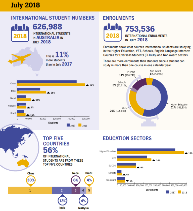
Excerpt from the “International Student Data monthly summary infographic” by the Department of Education and Training is licensed under CC BY 4.0 2
In the next step we will take a more in-depth look at the interpretation step in the data analytics cycle.
Your task
Look at the data in the two representations (the table and the infographic), how do the two different types of visualisations impact your understanding?
Share your thoughts in the comments.
References
-
Department of Education and Training. International student data 2018 [Internet]. Canberra ACT: Australian Government; 2018 [cited 2018 Oct]. Basic pivot table 2015–2018. Available from: https://internationaleducation.gov.au/research/International-Student-Data/Pages/InternationalStudentData2018.aspx ↩
-
Department of Education and Training. International student data: Monthly summary of international student enrolment data [Internet]. Canberra ACT: Australian Government; 2018 [cited 2018 Oct]. July infographic. Available from: https://internationaleducation.gov.au/research/International-Student-Data/Documents/MONTHLY%20SUMMARIES/2018/Jul%202018%20MonthlyInfographic.pdf ↩
Big Data Analytics: Opportunities, Challenges and the Future


Big Data Analytics: Opportunities, Challenges and the Future