
Conveyor belt case studies
In this Step we explore two case studies that provide further insight into conveyor belts.
October 28 2013
The animation above, provided by the Met Office, is from the St. Jude’s storm on 28 October 2013. It shows a depression passing over the south coast of England.
Watch the animation carefully. You should see the distinctive warm conveyor and cold conveyor clouds. Can you find the clear area between the two, where the really cold, dry air is descending from high in the troposphere?
At the end of the animation, you should see the cold conveyor curve round so far that it intercepts the warm conveyor belt.
January 24 2009
Figure 1 shows the storm that occurred on January 24, 2009. It killed 27 people in France and Spain, when hurricane force winds toppled trees, walls and, tragically, a school hall.
Figure 1: A map of the temperature of the atmosphere about 1.5km above the ground on 23 January, 2009 ©NOAA-ESRL Physical Sciences Division, Boulder Colorado. Data source NCEP/NCAR Reanalysis 1: Summary
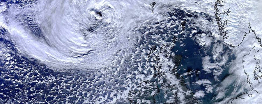
Figure 2: A satellite image, midnight 23 January © Crown Copyright, Met Office.
Figure 3: This image shows the location of warm, tropical air and cold, polar air at midnight on 23 January © Crown Copyright, Met Office.
Figure 4: A satellite image, midday 23 January © Crown Copyright, Met Office.
Figure 5: A satellite image, midnight 24 January © Crown Copyright, Met Office.
Figure 6: This image shows the location of warm, tropical air and cold, polar air at midnight on 24 January © Crown Copyright, Met Office.
Figure 7: Radar image showing rainfall, midnight 24 January © Crown Copyright, Met Office.
This radar image from the same time (Figure 7) shows the intense rainfall brought by the storm. In just 24 hours, this storm crossed the Atlantic and went through its entire lifecycle. This was partly due to the steep temperature gradient across the polar front. The storm was particularly destructive because it started quite far south, bringing with it its own warm, moist air.
Next time a weather presenter shows a satellite image, see if you can spot the cold and warm conveyor belt clouds associated with a depression. Or, you could look at the Met Office website and, by clicking on the ‘surface pressure charts’ and ‘rainfall radar’ buttons, you can compare the isobars with the current satellite images.
Come Rain or Shine: Understanding the Weather

Come Rain or Shine: Understanding the Weather
Reach your personal and professional goals
Unlock access to hundreds of expert online courses and degrees from top universities and educators to gain accredited qualifications and professional CV-building certificates.
Join over 18 million learners to launch, switch or build upon your career, all at your own pace, across a wide range of topic areas.

