
How to make charts in Excel
Excel is a very powerful tool that can be used for a range of business functions. This software is useful for storing data sets, deductions, and calculations by feeding formulas, and creating visualisations or data stories. Using spreadsheets is no longer a novelty, and many of you will already be using this software in your business or profession. However, making a note of some tricks and tips when working with Excel won’t hurt.
Tips and tricks
Let’s look at some tips and tricks for charts in Excel.
Tip #1: Tidying up axis scales
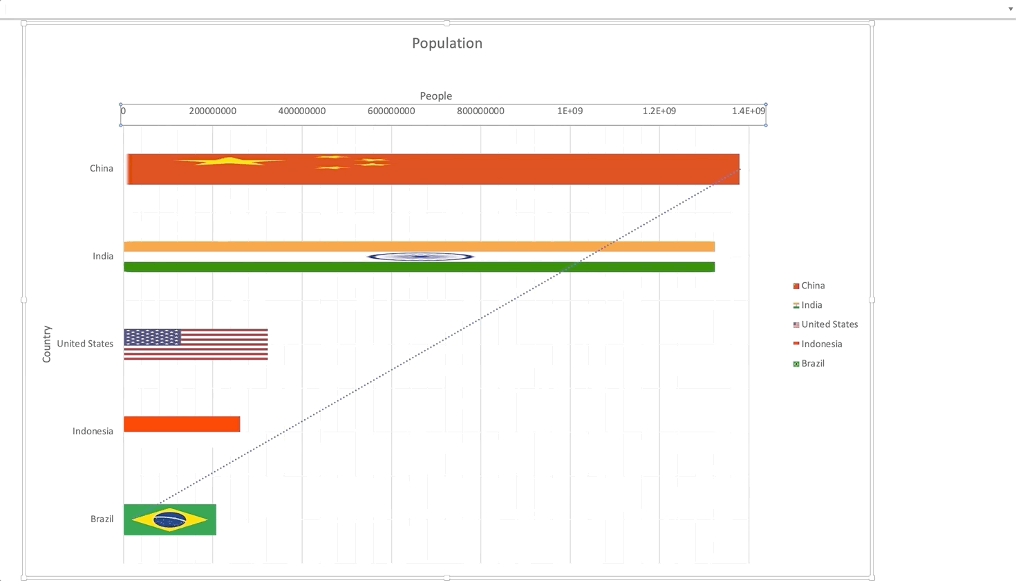
In one of the previous activities, we used a population chart that you might have already cleaned up. Alternatively, we even tried to clean some mess around the population numbers making them easy to read. Let’s remind ourselves what it looked like to begin with.
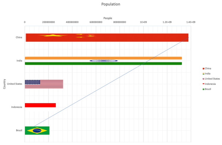
How do we fix this so that we can read in a scale of ‘billions’ in this chart? Follow the gif below:
Tip #2: Formatting a date axis
With time-series line graphs, there are some improvements we can make to Excel’s default date display, especially for long-term data. Observe the chart given below:
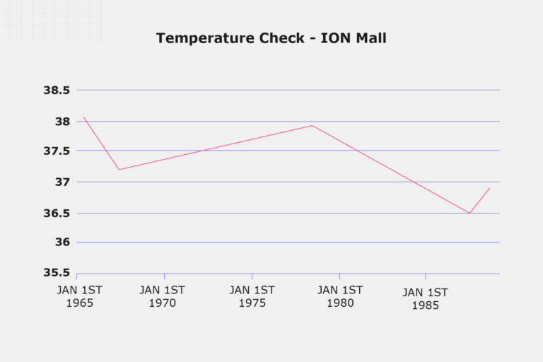
How do we fix this so that we read the date in the form of ‘years’ in this chart? Follow the gif below:
If you want to explore more such great chart tips using Excel, refer to the charts tips from Microsoft.
Download: Excel chart tips [1]
How can you develop your ideas to create efficient charts further?
References
- Ten tips for charts. Microsoft; [date unknown]. Available from: https://templates.office.com/en-sg/ten-tips-for-charts-tm22516108
Data Visualisation with Python: Matplotlib and Visual Analysis


Data Visualisation with Python: Matplotlib and Visual Analysis
Reach your personal and professional goals
Unlock access to hundreds of expert online courses and degrees from top universities and educators to gain accredited qualifications and professional CV-building certificates.
Join over 18 million learners to launch, switch or build upon your career, all at your own pace, across a wide range of topic areas.


