
Complex charts
3-D plots
Ask an expert and they would always suggest that you use 3-D plots sparingly – and that is correct!
Generally, 3-D plots are only used in scenarios where you need to add extra emphasis on important information. As an example, we can recollect the same example we used at the start of this activity (we’ve included it here again for your reference).
Observe: The Yield Curve: A 3-D chart [1]
In this 3-D chart, the analysts / authors have two major axes – year and % yield. However, to provide an extra emphasis on the interval of Treasury, the chart has one more axis.
Spatial data
Spatial data describes any data that is related to a location on the Earth, also referred to as geospatial data. It contains a variety of information rather than just information that is location-specific. We can visualise spatial data in the following ways:
-
Using different colours for regions defined by political boundaries.
-
Using different coloured labels for counties, states, or countries.
For example:
Here are the September 2020 unemployment rates per state for the USA.
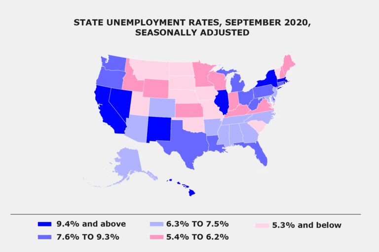
Adapted from: U.S. Bureau of Labour Statistics[2]
In the graph, each state colour is based on the unemployment percentage; the darker the colours, the higher the unemployment. This allows viewers to quickly compare different states relative to each other.
Geospatial data is the representation of concrete and physical elements on maps such as underground water pipes, roads, building locations, and so on. However, if we’re translating analysed data on a map, and it is continuous (crosses or spans political boundaries and regions) we can use a heatmap. So, what is a heatmap?
Let us unpack more on this in our next step.
Heatmaps
You can use heatmaps for data where you can represent the values with your data points in different colours. Heatmaps can visualise data such as temperatures, population density, rainfall, or even air pollution levels. It’s an extremely useful and powerful tool to have in your data visualisation inventory.
As an example, refer to the link below depicting the heatmap of The New York Times crossword grids by days of the week.
Refer to: Crosswords grid trends by days of week[3]
Notice how this heatmap uses seven different charts to show progression over time / day, therefore visualising another dimension – time.
You can also use a heatmap to render data about interaction with non-physical objects. For example, Tableau can be used to create a heatmap to display the geography of social capital in America.
Optional resource: Social Capital in America[4]
Reflect and share
What in your opinion is the information you could represent through spatial data?
Think and try to put them into categories like: locations, weather, etc!
References
-
Aisch G, Cox A. A 3-D View of a Chart That Predicts The Economic Future: The Yield Curve [Article]. New York Times; 2015 Mar 18. Available from: https://www.nytimes.com/interactive/2015/03/19/upshot/3d-yield-curve-economic-growth.html
-
State unemployment rates, seasonally adjusted [Graphic]. U.S. Bureau of Labor Statistics; 2020. Available from: https://www.bls.gov/charts/state-employment-and-unemployment/state-unemployment-rates-map.htm
-
Heatmap of NYTimes Crossword grids by day of week [OC] [Graphic]. Universe City. Reddit; 2017 Nov 16. Available from: https://www.reddit.com/r/dataisbeautiful/comments/7d7u2v/heatmap_of_nytimes_crossword_grids_by_day_of_week/
-
Felix C. Landscape of Social Capital in America [Graphic]. Tableau; 2018 Nov 2. Available from: https://public.tableau.com/profile/thecfelix#!/vizhome/LandscapeofSocialCapitalinAmerica/Desktop
Data Visualisation with Python: Matplotlib and Visual Analysis


Data Visualisation with Python: Matplotlib and Visual Analysis
Reach your personal and professional goals
Unlock access to hundreds of expert online courses and degrees from top universities and educators to gain accredited qualifications and professional CV-building certificates.
Join over 18 million learners to launch, switch or build upon your career, all at your own pace, across a wide range of topic areas.


