
Plotting different variables: Add two lines and second y-axis
When drawing a time-series plot, a quantitative variable is required. The plotting of time series objects is most likely one of the steps of the analysis of time-series data. If the value of a variable is measured at different points in time, the data are referred to as time-series data.
If you have different variables, how would you plot time series with that data?
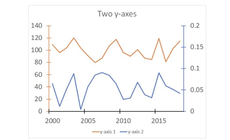
Plotting different variables could be challenging, especially displaying the values. In order to do so, you need multiple y-axes, one for each variable, as shown in the image below:
Examples:
-
Mapping a chart of how GDP of a country changes over time, compared to its population.
-
The effect of wind speed on temperature.
-
Plotting the population of two countries over time, one on the graph.
Note: This is different from comparing the same variable across two different datasets.
There are two ways to approach the problem of two variables on a graph:
-
Add two lines on a single plot and add a second y-axis with another scale.
-
Plot multiple axes, with the same x-axis.
Let us look at the first one in this step:
Add two lines on a single plot and a second y-axis with another scale
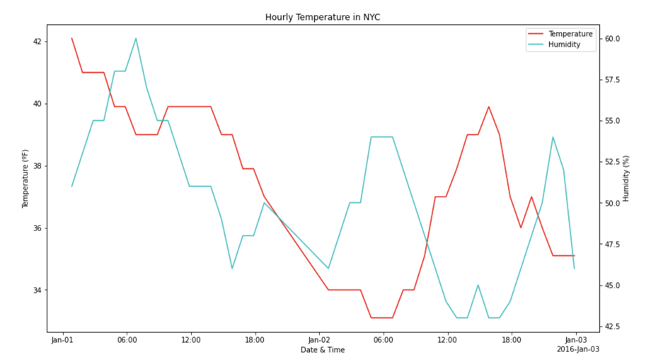
Using the graph shown below, let’s plot temperature and humidity on the same axes. Since the graph is quite dense (it has data for every hour), we’ll just plot data for the first two days of January.
You can see how the list was filtered in the accompanying Jupyter Notebook for this activity. We want to achieve this graph by following the below steps:

Follow the steps below:
Step 1
Create the plot in the usual way.
Code:
import numpy as np
january_data = weather_data_sorted[weather_data_sorted.date_TimeEST < np.datetime64('2016-01-03')]
Step 2
Have two axes sharing the same plot space. Put the name of the first axes as temp_ax (for temperature axes), instead of just ax as we normally might.
Code:
fig, temp_ax = plt.subplots()
fig.set_size_inches(14, 8)
Step 3
Now we need to add another axes that shares its x-axis with our main axes. We do this by calling the twinx method on the main axes. (This will return a new axes that has been configured to have its y-axis ticks and label drawn on the right.)
Code:
humidity_ax = temp_ax.twinx()
Set up the labels and tick marks now. Any label that’s shared can be applied to the main axes, in the same method that you’ve already seen:
Code:
temp_ax.set_title("Hourly Temperature in NYC")
temp_ax.set_xlabel("Date & Time")
temp_ax.set_ylabel("Temperature (ºF)")
Output:
Text(3.200000000000003, 0.5, 'Temperature (ºF)')
Step 5
Next, the only label that needs to be set specifically on the humidity axes is its y-axis label.
Code:
humidity_ax.set_ylabel("Humidity (%)")
Output:
~~~
Text(0, 0.5, ‘Humidity (%)’)
~~~
Step 6
Now, set the tick marks position on the x-axis using the ConciseDateFormatter.
Code:
major_locator = AutoDateLocator()
formatter = ConciseDateFormatter(major_locator)
humidity_ax.xaxis.set_major_formatter(formatter)
temp_ax.xaxis.set_major_formatter(formatter)
Step 7
Next, draw the lines with the plot() function.
(Note: We must assign the return values to variables as we’ll need to use them to set up the legend later.)
Code:
temp_lines = temp_ax.plot(january_data.date_TimeEST, january_data.TemperatureF, 'r')
humidity_lines = humidity_ax.plot(january_data.date_TimeEST, january_data.Humidity, 'c')
Step 8
Now let’s plot the temperature line on the temp_ax and the humidity line on the humidity_ax.
Step 9
The final step is to draw the legend. We’d have a slight problem if we tried to do it automatically.
If we called temp_ax.legend() it would draw a legend just for the temperature line. Similarly, humidity_ax.legend() would draw a legend with just the humidity line. If we call both methods, we’ll get two legends (which can be done manually though!).
However, this can be done in two ways:
A. The first way is a list of lines to add to the legend.
Example: ax.legend([line1, line2, line3], [“Label 1”, “Label 2”, “Label 3”])
Let’s look at an example from the same graph shown above. Since Python allows up to combine lists by adding them together, we can simplify this statement by using the below code:
Code:
all_lines = temp_lines + humidity_lines
B. The second way is a list of strings, of the same length, of labels to give these lines.
Code:
temp_ax.legend(all_lines, ["Temperature", "Humidity"])
Output:

Data Visualisation with Python: Matplotlib and Visual Analysis


Data Visualisation with Python: Matplotlib and Visual Analysis
Reach your personal and professional goals
Unlock access to hundreds of expert online courses and degrees from top universities and educators to gain accredited qualifications and professional CV-building certificates.
Join over 18 million learners to launch, switch or build upon your career, all at your own pace, across a wide range of topic areas.


