
Bar charts in Matplotlib
If you noticed, in all the charts so far, we’ve been plotting line charts using Matplotlib. What about other types of charts?
For the purpose of quantitative comparisons, let us unpack three types of charts further: bar charts, histograms, and scatter plots. Let us start with bar charts.
There are three types of bar charts: simple bar charts, grouped bar charts, and stacked bar charts. Whatever may be the type of bar chart, they are all built with the Axes.bar method.
Simple bar chart
The Axes.bar method takes at least two positional arguments, the first being a list of x-values, and the second the corresponding heights of those values.
Do you recall the ISP bar graph that displayed the speed of different broadbands we learnt about earlier? Follow the steps to learn how you can recreate that in Matplotlib.
Step 1
First, we need to start with a figure and axes as we had to when creating a plot. Then, call ax.bar() with the series and values.
Code:
fig, ax = plt.subplots()
Output:
bars = ax.bar([”Our ISP”, “ISP B”, “ISP C”, “Big ISP”, “ISP E”], [100, 95, 55, 20, 5])
fig
Output:
Step 2
The bar method returns a list of the bars that were drawn, so we can then reference the bars and make changes to them. For example, we can replicate the colors used last time we saw this chart.
Code:
bars[0].set_color(”#ED7D31”)
bars[1].set_color(”#E7E6E6”)
bars[2].set_color(”#E7E6E6”)
bars[3].set_color(”#4472C4”)
bars[4].set_color(”#E7E6E6”)
fig
Output:
Stacked bar charts
Stacked bar charts are easier than grouped bar charts. Hence, let us first explore this one.
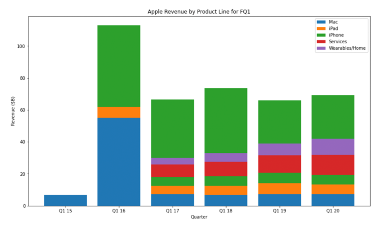
Follow the step-by-step demonstration of an example where you will recreate the Apple revenue bar chart used in the removing chart junk activity to create both stacked, and later grouped, bar charts. For the stacked chart, each bar would show the total revenue for the quarter.
Step 1
First, you will import the NumPy library, and set a fixed size for your figure and axes.
Code
import numpy as np
fig, ax = plt.subplots()
fig.set_size_inches(14, 8)
Step 2
Next, you will define labels as an array. This will mostly be used to refer to the number of groups we have.
Code:
labels = [”Q1 15”, “Q1 16”, “Q1 17”, “Q1 18”, “Q1 19”,”Q1 20”]
Step 3
Next, you set up our data series (i.e. mention the height of each bar).
Code:
mac = np.array([6.9, 55, 7.2, 6.8, 7.4, 7.2])
ipad = np.array([0, 6.9, 5.4, 5.8, 6.7, 6])
iphone = np.array([0, 51.1, 53.8, 61.1, 52, 56])
services = np.array([0, 0, 8, 9.1, 10.9, 12.7])
wearables_home = np.array([0, 0, 4, 5.5, 7.3, 10])
Then, use the bottom keyword argument to the bar method. This sets the y-position of the bottom of the bars we’re drawing. Since we’re using NumPy arrays, calculating the bottom of each bar is easy.
-
ipad_bottom = mac
-
iphone_bottom = ipad_bottom + ipad
-
services_bottom = iphone_bottom + ipad
-
wearables_home_bottom = services_bottom + services
Step 4
Moving the bars up is now easy, using the bottom keyword argument. For brevity, we’ll just show the first two bar calls but the rest can be found in the Jupyter Notebook.
Code:
mac_bars = ax.bar(labels, mac, label=”Mac”)
ipad_bars = ax.bar(labels, ipad, bottom=ipad_bottom, label=”iPad”)
Step 5
Lastly, we add titles, labels, and the legend.
Code:
ax.set_title(”Apple Revenue by Product Line for FQ1”)
ax.set_ylabel(”Revenue ($B)”)
ax.set_xlabel(”Quarter”)

ax.legend()
fig
Output:
Once again, there’s a few more options for customising the bar chart, and you can see these in the API documentation. Read through to get acquainted with the customisation options.
Refer to: API documentation for matplotlib [1]
Do note that bar charts can also be drawn horizontally, using the barh method. It mostly works the same, however width / heights and x / y are swapped. Read the documentation to learn how to use the barh method.
Refer to: Bar chart documentation for Matplotlib [2]
References
-
matplotlib.axes.Axes.bar [Document]. Matplotlib; [date unknown]. Available from: https://matplotlib.org/3.1.1/api/_as_gen/matplotlib.axes.Axes.bar.html
-
matplotlib.axes.Axes.barh [Document]. Matplotlib; [date unknown]. Available from: https://matplotlib.org/3.1.1/api/_as_gen/matplotlib.axes.Axes.barh.html
Data Visualisation with Python: Matplotlib and Visual Analysis


Data Visualisation with Python: Matplotlib and Visual Analysis
Reach your personal and professional goals
Unlock access to hundreds of expert online courses and degrees from top universities and educators to gain accredited qualifications and professional CV-building certificates.
Join over 18 million learners to launch, switch or build upon your career, all at your own pace, across a wide range of topic areas.


