
Line plot and bar plot
Line plots
A line plot (also known as a line chart or curve chart) is a graph that displays information as a series of data points using a number line or by straight-line segments. A line chart is often used to visualise a trend in data over intervals of time – a time series (in these cases they are known as run charts).
To create a line plot, we need to create a number line first. Next, place an ‘X’ (or dot) above each data value on the number line.
Demonstration: Highlighting line plot
The process of highlighting line plots is similar to that of scatter plots. Make multiple calls to the plot method, and give different colours to the lines you want to highlight.
Let’s look at how to highlight particular data points in a line plot. For this we can draw a line plot of flight data, highlighting just flights in 1955.
Step 1
Import flight.csv file to Matplotlib extracted from the zipped folder.
Code:
flights = pd.read_csv("flights.csv")
Step 2
Set the axis and size of the subplots. Here we will take twelve by eight (12/8) inches.
Code:
fig, ax = plt.subplots()
fig.set_size_inches(12, 8)
Output:
The figure shows a blank plot as the result of the code.
Step 3
Insert the flight data now: Flight year, passenger, month, and line colour respectively.
Code:
for year in flights["year"].unique():
 flights_for_year = flights[flights["year"] == year]
Step 4
Highlight line colour corresponding to 1995. Draw all bars the same way as the line colour.
Code:
 line_color = "#4472C4" if year == 1955 else "#EFF3F9"
 ax.plot(flights_for_year["month"], flights_for_year["passengers"], color=line_color)
Output:
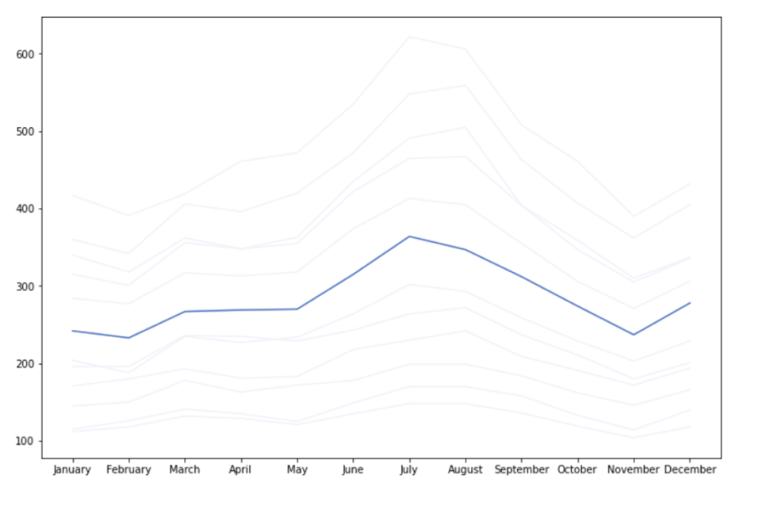
The figure shows details of the flight in 1995 (month, passenger capacity, and line colour as blue) as the result of the code.
Bar plots
Bar graphs represent data in a similar fashion to the line graphs. Bar graphs are appropriate for comparing larger changes in data among groups. Line graphs are useful for illustrating smaller changes in a trend over time.
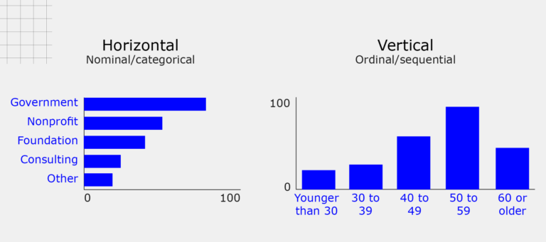
A bar graph is a tool used in visualisation to compare data among categories using bars. A bar graph can be presented horizontally or vertically. Bar plot relation is direct: in the sense that the longer the bar, the greater its value.
Bar graphs consist of two axes.
-
The colored bars are the data series.
-
The horizontal axis (x-axis) shows the data categories (vertical graph).
-
The vertical axis (or y-axis) is the scale (vertical graph).
Example:
Features of a bar plot:
-
A bar chart helps to compare a group of data between different groups at a glance.
-
The graph represents the relationship between the two axes (x- and y-axis).
-
It represents categories on one axis and a discrete value on the other.
-
Bar charts show big changes in data over time.
To look at more examples of a bar plot, read the following and think about which example you like the best:
Read: Examples of Bar Plot [1]
We saw how to change bar colour earlier, and we can use that technique to highlight a single bar as well.
Demonstration: Highlighting bar plot
Let’s look at how to highlight particular data points in a bar plot. Using the same data from flight data, highlighting just flights in 1953.
Step 1
Use the same flight.csv file extracted from the zipped folder.
Step 2
Since the file is already imported on Matplotlib, we’ll set the axis and size of the subplots directly. We will take 12 by 8 here as well.
Code:
fig, ax = plt.subplots()
fig.set_size_inches(12, 8)
Insert the flight data: flight year and month respectively.
Code:
august_flights = flights[flights["month"] == "August"]
bars = ax.bar(august_flights["year"],
Step 3
Draw all bars the same grey colour. The bar method returns a list containing all the bars that were drawn.
Code:
august_flights["passengers"], color="lightgrey")
Step 4
Just set the highlight colour on the bar to where you want attention to be drawn. Do this by selecting the bar by its index and calling the set_color method.
Code:
ax.set_xticks(list(range(1949, 1961, 1)))
bars[4].set_color("#4472C4")
fig
Output:
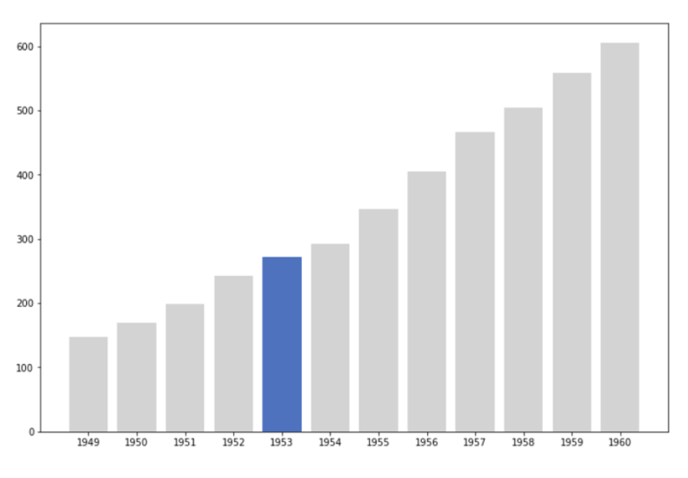
The figure shows details of the flight in 1953 (highlighted with blue color bar) as the result of the code.
Next, we’ll look at some ways to compare groups of data with highlighting.
Share with us!
-
Did line and box plots appear easier than others we’ve done? Why?
-
What are some of the functions you liked the most here?
Share your thoughts in the comment section below.
Data Visualisation with Python: Seaborn and Scatter Plots


Data Visualisation with Python: Seaborn and Scatter Plots
Reach your personal and professional goals
Unlock access to hundreds of expert online courses and degrees from top universities and educators to gain accredited qualifications and professional CV-building certificates.
Join over 18 million learners to launch, switch or build upon your career, all at your own pace, across a wide range of topic areas.


