
How to compare groups of data with Python
Using different plots to compare groups of data
We can use selective highlighting to compare groups of data on the same plot. We do not need to go into this in too much detail since it involves reusing and applying techniques you have already seen!
In this article, we will use Matplotlib in Python and see examples and demonstrations of how to compare groups of data on different plots.
Demonstration: Comparing in scatter plots
To highlight points for comparison, observe the demonstration below.
Step 1
Use the same iris.csv file data set that we used in the scatter plot previously.
Step 2
Once again, the file is already imported on Matplotlib so we’ll set the axis and size of the subplots directly. We will take eight by eight.
Code:
fig, ax = plt.subplots()
fig.set_size_inches(8, 8)
Step 3
Draw the points of comparison in colour. Leave the groups that you don’t want to be compared in grey.
Code:
ax.scatter(versicolor["petal.length"], versicolor["petal.width"], marker="x", label="Versicolor", facecolor="lightgrey")
ax.scatter(setosa["petal.length"], setosa["petal.width"], label="Setosa", marker="x", facecolor="blue")
ax.scatter(virginica["petal.length"], virginica["petal.width"], label="Virginica", marker="x", facecolor="red")
Output:
The figure shows a comparison between two species highlighted in red and blue as the result of the code.
Demonstration: Comparing in line plots
For a line plot, we will again follow a similar method for highlighting the line. Here, you can choose to highlight the one you want with a different colour.
Step 1
Use the same flight.csv file data set from the zipped file that we used previously.
Step 2
Set the axis and size of the subplots as 12 x 8 (the same as earlier).
Code:
fig, ax = plt.subplots()
fig.set_size_inches(12, 8)
Step 3
Insert the comparison variables on the plot. Here, we will do a comparison between the number of passengers traveling in 1955 and 1958.
Code:
for year in flights["year"].unique():
 flights_for_year = flights[flights["year"] == year]
 line_color = "#4472C4" if year == 1955 or year == 1958 else "#EFF3F9"
 ax.plot(flights_for_year["month"], flights_for_year["passengers"], color=line_color)
fig
Output:
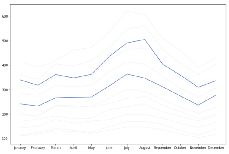
The figure shows a comparison between the number of passengers travelled in 1955 and 1958 as the result of the code.
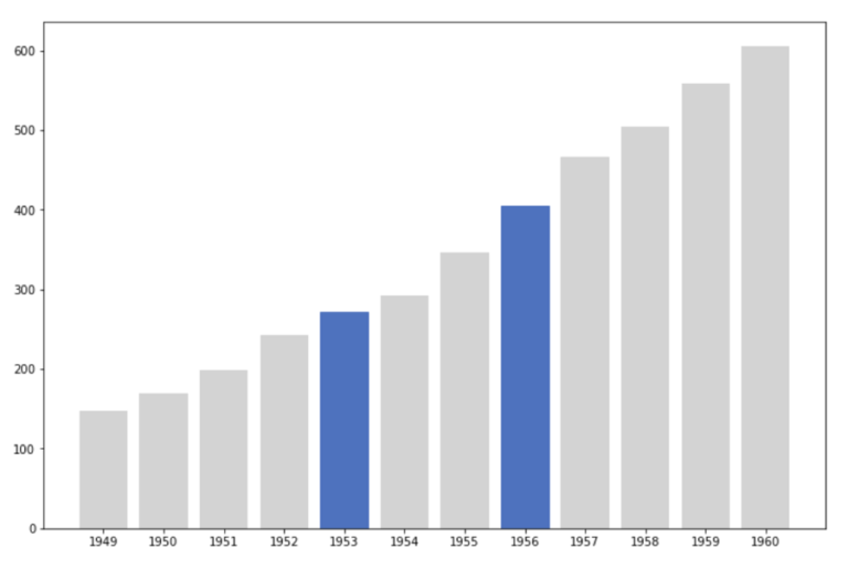
Demonstration: Comparing in bar plots
To compare multiple bars, highlight them all by setting their colours. Do this by calling set_color on each bar. Look at the demonstration below to understand the process.
Step 1
Use the same flight.csv file data set that we used just now for the line plot.
Step 2
Keep the axis and size of the subplots as 12 by 8 (the same as earlier).
Code:
fig, ax = plt.subplots()
fig.set_size_inches(12, 8)
Step 4
Insert the comparison variables on the plot. Here, we will do a comparison between the number of passengers traveling in 1953 and 1956.
Code:
bars = ax.bar(august_flights["year"], august_flights["passengers"], color="lightgrey")
bars[4].set_color("#4472C4")
bars[7].set_color("#4472C4")
Output:

The figure shows a comparison between the number of passengers travelled in 1953 and 1956 (highlighted bars) as the result of the code.
If you’d like to learn more about data visualisation, check out the full online course, from FutureLearn, below.
Data Visualisation with Python: Seaborn and Scatter Plots


Data Visualisation with Python: Seaborn and Scatter Plots
Reach your personal and professional goals
Unlock access to hundreds of expert online courses and degrees from top universities and educators to gain accredited qualifications and professional CV-building certificates.
Join over 18 million learners to launch, switch or build upon your career, all at your own pace, across a wide range of topic areas.


