Skip main navigation

挿絵の枠と平仮名版本の匡郭

挿絵の枠と平仮名版本の匡郭
4
Here I will talk about illustrated books. Prof. Ichinohe explained about printed books, so Here I will concentrate on printed picture books. With the introduction of movable type printing technology from Europe and from Korea at the end of the 16th century, movable type began in earnest in Japan too. The diffusion of these printed book exerted a strong influence on Japanese publishing, but there are some subtle differences to keep in mind. Let us start with these books [5] produced under the influence of books in Chinese from the Korean peninsula. As you can see, there is a border around the text.
67
This border was called kyōkaku, you can also see the grid of columns between the lines of text, and it is standard in kanji-based books. At the opposite end of the spectrum were the books in the local script, the kana. This is an example [2], and as you can see, there is no border. In 1608 the first illustrated movable type edition of the Tales of Ise (Ise monogatari) was published. There is no border around the text portion, but there is one around the plates. This [3] is a different, slightly later book but it is a similar example. As you can see, there is no border around the text but there is one around the images.
139
The images are were colored by hand and the whole genre is known as tanroku-bon (red and green books) after the pigments used for coloring. These books always have a border around the images but not around the text. Next, this book [4] here is titled Sanjūrokunin utaawase (Poetry Contests of the Thirty-six Immortal Poets). Suminokura Soan (1571-1632), the man behind the series of luxurious printed books known as Saga-bon (Saga books), the first of which was the Tales of Ise we have just looked at, is thought to have been involved in its publication. It contains portraits of famous poets next to their most representative poems.
192
This kind of pictures are known as kasen-e (pictures of famous poets) and were popular since the 12th century. Traditionally these pictures did not feature a border but they do in this book we are looking at. So there seems to be a connection between the print medium and the use of the border. There is no definitive explanation as to why illustrations in printed books feature the border and those in handwritten ones do not. One intriguing possibility is that it was as a result of Western influence. Illustrations in Western books tend to feature a border. The way some of them had green and red added to them by hand also resembles the way color was applied on plates in Japan.
264
So Western influence is a distinct possibility. And so we have roughly outlined how illustrations became a common presence in Japanese printed books, but it is important to keep in mind that this occurred because of the popularity of handwritten illustrated books before them. Moving back to the border, originally it was only used for images, but as time went on, it also began to be used around the text, as in this example [1]. Why? Without the border, a printed book looks very similar to a manuscript. It is possible that early printed kana books, which do not feature the border, were meant to look like manuscripts. By contrast, books that featured a border around the text sort of flaunted their “printedness”.
362
In other words, though they began life as passable replica of handwritten books gradually printed books came to be accepted as a legitimate medium in their own right. Illustrations may have played an important role in making the border around the text acceptable. If we look at this book we already saw earlier, we see that there is no border around the text, but there is one around the image. However, the image is slightly smaller than the text and there is a certain unbalance between the two pages. But as the border began to be used for both text and images, as in this example, it gradually became standard to use frames of equal size for the two.
443
This book here, it doesn’t have any illustrations, and this one are two printed versions of the same text, the Aki no yo no nagamonogatari (Tale of a Long Autumn night). They were published about 100 years apart from each other and they show just how much publishing conventions changed during this period of time. Finally, let us look at an example of a book both going against and exploiting the trend of the times. If we look inside, it is a printed book but there is no border around the text and neither is there one around the images. If we added color to the images it would look virtually identical to the illustrated handwritten Nara ehon that we saw earlier.
518
In other words, this was made as a replica of a Nara ehon. In order to make it look just like a handwritten book the borders were omitted. Although technically possible, by this point borderless printing was extremely rare. Though these may seem like minor details, it is surprising how much we can learn by paying attention to the relationship between images and the border.

写本と版本の重要な違いとして、版本に書かれた挿絵は線で囲まれていることが多いのですが、写本ではそれがないということです。まず以下のテキストを読み、次に佐々木教授が例をあげながら解説するビデオをご覧ください。

絵入りの冊子写本を追いかけるようにして登場した絵入り版本ですが、両者には注目すべき違いがあります。写本の挿絵には外側の枠は存在しないのが普通なのですが、この『伊勢物語』(図1)にはそれがあるのです。そしてこれ以降の絵入り版本の挿絵には当然のごとくに枠が存在しているのです。
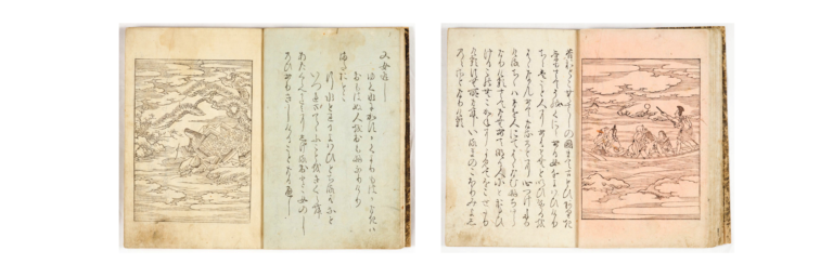
Saga-bon Ise monogatari 図1. 伊勢物語
Click to take a closer look

嵯峨本は活字による印刷が中心でしたが、『新古今集抄月詠和歌巻(しんこきんしゅうしょうげつえいわかかん)』(SEE ALSO参照)のように従来の木の板に彫る「整版(せいはん)」の技法による刊行物も存在しています。嵯峨本であることを疑う意見もあるものではありますが、『嵯峨本三十六人歌合』(図2)もその一つです。
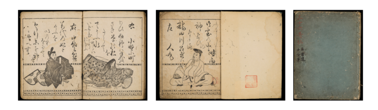
*Saga-bon Sanjūrokkasen* 図2. 嵯峨本三十六歌仙
Click to take a closer look

これは、平安時代後期の12世紀から存在する、歌人の姿を描き、その代表作の和歌を書き添える「歌仙絵(かせんえ)」の伝統を受け継ぐものです。巻子装や冊子、あるいは色紙形式のものなど多くの作品が伝わっています(図3. 小倉山百人一首)が、それらには枠がないのに、この版本にはやはり枠があるのです。
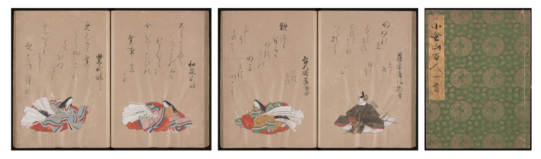
Ogura hyakunin isshu 図3. 小倉山百人一首
Click to take a closer look

何故挿絵には枠がついたのかという問題は、残念ながら明らかになっていません。印刷上の都合とも考えられますが、絶対的な理由とはならないようです。非常に魅力的な仮説は、西洋の絵入り印刷物の影響を受けたとみる説です。よく知られているように西洋では、グーテンベルグが1455年頃に聖書を出版して以来の活字印刷の歴史を有しています。そして西洋の書物は古くから冊子本が主体であり、それに挿絵があることも普通のことでした。また挿絵に枠があるのが普通であったのです。

日本に火縄銃が伝わったのが1543年のことであり、これ以後日本と西洋の交流が活発になっていきますが、その過程で日本に西洋の書物も伝わったことは疑いありません。しかしながら、江戸時代になってキリスト教が禁止されたために、日本に伝わっていた洋書は国内に殆ど残っておらず、その影響関係を見積りがたいのが実際です。それでも日本における絵入り冊子本の登場も16世紀であることを考えると、洋書が和本に影響を与えたと考えたくなります。日本の版本の挿絵の枠も西洋の絵入り本に由来するかもしれないのです。

この挿絵の枠の存在は、本文部分にも影響を与えることとなったようです。近世初期の古活字版の時から、平仮名書きの版本は本文に四周の枠がないのが普通でした。この版本の枠のことを「匡郭(きょうかく)」と呼びますが、漢字の版本は中国や朝鮮半島のものと同様に、冊子のものは匡郭があるのが普通です。漢文の補助記号的に使われることの多い片仮名の版本にも匡郭が存しています。視覚的に印象的な匡郭というものの存在は、その本が版本であることを主張していると言えます。この本『史記』(図4)は嵯峨本であることが近時明確になったもので、匡郭の存在が目立っています。
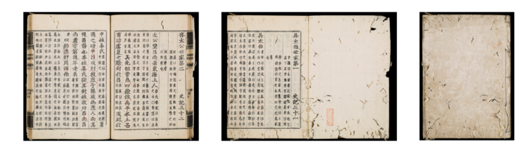
Shiji 図4. 史記
Click to take a closer look

これに対し、匡郭を有さない平仮名版本は、見た目には写本との差異がなく、いわば写本の複製的な存在として製作されていることが判ります。西洋の活字印刷も写本の複製として行われたことを思い合わせると、その共通性は興味深いものがあります。

この『俵藤太物語』(図5)は、文字の部分だけを見ると写本のようです。しかし挿絵の部分には枠があるので、そこを見れば直ぐに版本であることが理解できます。
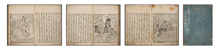
Tawara Tōda monogatari 図5. 『俵藤太物語』
Click to take a closer look

この挿絵の枠の高さは、本文部分の高さよりもやや小さいのが「嵯峨本伊勢物語」以来の特徴です。両者が並んだ様子を見るとややバランスに欠ける印象があります。このことが関係していると断言はできないのですが、17世紀の半ばを過ぎたころから、平仮名の本文に匡郭が加わることが増えていくのです。それと共に最初から本文と挿絵の版木が同時に製作されたものは(本文だけのものに後から挿絵を差し込むこともあり、古い挿絵の版木を転用したり、新たに作って加えることもありました)、両者の枠の大きさが揃えられるようになり、それが一般化していくのです。この『鶴の草子』(図6)は、挿絵の枠と本文の匡郭の高さがほぼ揃った早い例です。
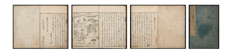
Tsuru no sōshi 図6. 『鶴の草子』
Click to take a closer look

平仮名版本における匡郭の登場は、版本が写本の複製であることをやめて、版本であることを積極的に主張し始めたことの象徴と捉えることができるのです。

非常に珍しい事例ですが、挿絵に枠がない版本も17世紀中頃に製作されています。すべて同時に版木が作られたかは不明ですが、『御伽文庫(御伽草子)』と呼ばれる二十三編のシリーズとなっているものです。横本であることや表紙の雰囲気などからしても、横本型奈良絵本を模して作られたことは明らかで、その内の『文正草子』には販売時から手彩色が加えられたものも存在しています。平仮名版本が写本の複製的な存在ではなくなっていった時期だからこそ、逆に珍しさを狙って複製的なものを企画したと考えられるのです。
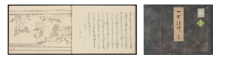
Issun bōshi 図7. 『一寸法師』〔御伽草子〕
Click to take a closer look

ビデオで紹介した書籍

Books on the table

6. のせさる草子 5. 秋の夜長物語 4. 秋の夜長物語
3. つきしま 2. 三十六歌仙 1. 史記
This article is from the free online

古書から読み解く日本の文化: 和本の世界

Created by
FutureLearn - Learning For Life

Reach your personal and professional goals

Unlock access to hundreds of expert online courses and degrees from top universities and educators to gain accredited qualifications and professional CV-building certificates.

Join over 18 million learners to launch, switch or build upon your career, all at your own pace, across a wide range of topic areas.

Start Learning now