
Victor’s research on people standing still

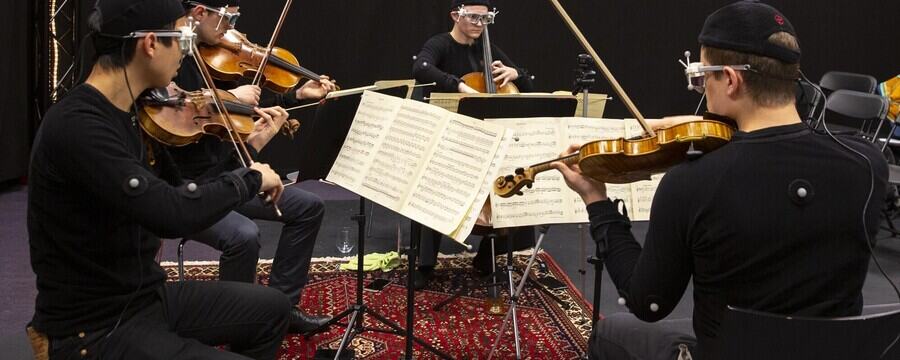
As we just heard about in the video, there are many things to think about when capturing the motion of perceivers.
In many ways, motion capturing perceivers—such as audience members—is easier than performers. Perceivers usually move slower, and they don’t have any instruments covering up markers. That said, we have been trying to push the limits in what it is possible to achieve with the motion capture of perceivers. This includes many studies of people responding to music in various ways: dancing, playing “air instruments”, “conducting” music, rowing to music, and so on.
Out-of-lab motion capture
All of the above-mentioned studies have been conducted in the lab. We have also experimented with recording the motion of perceivers in “ecological” settings, such as audiences, during real-world concerts. This includes our innovation project MusicLab, built around capturing the motion of both musicians and audiences.
As Laura has already talked about, there are many challenges with capturing musicians in such a setting. It is equally challenging to capture perceivers, particularly since we do not want to influence their musical experience too much. Then it is necessary to think about what types of motion capture devices to use. In our experience, infrared motion capture does not work well in such scenarios. It is much easier to equip audience members with an inertial measurement unit that can record on a single device. We have also explored using wireless sensors with muscle (EMG) and motion (IMU) sensing.
The challenge with all such real-world recordings is that the concert will always have to be the priority. Data capture is a secondary priority, and if something fails, there is no time to stop the recording and start over again. So we have learned that it is necessary always to set up backup solutions. In addition to on-body sensors, we usually set up video cameras that can be used to extract some relevant motion features. There are several ethical challenges involved in this, which we will get to in Week 6. Together, on-body sensors and video cameras can provide enough information to analyse the activity, albeit with lesser spatiotemporal accuracy and precision than what could be achieved in the lab.
Capturing human micromotion
One of the experimental paradigms we have developed over the years is based on our interest in studying human music-related micromotion. This is the smallest motion that people can produce and perceive, often at the scale of 10 mm/s or smaller. We have studied such micromotion with full-body motion capture of individual participants. But to collect larger amounts of data, we came up with a unique paradigm: the Norwegian Championship of Standstill.
Organized as part of the annual “open day” at the University of Oslo, the Championships have allowed for capturing hundreds of participants over the years. The participants face a simple task: stand as still as possible for 6 minutes. First in silence, and then with short (30-40-second) musical excerpts being played with silence in between. The silence parts are important since they serve as the “baseline” for how much (or little!) people moved to start with.
We were interested in answering whether people move when listening to music than when they stand still. And, we have now, quite ample evidence that this is, indeed, the case. This we have found by calculating the differences between the quantity of motion of participants in the silence and music conditions.
Over the years, we have also tested different types of music. The aim has been to understand if any musical features lead to more involuntary body motion than others. Perhaps not unexpectedly, we have found that dance music with a regular pulse makes people move more. We have also found that music with a tempo of around 120 BPM makes people move more than faster or slower tempi. The complexity of the music also has an impact, and so does some personality traits and the listening mode (headphones or speakers).
If you are interested in the results, please have a look at the reference section below. Here we will look more at the motion capture setup and some of the data.
The setup
The championships have been run in the fourMs Lab. To allow for more participants, we decided to capture groups of participants. This quickly complicates things from a motion capture perspective. After all, if you have many people standing next to each other, they will typically cover up the line-of-sight of the cameras. It would have been interesting to capture several points on people’s bodies. However, this turned out to be difficult in practice. For example, we tested placing markers on people’s hands, but we could not get reliable tracking.

The result was only to capture the motion of people’s heads. This was done by placing one reflective marker on each participant’s head. Since the cameras were placed in the corners of the room, this was a solid way of getting robust data capture. While this is certainly a more limited setup than what we could have done by capturing individual performers, it was sufficient to find statistical differences.
The data
The plots contain a lot of information and can be quite challenging to read. Therefore, we will, in the following, go through all the different parts of the plots.
For all of these plots, the three dimensions (XYZ) have the following meaning:
X = sideways motion
Y = front-back motion
Z = up-down motion
All of the data has been normalised for each participant. This means that they have been changed so that the average value is always 0 in all planes. That makes it easier to compare data between people.
Position plots
The first set of plots shows the position of the marker in the three dimensions (XYZ). The data are shown for all the 360 seconds (= 6 minutes) that were recorded.

All the raw data are plotted first (grey line). This graph is quite chaotic. Therefore, we also plot a “smoothed” line (black) on top. Finally, there is a trend line (red), which shows which direction the data moves.
Note that the vertical axes (the left side) do not have the same values. There are larger values for the front-back motion (Y dimension) than the sideways motion (X dimension). The least motion can be seen in the vertical motion (Z dimension). Here it is more common to see either a gradual increase or decrease over time.
XY Plots
The next set of plots are only showing motion in space; there is no time axis. They differ in how two and two of the axes are plotted together (XY, XZ, and YZ).
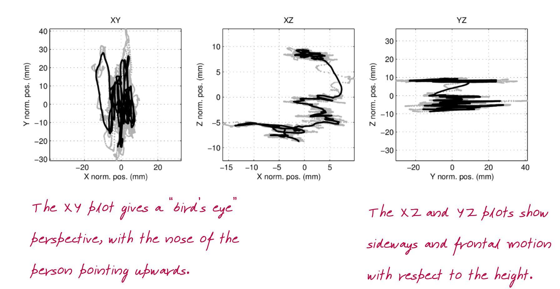
The most intuitive of these plots are the XY plots. These can be thought of as a “bird’s eye” view of the motion. Imagine that you are sitting in the ceiling of the space, looking down at the person moving. The person’s nose is pointing upward, so in most of these plots, you will see that most motion is happening on the vertical axis. Our feet keep us more stable sideways, so it is expected that we sway most back and forth.
Derivative plots
If we turn to the plots on the other sheet (the “b page”), these are slightly different. Here we do not look at each of the three dimensions (XYZ) any longer. Instead, these plots show the magnitude of the motion. This is calculated by combining the three axes into one figure.

The position magnitude can be thought of as the “quantity of motion”. This is low when there is little motion and higher when there is more. So it can be used to see where there is more motion in the graph.
The speed plot has been calculated by taking the first derivative of the position. This tells something about the changes in motion over time. Similarly, the acceleration plot represents the second derivative of the position. The speed and acceleration can be useful to detect changes in the data.
Finally, one of the most interesting plots on this page is that of the cumulative distance travelled. This looks at the change in position between every single sample and adds them together. If the line is straight, it means that the person moved similarly throughout the whole experiment.
Other plots
The last plots may not be particularly interesting for standstill data, but they often reveal useful things about other types of motion. The phase plot shows relationships between position and speed. This can reveal rhythmic patterns in the motion. The histogram tells about the distribution of the motion and whether it is skewed in one direction or another.

Finally, the spectrum plot shows whether any particular frequencies stick out. Since the standstill data are quite noisy in nature, this usually does not show anything. However, sometimes we see a spike in the data, often because of some error in the measurement.
Want to learn more?
There are several more advanced ways of analysing such data. If you are interested in learning more about how the data can be analysed, we have made all the data available in the Oslo Standstill Database. You can also find a lot of our analysis scripts available, including Jupyter notebooks explaining the steps in detail.
Motion Capture: The Art of Studying Human Activity

Motion Capture: The Art of Studying Human Activity
Reach your personal and professional goals
Unlock access to hundreds of expert online courses and degrees from top universities and educators to gain accredited qualifications and professional CV-building certificates.
Join over 18 million learners to launch, switch or build upon your career, all at your own pace, across a wide range of topic areas.


