Week 5 wrap-up: the data behind every forecast
You’ve reached the end of Week 5 – and you can now answer a question that sits underneath every ocean forecast ever made: where does the data come from?
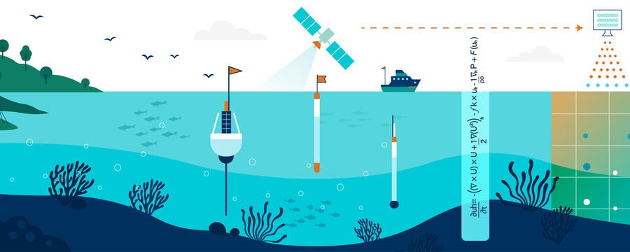
At the start of the week, a forecast’s inputs might have seemed to appear from nowhere. Now you know the upstream data ecosystem: the observations that describe the ocean, the atmospheric data that drives it, the providers who turn raw measurements into usable products, and the open-access portals that put all of it within your reach – for free.
The journey of the week
The week followed the data from its sources to your own hands:
- You began with what upstream data sources are – the observations and external datasets that initialise, force, and validate ocean models
- You met the global data providers – the international services that collect, quality-control, and distribute the world’s ocean data under the FAIR principles
- You explored the Copernicus Marine Service – its four services, three ocean domains (Blue, Green, White), and consistent product structure
- You learned about atmospheric forcing – the winds, heat, and pressure that drive ocean models, and why forcing quality shapes forecast skill
- You saw the contribution of regional and in-situ data – the satellites, Argo floats, moorings, and tide gauges that complete the picture
- And you finished by learning to access open-access data yourself – for both the ocean and the atmosphere, navigating real portals like the Copernicus Marine Data Store and the Climate Data Store
The ideas to carry forward
A few threads run through the whole week.
Accurate forecasts begin with accurate data. However sophisticated a model is, its output is only as good as the data used to initialise and drive it. The quality of the inputs sets a ceiling on the quality of the forecast.
No single source is enough. Satellites and in-situ platforms, ocean and atmospheric data, observations and model outputs – each contributes something the others cannot. A complete forecast draws on all of them.
Open access changes who can take part. The same datasets used by the world’s leading forecasting centres are freely available to anyone. For regions with sparse local observing systems – including much of the African coast – open-access data is often the difference between having usable forecast inputs and having none.
Metadata is not optional. Two datasets can both offer “sea surface temperature” yet differ completely in resolution, coverage, and update frequency. Reading the metadata first is what separates using data well from using it wrongly.
Grounded in the real world
Throughout the week, these ideas connected to real providers and real needs – ERA5 and the Copernicus services, the PIRATA moorings and Argo floats of the tropical Atlantic, the Gulf of Guinea oil-spill scenario, and the data-sparse African coastlines where open access matters most. You didn’t just learn about the data ecosystem – you learned to navigate it, and by the end you could find and download real data yourself.
Why this matters for what comes next
This week connects the observations and models of the earlier weeks to the forecasts you’ll interpret and apply later. Upstream data is where every forecasting system begins. You now understand not only what goes into a forecast, but how to find it – a genuinely practical skill you can use the moment this course ends.
From here, the course moves toward the downstream end of the chain: how the forecasts built on all this data are turned into services and decisions that matter for people and coasts.
Before you move on
You’ve reached the end of the week – so this is the place for any last thoughts.
Use the comments below to share:
- one idea that surprised you, or changed how you look at the sea
- one thing you’re still turning over – a question, or something you’d like to understand better
- or simply what you’ll take away from the week
It’s worth reading a few other comments too. Someone has often articulated exactly the thing you were half-thinking.