Reading forecast maps
Maps are the most common forecast products in operational oceanography. They let you identify spatial patterns – fronts, gradients, eddies, upwelling regions, and large-scale circulation features – at a glance. This reading builds the habit of reading them correctly.
What to focus on
When reading a forecast map, focus on:
- Colour bars and ranges
- Units and reference values
- Spatial gradients
- Coastal versus offshore differences
- Large-scale patterns, rather than isolated pixels
A strong colour transition often marks an important oceanographic feature – a thermal front, or a region of strong variability. But colours alone should never be interpreted without checking the associated scale.
In fact, one of the most common interpretation mistakes is assuming that warm colours always indicate abnormal conditions. In reality, some regions are naturally warm, and the colour only reflects the plotting scale that was chosen.
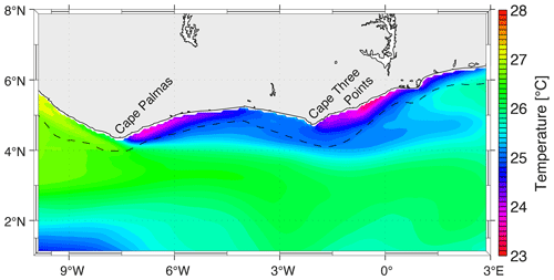 Figure: Example of a sea surface temperature forecast map. Colours represent SST values, while the colour bar converts colours into numerical temperatures. Strong gradients and coastal-offshore contrasts may indicate features such as fronts or upwelling zones. Source: Brandt et al. 2023 (https://doi.org/10.5194/os-19-581-2023).
When examining a map like this, ask yourself:
- What variable is being displayed?
- What units are used?
- What do the warm and cool colours represent?
- Where are the strongest gradients located?
- Are there clear coastal-offshore differences?
- What features appear scientifically important?
Interpretation example. Notice that some coastal regions may appear cooler than offshore waters. In many tropical and eastern-boundary coastal systems, this pattern can be associated with coastal upwelling, where colder subsurface water rises toward the surface. Even so, stay cautious: a single map alone cannot fully explain every environmental process or impact.
Understanding anomalies
An anomaly is the difference between the current condition and a reference average, or climatology. For example:
- Climatological SST = 26°C
- Observed SST = 28°C
- SST anomaly = +2°C
An anomaly therefore does not represent the actual value – it represents the departure from normal conditions. Positive anomalies indicate conditions warmer (or larger) than average; negative anomalies indicate cooler (or smaller) than average.
Common mistakes include confusing anomaly maps with absolute-value maps, assuming positive anomalies always indicate hazards, or ignoring the seasonal context. Whenever you interpret an anomaly, ask one question above all: compared to what? An anomaly only has meaning relative to a reference climatology or long-term average.
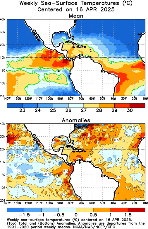 Figure: Comparison between actual SST and SST anomaly. The left panel shows the actual sea surface temperature distribution; the right panel shows SST anomalies relative to climatology. Warm SST does not necessarily imply positive anomalies, and cool SST does not necessarily imply negative anomalies. Source: NOAA Climate Prediction Center (https://www.cpc.ncep.noaa.gov/products/hurricane/atlsst_lastweek.html).
Reading this comparison, ask:
- Which panel shows actual temperatures?
- Which panel shows departures from normal conditions?
- Can a naturally warm region still have negative anomalies?
- Why is climatology important when interpreting anomalies?
- Which map is more useful for identifying unusual events?
Interpretation example. A tropical region may naturally have SST above 28°C and still be near-normal, if its climatological average is also close to 28°C. Conversely, a region with relatively cool absolute SST may still show positive anomalies if it is warmer than expected for that season or location. This is exactly why anomaly maps are so widely used in operational oceanography and climate monitoring.
Reading surface current maps
Surface current maps commonly use arrows, vectors, or streamlines to show ocean circulation. Typically, arrow direction indicates the direction of flow, while arrow length or colour indicates speed.
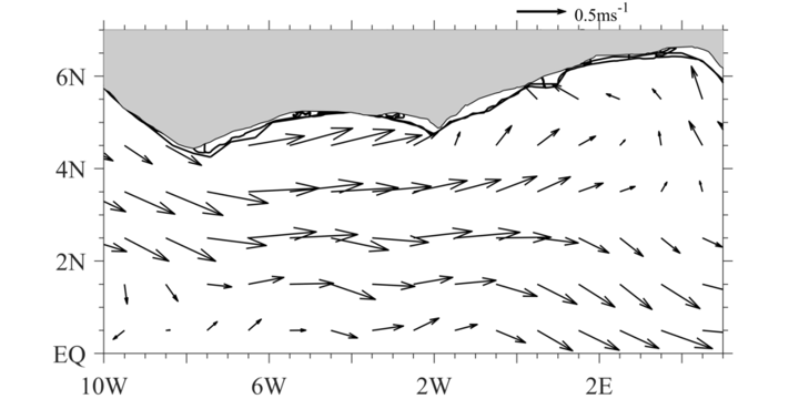
Figure: Example of a surface current vector map. Arrows indicate current direction, while arrow length often represents current speed. Surface current products are widely used for navigation, pollutant transport, search-and-rescue, and coastal monitoring.
When interpreting a current map, look for:
- regions of stronger currents,
- rotating features such as eddies,
- coastal jets,
- and transport pathways.
These matter because currents drive navigation, pollutant transport, oil-spill forecasting, larval transport, and search-and-rescue. One key principle: ocean currents evolve with time, so a single snapshot should not be assumed to represent long-term behaviour.
Reading a current map, ask:
- In which direction are the currents flowing?
- Where are the strongest currents located?
- Are there visible coastal currents or offshore transport features?
- Do any rotating features (eddies) appear?
- Which regions appear dynamically active?
Interpretation example. Some regions show stronger, more organised current structures than others. Coastal jets, eddies, and offshore transport pathways are often linked to wind forcing, coastline geometry, or large-scale circulation systems.
Bringing it together
Across all three – temperature maps, anomaly maps, and current maps – the same discipline applies: check the variable and units, read the colour bar and scale, look at whole patterns rather than single pixels, and remember that one map is a snapshot in time. Keep that discipline, and a forecast map becomes a readable story rather than a wall of colour.