Week 6 wrap-up: reading the forecast, and telling people what it means
You’ve reached the end of Week 6 – and with it, a skill that changes what a forecast is for you.
At the start of the week, an ocean forecast map might have looked like a colourful picture of the sea. Now you can read it: what the colours mean, what the arrows are telling you, what a bump in a time series signifies, what lies beneath the surface, and – crucially – how much to trust any of it. You’ve moved from receiving forecasts to genuinely interpreting them.
The journey of the week
Looking back, the week built up in a clear arc:
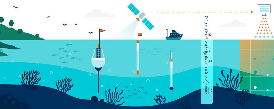
- You began with what ocean forecast outputs are – the pathway from observations and models to the products delivered to users, and the main product types: maps, time series, and vertical profiles
- You met the key ocean variables – sea surface temperature, sea surface height and anomalies, salinity, currents, winds, ocean colour, and significant wave height – and what each one physically represents
- You learned how to read forecast maps – colour shading, contours, vectors, projections, and the crucial difference between absolute values and anomalies
- You explored time series and vertical profiles – because maps show where, time series show when, and profiles show what happens below the surface
- You confronted variability, anomalies, and uncertainty – how the ocean changes naturally across timescales, why forecasts are never perfect, and how uncertainty grows with lead time
- And you finished with communicating forecast information – turning technical output into clear, trustworthy, actionable messages for the people who need them
The ideas to carry forward
If a few threads run through the whole week, they are these.
Every product answers a different question. A map, a time series, and a profile are not three views of the same thing – they answer where, when, and how deep. Knowing which one to reach for is half of forecast literacy.
Context makes a number meaningful. A temperature is just a number until you know what’s normal for that place and season. This is why anomalies matter: they tell you not what the ocean is, but how unusual it’s being.
A forecast without its uncertainty is only half the information. No forecast is perfect, and skill declines with lead time. Interpreting responsibly means holding the prediction and its limits together – and communicating both.
Interpretation isn’t finished until someone understands it. The final step of reading a forecast well is being able to say what it means, plainly, to a fisher, a port manager, or a coastal official. Clarity is not a nicety – it’s what makes the forecast usable at all.
Grounded in real decisions
Throughout the week, these skills connected to real users and real choices – marine safety, fisheries, coastal management, environmental monitoring, and climate services. Interpreting a forecast is never an academic exercise: someone is waiting to decide whether to sail, where to fish, or when to warn a community.
Why this matters for what comes next
This week bridges the science and the service. The earlier weeks built the systems that produce forecasts; this week taught you to read what they produce. Next, the course turns to the downstream end – how these interpreted forecasts become the products, services, and decisions that deliver real benefit to people and coasts.
Before you move on
You’ve reached the end of the week – so this is the place for any last thoughts.
Use the comments below to share:
- one thing that surprised you this week, or changed how you look at a forecast map
- one thing you’re still turning over – a question, or something you’d like to understand better
- or simply what you’ll take away from the week
It’s worth reading a few other comments too. Someone has often articulated exactly the thing you were half-thinking.