
Time Series Models

The graph above is an example of a time series. It is a series of data points in March 2020 showing the total number of people in the USA infected on each day.
Time series data for most countries in the world can be found on the website https://www.worldometers.info/coronavirus/country/us/. The data for the USA during March are tabulated below.
Table 8.1. Number of infected people in the USA 1st-30th March 2020 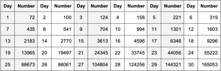
The value for 29th March is 144,321 and on 30st March is 165,053, an increase of 20,732. What do you think the number is for 31stMarch? Before reading on, make an estimate and write it down.
One way to model the time series is to say that the estimate for the next value is the current value plus the difference between the current value and the previous value. This can be written as:
Estimated Next Value = Current Value + (Current Value – Previous Value)
or
Estimated Next Value = 165,053 + 20,732 = 185,785
In fact the observed number for 31st March was 189,967 so our estimate is 4,182 infected people too low, or an error of about 2%. You might think that is quite good, but it’s only an estimate for the next day. What about making an estimate a week ahead, say for the 6th April. Before reading on, make you own estimate and write it down.
Modelling depends on making assumptions about the system being modelled. Here I am making the assumption that the future trajectory of the curve will be similar to the past. I have interpreted this as
Estimate for + 1 day = Current Value + (Current Value – Previous Value) x 1
which gave an error of about 2%. for + 1 day ahead. I propose to modify this model for + 7 days ahead to the following:
Estimate for + 7 days = Current Value + (Current Value – Previous Value) x 7
This could be called a linear extrapolation model. My estimate for 6th April is then 165,053 + 20,732 x 7 = 310,177. In fact the actual figure was 370,019, 59,842 higher. This is an error of about 17%. This is, of course, terrible.
Figure 8.1. Graphs of UK death between 1st March and 4th April 2020 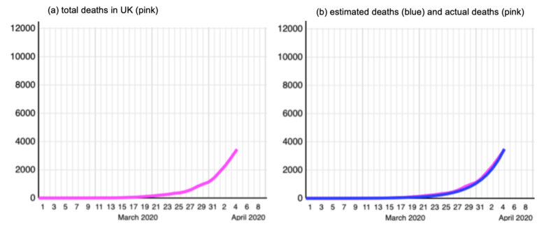
Of course the problem is that there is not a linear relationship between the values in most time series. Figure 8.1 shows the number of deaths in the UK. Figure 8.1(a) shows, towards the end of March the pink curve begins to increase rapidly. This behaviour is often described colloquially as exponential. Exponential functions get very big very fast. For example 101 = 10, 102 = 100, 103 = 1,000, 104 = 10,000, 105 = 100,000 and 106 = 1,000,000. In six steps this function goes from ten to a million. In three more steps it’s a billion, and in three more it’s a trillion.
This time the modelling assumption is that there is an exponential relationship between the number of days and the number of deaths. I found a model that fitted the pink data very well. It is estimated deaths = 10 (number of days – 1) x 0.104 but the mathematical details don’t matter here.
This is plotted in blue in Figure 8.1(b). As you can see the blue curve is a very good approximation to the pink curve and fits the data very well. Do you agree?
According to the exponential model, the number of deaths on 9th April is estimated to be 1039 x 0.104 = 11,376. This is much higher than the observed number, which is 6,159. Another terrible estimate!
Figure 8.2 Divergence between the exponential model and the data 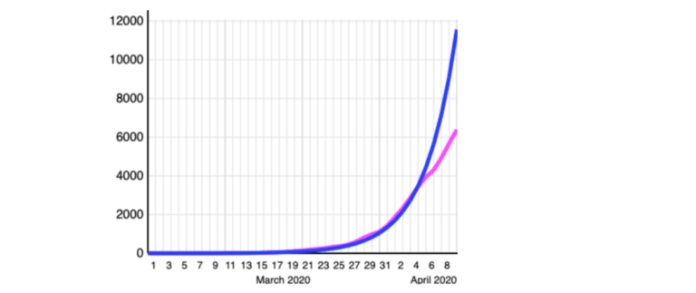
As Figure 8.2 shows the blue exponential curve keep rising very fast, but the data have stopped having this exponential relationship and straightened out to a more linear relationship.
From this it must be concluded that the exponential extrapolation model is not appropriate for these data – I was using a model with inappropriate assumptions.
What do you think?
If you never worked with models before did this step enable you to understand them better? Do you agree that models and modelling are essential for making policy, but care is required? Do the examples illustrate how making incorrect assumptions can lead to very poor forecasts? Do you have your own ideas on how the COVID-19 epidemic could be modelled?
COVID-19: Pandemics, Modelling, and Policy


Reach your personal and professional goals
Unlock access to hundreds of expert online courses and degrees from top universities and educators to gain accredited qualifications and professional CV-building certificates.
Join over 18 million learners to launch, switch or build upon your career, all at your own pace, across a wide range of topic areas.


