User needs – doing the hard work to make it simple
User needs are shaped by user behaviours and contexts, and there are many different factors that must be understood. This means that we need to understand the complexity of how users think, feel, and act in all different contexts and situations.
In our introductory course, we learned about the Government Design Principles.
Principle 4 is do the hard work to make it simple:
“Making something look simple is easy. Making something simple to use is much harder – especially when the underlying systems are complex – but that’s what we should be doing. Do not take “it’s always been that way” for an answer. It’s usually more and harder work to make things simple, but it’s the right thing to do.”
Following this principle, we aim to make things as straightforward, intuitive and easy to use as we can. In order to make sure people can do what they need to do, we need to make it as simple as possible for that to happen.
However, this takes hard work to achieve. Even though we aim for simplicity, if teams fail to design something that takes the wide range and complexity of our users’ needs into account, the end result might not actually meet them.
The balance between simple and complicated
Simple, easy-to-use products and services are the goal. However, simplicity that is not carefully considered can create unexpected barriers and cause problems for users. Simplicity is subjective, which means that it means different things to different people.
For user researchers and service teams, there is a big question to answer – how do we make something simple while ensuring that it works for everyone and meets their needs?
Let’s use Tax your vehicle to explore this.
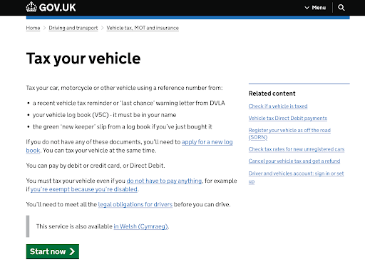
This is the first page of the ‘Tax your vehicle’ service on GOV.UK (accessed using a laptop computer). Like other government service webpages, it is designed to be as clear and easy-to-use as possible, following the Design Principles and the rules laid out in our Service Standard and content design guidelines.
To create this page, the team had to balance simplicity and user-friendliness with ensuring that users have access to all the information they require to use this service.
Someone might argue that there is a lot of information on screen here – it contains several links to different pages, and not all of them will be relevant to every user. They might argue that it would be simpler to have the “Start now” button and nothing else on screen, with all the other links or information included later at a different point in the process.
Would this actually make things easier for users?
Simple pages that do not have a lot of information on screen might seem like a good idea, but what if the user needs help and there is no additional guidance? If users do not know where to find the information they need, they will not be able to complete the process.
Similarly, services need to ensure that everyone can use the service for whatever task they need to use it for. Even though not every link on the screen will always be relevant to every user (for example, not every user will need information about disabilities or need to register their vehicle as off the road) these links will always be relevant to some users, so they must be included.
Another important aspect of simplicity is compatibility, or optimising the function of a service when it is accessed using different types of technology.
For example, a website might look great on a computer, but if it is not optimised for mobile devices then even a simple layout can cause additional problems. It can cause frustration, and make the process difficult if the user is having to zoom in and out or scroll around to find things on the page.
Simple services must also always be designed with accessibility in mind.
For example, a webpage might contain guidance in the form of text on an image. It might look clear and easy to read, but if the image does not have suitably descriptive alternative text (or alt text), then a user who interacts with webpages using a screenreader will not have access to this information. For this reason, user research must always include people with disabilities. These are all principles of inclusive design.
We will learn more about accessibility and inclusive research in Week 3.
Keep it simple, but always think about user needs
Simplicity is good. Simple designs make it easy for the user to interact with your service and complete the tasks they need to do.
However, if they are too simple, they might not actually work for users. Simple services still need to be well-designed, providing support and guidance where necessary, and helping users complete their tasks with confidence.
You must always think about the needs of all users and ensure that no one is unable to use your service because of the way it is designed. Something you might think is a nice feature may not work for a disabled person using assistive technology or a user trying to access your service on a smartphone instead of a computer.
The only way to understand these barriers is through thorough and consistent user research, ensuring that your team is fully aware of your users and their needs.
Good service design solves real problems. The goal is always to help your users – simple is best when it helps people do what they need.
Task
Think about a service that felt simple and easy to use and try to answer these questions:
- what made it feel simple?
- do you think it would feel the same for someone with different needs or circumstances?
In the comments below, share your thoughts and reflections on why this service worked well and why.
You do not need to share any personal details if you do not want to, but, if you feel comfortable, sharing your experiences can help us to consider how different perspectives shape our understanding of simplicity.
User Research in Government: Developing Further

User Research in Government: Developing Further