Skip main navigation

New offer! Get 30% off one whole year of Unlimited learning. Subscribe for just £249.99 £174.99. New subscribers only T&Cs apply

Find out more

Line, shape, and silhouette

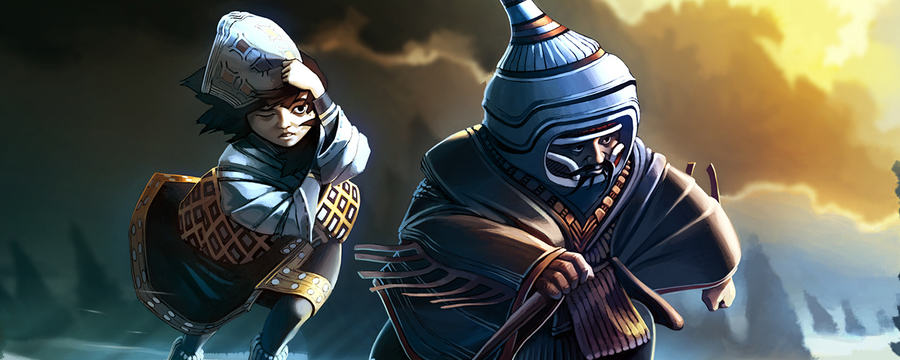
We discuss the visual design of characters using line, shape and silhouette
6.1
In the next few videos, we’ll consider the visual principles that can be used to describe a game character. Now, to stress, these are principles rather than hard and fast rules. Or there could be connotations associated with particular visual elements. These are all subject to interpretation, and conventions can be broken, downplayed, or modulated by context. As such, it’s crucial that visual principles are considered critically. There are no definitive meanings behind the colour red or the use of triangles, for instance. Our understanding of common visual associations and appreciation of the subtlety of human perception can inform our critical interpretation of a character. So let’s consider the most basic visual element, the line.
49.3
This is less well discussed in the character design literature, but it is fundamental to analysis. The line is not only responsible for outlining shapes within a character, but also for leading the eye, making connections between and intersections with shapes, and communicate movement in direction. Consider how the following attributes can define the visual appearance of a character. Firstly, line thickness. Technically, lines are one dimensional and are therefore infinitely thin. In order to perceive them, however, some thickness must be shown. How to perceive thickness is based on the ratio between width and length. This thickness of a line can have an effect on the impression it creates. A thin line has less impact than a bold line, for instance. Next, line orientation.
98.3
The angle at which a line is orientated in relation to the rest of the design can affect the perception of a character’s appearance. Lines that are horizontal suggest restfulness and steadiness. Conceptually, they are parallel to the ground. Next, line position. It’s important to think about how lines are positioned. Lines can be positioned to create outlines or positioned to surrounding and therefore group several elements together, and they’ll use a line position as to make visual connections between elements, which can, in turn, infer metaphorical connections. For instance, lines might be used to link to or more elements together, to intersect or divide elements, or to support elements.
141.7
Finally, it’s important as discuss line type. So lines are not always straight. While straight lines can complement uniform thickness and horizontal vertical orientation to reinforce notions of strength and consistency, curved lines can instead connote dynamism and energy and nature. Deep curves can be used to emphasise playfulness and joy, whereas shallower curves can give an impression of softness, gentleness, sensuality, or femininity. In an analysis of a line within the visual appearance of the character, it’s important to be sensitive to both the explicit and implicit use of line. In both instances, they’re both criteria that can aid interpretation of how line is used to communicate the nature or personality of a character.
186.3
The characters of Super Meat Boy are outlined in bold, ragged lines that vary in thickness and that lack precision. The use of line emphasises the connection to alternative cartoons and a 1980s gaming aesthetic, reflect the wacky humour of the game, and also makes a connection to the indie development of the game itself. The use of line in design of GLaDOS in Portal 2, by contrast, is less explicit. Here, a combination of straight, diagonal lines and subtle curves are used throughout, flowing from top to bottom, but in an erratic and unstructured manner. Implied lines serve a functional purpose, leading the eye to the character’s face, which could easily be lost in the scene, given that it contains few familiar features.
231.8
More than this, though, the lines within GLaDOS’s design reflect her part feminine, part machine nature, and the erratic line placement reflects her madness, menace, and despotism. Progressing from line, the next visual element that can be examined within character design is shape. The most common shapes discussed in the literature are the circle, the triangle, and the square, the primary shapes. These are the simpler shapes the observers can reduce an image down to. Making sense of complex scenes with simplification to base elements is an important aspect of perception and cognition. These basic shapes do not need to conform to a geometric ideal, i.e., the perfect circle, equilateral triangle or square, but instead can be loosely interpreted by their definitions.
280.3
So any rounded shape defined by continuous, integrated curve may be considered a circle, and associated with common connotations. It’s connotations have a tendency to focus on two broad categories, youth, and goodness. Triangular shapes can offer quite different interpretations, depending on their usage. Triangles that are orientated to point towards the sky, can communicate stability, rest, and strength. Whilst triangles that point towards the ground suggest precarious balance, instability, and tension. Finally, squares and rectangles are considered to be the strongest and most stable shapes. As well as connoting ideas such as strength and stability, square shapes can be associated with masculinity, security, orthodoxy, rationality, and purity.
328.6
In considering shape within character design, is imperative to be open to both explicit use of shape as well as implied shapes. Normally, primary shapes are not used wholesale in character design. Character such as Pac Man and Dizzy are effectively circular in nature, but this was an outcome of technical limitations in the 1980s rather than intentional visual design. Visual analysis should account for identification and critique of both the clear use of primary shapes in a character design as well as the less obvious use of shapes. Consider the characters in the image on this slide, for example.
363.9
These character designs make use of implied squares, circles, and triangles to generate not only distinctive character appearances, but also connotations of character type and personality. Beyond line and shape, we can consider that the overall spatial appearance of a character can be analysed by looking at its silhouette. This is a key technique used by characters designers in an important stage of the design process. By removing all or most internal details and discounting colour, silhouettes are used to ensure the complete outline of a character can be clearly recognised from a range of angles and in different poses.
401.2
Examining characters through silhouette can enhance analysis of both line and shape, so as well as being a vital design tool and the production of the character, it can also be used to aid visual deconstruction. In addition to line and shape criteria, however, there are other factors that can be considered when analysing a character silhouette. So firstly, recognizability. This is actually the most important aspect of the silhouette, and it depends on this on whether or not the character is distinctive. This works on two levels that can be considered in the visual analysis of a character. The first level is the purely aesthetic response. Is the character sufficiently distinctive, interesting, and pleasing to look at?
444.8
In an ideal situation, all characters will generate this response. Typically, you’d expect the prominent characters to receive the most iteration and refinement. Consider this silhouette shown here. I’m sure you’ve already figured out who this is. Next, you have hierarchy. Visual hierarchy extends the notion of the recognizability of a character by paying particular attention to how visual elements are used to infer the importance of particular characters in relation to other characters, or to reflect the relationships between characters. In graphic design, visual hierarchy is primarily about making information easier to understand by providing visual cues. For instance, through the use of size and shape.
486.3
When we take these theory forward into character design, we can consider how a cast of characters can be made easier to understand through explicit use of visual design elements evident in the silhouettes.
499.3
Beyond the practical implications of the silhouette, analysis should also consider the functionality of a design in terms of whether the character’s silhouette appears logical or illogical within the game world. For instance, the clothing, armour, and equipment that characters wears can suggest a lack of manoeuvrability, or even inability to stand or move appropriately.
522.9
Building on an interpretation of the use of line and primary shapes within a character, the overall silhouette can be analysed to determine whether it acts as a metaphor. In its broadest sense, we can look at the complete outline of the character, determine whether it makes a connection with a recognisable form from nature, a work of art, or a cultural icon.
544.8
Finally, and of particular importance to game characters, is the notion of dynamism. By definition, game characters are interactive and have the potential to be modulated by player action. As a consequence of this, there’s a strong likelihood that a game character, particularly a playable character, observed from a third person camera, will have a silhouette that changes based on player action. Consider how the silhouette of a character shifts within the context of player interaction and the game narrative. Character may go through a story arc that suggests a change in their worldview or their belief system. How does the visual design adapt to reflect this change?
584
Similarly, their character may experience physical changes, both short and long term, that can be reflected in this silhouette. For example, consider how a character’s silhouette can be modified to mirror a severe depletion in health, or how build up of physical strength or skill over the course of the game can be reinforced with complimentary changes in silhouette design.
608.1
In summary, in this video we have discussed the importance of the basic visual elements of a game character’s design, the use of line, shape, and silhouette. Line and shape help us to break down individual design formally, and understand what connotations may be inferred by the character’s appearance. The silhouette builds on line and shape to create an overall impression of a character, which is used to aid recognizability, to reflect personality, to create contrast or continuity, and to convey potentially complex ideas.

To begin our discussion of visual design, we will first consider how line, shape, and silhouette can be used to help communicate a character’s personality to players.

This article is from the free online

Video Game Design and Development: Video Game Character Design

Created by
FutureLearn - Learning For Life

Reach your personal and professional goals

Unlock access to hundreds of expert online courses and degrees from top universities and educators to gain accredited qualifications and professional CV-building certificates.

Join over 18 million learners to launch, switch or build upon your career, all at your own pace, across a wide range of topic areas.

Start Learning now