
Making data visualisations in RStudio
Making data visualisations in RStudio.
Data Visualisation with ggplot2
Introduction
Let’s load our data set of interest, install and load all the packages we need, and start making data visualizations in RStudio.
Good practice
A good practice is to load the packages you need before starting your analysis. It is also recommended to write the packages you need in the script you prepare for a project. This is a list of convenient packages to use with ggplot2
> library(ggplot2)
> library(RColorBrewer)
> install.packages("viridis")
> library(viridis)
Note. Another widely used package in data science is called tidyverse, and is a collection of packages including ggplot2, dplyr and many other helpful resources. It can be worth trying to use it on your own after this course.
Setting your working directory in RStudio
Step 1. We recommend you to work in the Project folder Project_Test that we created previously, either by clicking directly on the Project_Test or using the following command
> setwd("/Users/imac/Desktop/exerciseR/Project_Test")
> getwd()
[1] "/Users/imac/Desktop/exerciseR/Project_Test"
Step 2. As a reminder, you can create a specific script file to write your commands and related comments.
Setting your data
Step 1. Import or load the iris dataset we want you to work on in RStudio. All options are identically accessed in R, but the two final options are particular to RStudio.
-
- From your computer, if you placed the iris dataset file in your working directory
> Iris <- read.table("iris.txt")
-
- From your computer, if the iris dataset file is in the parent folder exerciseR
> Iris <- read.table("/Users/imac/Desktop/exerciseR/iris.txt")
-
- From the available data sets in R
> data(iris)
-
-
From the “Import Dataset” tab in the Environment, by selecting the correct file with its type and parent folder.
-
From the “Import Dataset” tab in the Environment, by selecting the correct file with its type and parent folder.
-
-
From the File menu, by choosing the “Import Dataset” option.
-
From the File menu, by choosing the “Import Dataset” option.
Note 1. Be careful to choose the “iris” dataset as “Iris” would here correspond to the same data set but with changes that could impede the rest of the commands.
Note 2. As other functions in R, the “read.table()” function has different options that you can view in the following link, which also shows you other functions used to import data from other file formats (for example with the “read.csv()” function to read “.csv” files). https://www.rdocumentation.org/packages/utils/versions/3.6.2/topics/read.table.
Step 2. You can also display and work on specific data chosen from the iris data set
> iris_length <- iris %>% select(Sepal.Length, Petal.Length)
> head(iris_length)
 Sepal.Length Petal.Length
1 5.1 1.4
2 4.9 1.4
3 4.7 1.3
4 4.6 1.5
5 5.0 1.4
6 5.4 1.7
Setting Aesthetics and Geometries
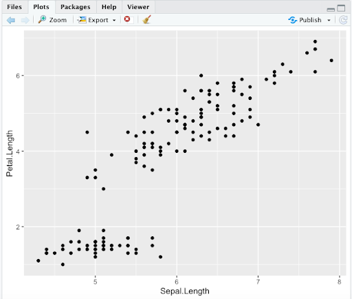
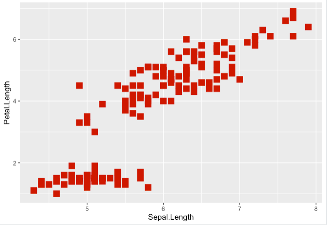
Step 1. Let’s use basic layers to plot Petal.Length vs. Sepal.Length. With ggplot2, “aes()” specifies aesthetics for x and y-axis, and “geom_point()” generates a scatterplot
> ggplot(data = iris,aes(x = Sepal.Length, y = Petal.Length)) +
geom_point()
Note 1. Here is an example of how you should see the output in your “Plots” area in RStudio. Note that you have the possibility to save your plot using the “Export” button, with options related to file formats. Other R options we saw for saving plots remain possible.
Note 2. We will not show the whole area again, but remember that the plots you generate will appear here.
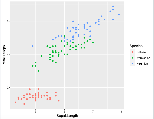
Step 2. Using the same previous plot options, let’s color the points according to the Species
> ggplot(data = iris, aes(x = Sepal.Length, y = Petal.Length, color = Species)) + geom_point()
Step 3. There are other possible shorter ways for generating this same output
> ggplot(iris, aes(Sepal.Length, Petal.Length, color = Species)) +
geom_point()
Note. However, for the sake of clarity, we will mainly keep the full details such when using data, x and y to ease the understanding
Step 4. It is possible to create a variable with your base aesthetics and then simply call it to apply other layers. The following will create the same output as the previous graph
> key <- ggplot(data = iris, aes(x = Sepal.Length, y = Petal.Length, ,
color = Species))
> key + geom_point()
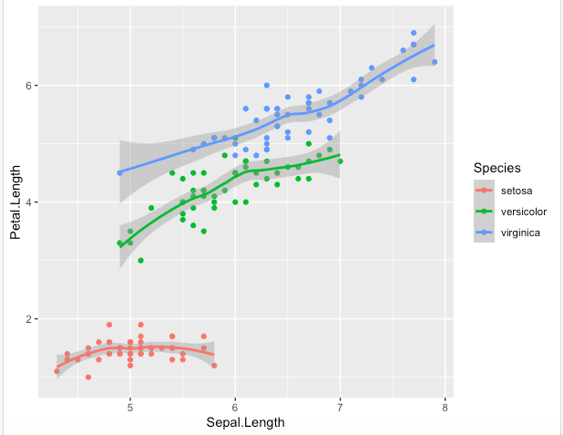
Step 5. Different geometries can also be used to complement each other. Here “geom_smooth()” adds a trend line and area to the points
> key + geom_point() + geom_smooth()
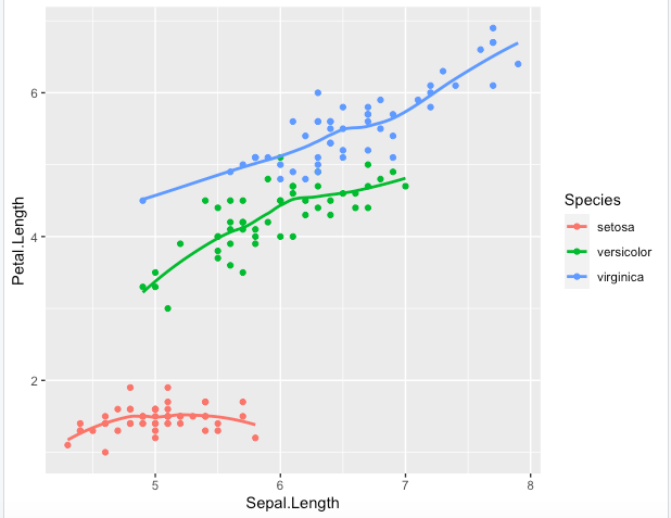
Step 6. You should have noticed how geometries are here added with default options. Each has a set of options, such as removing the trend area in the following with se=FALSE
> key + geom_point() + geom_smooth(se=FALSE)
Step 7. You can easily change the points size, shape and colour from “geom_point()” options, but see how it affects the display: if you force one colour, you will not have any more colors by Species, even if they are required in the key variable
> key + geom_point(size=4, shape=15, color="red3")
Step 8. Or the size, shape and color as dependent now on Sepal.Length values from aes
> ggplot(data = iris, aes(x = Sepal.Length, y = Petal.Length,
color = Sepal.Length, size = Sepal.Length)) + geom_point()
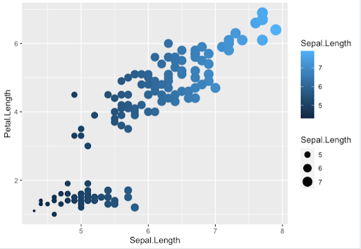
Note. We used here the default ggplot2 colors, but we will see later on how to use other color palettes
Other Functions and Plots
Step 1. Remember that we are only covering here the “ggplot()” usage, but other possibilities exist to generate the same output as in Step 6 of this Article, such as “qplot()” which is used to generate quick plots with ggplot2
> qplot(Sepal.Length, Petal.Length, data = iris, color =
factor(Species)) +
geom_point() +
geom_smooth(se=FALSE)
Step 2. Generating different plots will require different geometries
-
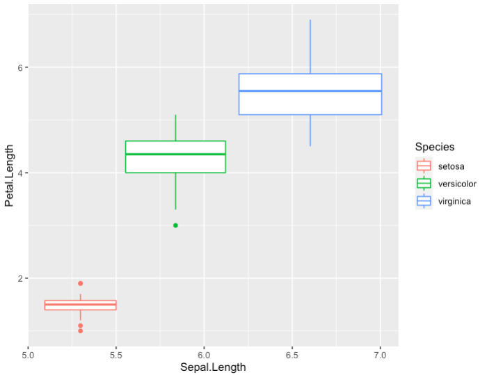
- Boxplot with default options
> ggplot(data = iris, aes(x = Sepal.Length, y = Petal.Length,
color = Species)) + geom_boxplot()
-
- Bar plot with default options
> ggplot(data=Iris,aes(x=Sepal.Length)) + geom_bar()
-
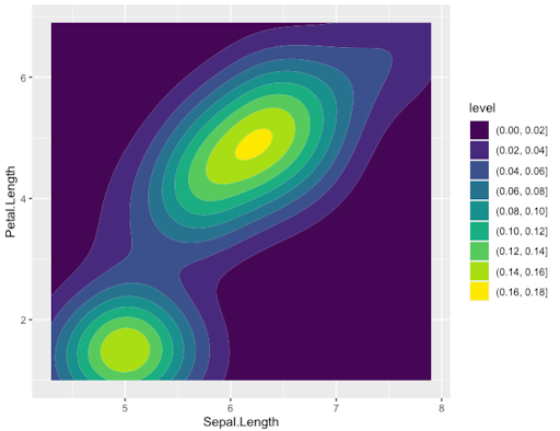
- Or more complex ones even with default options such as Density plot
> ggplot(data=Iris,aes(x=Sepal.Length, y = Petal.Length)) +
geom_density_2d_filled()
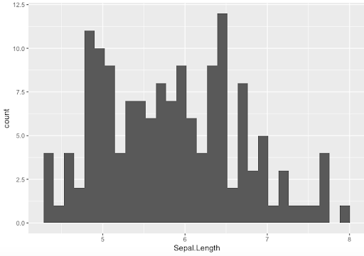
Step 3. An important thing to remember is that each plotting functions comes with its own set of option, that might not work for other functions. Let’s see how to generate and modify histograms
-
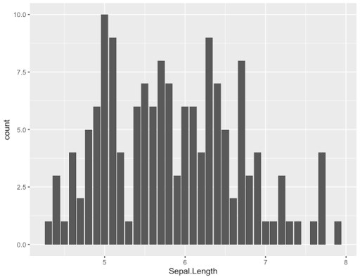
- Default options
> ggplot(data=Iris,aes(x=Sepal.Length)) + geom_histogram()
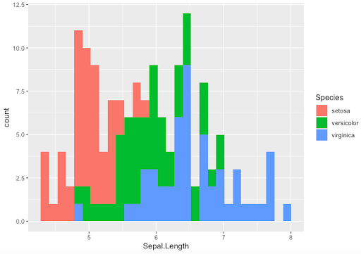
-
- Filling histogram colurs by Species. Note how calling the colour option is different here
> ggplot(data=Iris, aes(x=Sepal.Length,fill=Species)) +
geom_histogram()
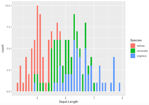
-
- Use binwidth option with histograms
> ggplot(data=Iris,aes(x=Sepal.Length,fill=Species)) +
geom_histogram(binwidth = 0.05)
Note. A wide range of different plots can be generated with ggplot2 such as Bar plots, Boxplots, Violin Plots, Density Plots, Area Charts, Correlograms…and many many more !
Bioinformatics for Biologists: An Introduction to Linux, Bash Scripting, and R


Bioinformatics for Biologists: An Introduction to Linux, Bash Scripting, and R
Reach your personal and professional goals
Unlock access to hundreds of expert online courses and degrees from top universities and educators to gain accredited qualifications and professional CV-building certificates.
Join over 18 million learners to launch, switch or build upon your career, all at your own pace, across a wide range of topic areas.


