Skip main navigation

Why do many find the surveillance map of Nigeria hard to believe?

In this article, you are invited to apply the knowledge you have gained so far by analyzing a map of polio surveillance data (Step 2.4).
© Copyright @ 2020 Johns Hopkins University. Except where otherwise noted, this work is licensed under a Creative Commons Attribution-NonCommercial-ShareAlike 4.0 license.

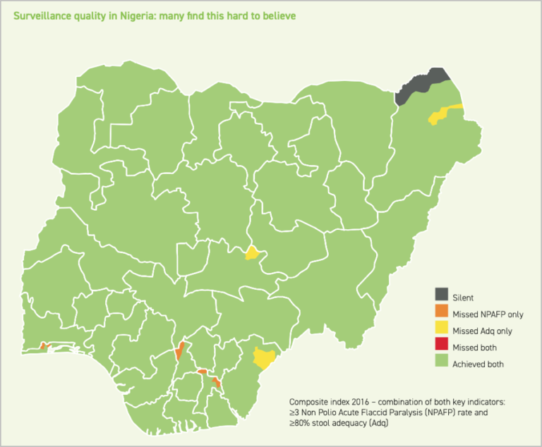
Review the map used in the lecture:

A map of Nigeria shows that the vast majority of the regions have achieved both surveillance objectives. Three regions missed Adq, and four missed NPAFP. None missed both, and only one was silent Image source: Global Polio Eradication Initiative (GPEI)

The Independent Monitoring Board for polio eradication showed this map of surveillance quality in Nigeria with the caption, “Many find this hard to believe.” 

Why? What do you think is going on here?

© Copyright @ 2020 Johns Hopkins University. Except where otherwise noted, this work is licensed under a Creative Commons Attribution-NonCommercial-ShareAlike 4.0 license.
This article is from the free online

Collecting and Using Data for Disease Control and Global Health Decision-Making
Created by
FutureLearn - Learning For Life

Reach your personal and professional goals

Unlock access to hundreds of expert online courses and degrees from top universities and educators to gain accredited qualifications and professional CV-building certificates.

Join over 18 million learners to launch, switch or build upon your career, all at your own pace, across a wide range of topic areas.

Start Learning now