Home / Business & Management / Big Data & Analytics / Collecting and Using Data for Disease Control and Global Health Decision-Making / Analyzing Surveillance data of Polio Cases in Pakistan and Afghanistan

Analyzing Surveillance data of Polio Cases in Pakistan and Afghanistan
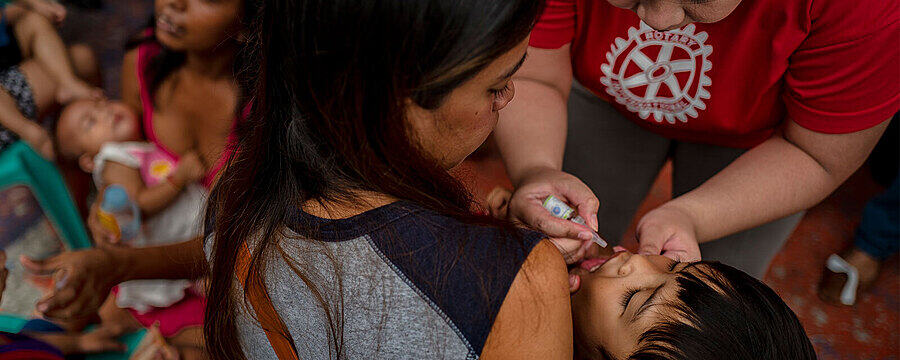
In this article, you are invited to try out analyzing some data before watching the lecture where the data is analyzed in greater depth (Step 3.3).
© Copyright @ 2020 Johns Hopkins University. Except where otherwise noted, this work is licensed under a Creative Commons Attribution-NonCommercial-ShareAlike 4.0 license.
Part 1: Above you can see a map used by polio eradicators showing recent polio cases in Pakistan and Afghanistan. You can also view the map here. Consider the distributions of people on the map. Each person represents a polio case.
- What does this map of cases tell you?
- What kinds of decisions could you make based on this information?
Part 2: Now, take a look at the right side of this map. Each different color represents polio cases that are closely related to each other.
- What does this tell you about polio transmission?
- What kinds of decisions would you make based on this information?
- What new information does this environmental surveillance give you that you couldn’t have gotten otherwise?
© Copyright @ 2020 Johns Hopkins University. Except where otherwise noted, this work is licensed under a Creative Commons Attribution-NonCommercial-ShareAlike 4.0 license.
This article is from the online course:
Collecting and Using Data for Disease Control and Global Health Decision-Making
Created by

This article is from the free online
Collecting and Using Data for Disease Control and Global Health Decision-Making
Reach your personal and professional goals
Unlock access to hundreds of expert online courses and degrees from top universities and educators to gain accredited qualifications and professional CV-building certificates.
Join over 18 million learners to launch, switch or build upon your career, all at your own pace, across a wide range of topic areas.


