
Linking Plots Together
Plots can be linked together to provide a wholesome experience. In cases where we have to compare plots, we can show multiple plots together in rows or columns to make comparison easy.
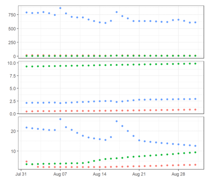
Consider this example: When showing different facets of the same data across different plots, linking plots together can help by using the same range for each of their axes.
To link the plots, begin with a normal figure and then reference the linked figure ranges from the original to achieve multiple plots together.
In this step, we will link different plots together with the help of demonstration on Jupyter Notebook using Bokeh. We will use three figures for this demonstration.
Demonstration: Linking Plots Together
Step 1
Link the axes. The first two axes will have their x-axes linked, so panning one will update the x-axis of the other. The second two will be linked on y-axes, so panning one updates the y-axis of the other.
Code:
x = [1, 2, 3, 4]
y0 = [10, 8, 6, 2]
y1 = [2, 9, 4, 7]
y2 = [3, 6, 1, 5]

scatter_plot = figure(plot_width=figure_width, plot_height=figure_height)
scatter_plot.scatter(x, y0, color="red")
Step 2
Next, the second figure will be linked on the x-axis only. We supply the x_range keyword argument when creating the figure, passing in the first plot’s x_range attribute.
Code:
line_plot = figure(plot_width=figure_width, plot_height=figure_height, x_range=scatter_plot.x_range)
line_plot.line(x, y0, color="blue")
Step 3
Finally the third figure will link on the y-axis by sharing the y_range with the second figure:
Code:
circle_plot = figure(plot_width=figure_width, plot_height=figure_height, y_range=line_plot.y_range)
circle_plot.circle(x, y2, color="green", size=20)
Step 4
Now, plot the figures in a row.
Code:
show(row(scatter_plot, line_plot, circle_plot))
Output:

Learn more about linking multiple plots by reading the following:
Read: Linking plots [1]
What do You Observe?
Looking at the outputs, what do you think of the plot now? Is it much easier to understand the comparison among the three figures? Would you still prefer these plots shown as separate figures?
References
- Linking Behavior [Document]. Bokeh; [date unknown]. Available from: https://docs.bokeh.org/en/latest/docs/user_guide/interaction/linking.html
Data Visualisation with Python: Bokeh and Advanced Layouts


Data Visualisation with Python: Bokeh and Advanced Layouts
Reach your personal and professional goals
Unlock access to hundreds of expert online courses and degrees from top universities and educators to gain accredited qualifications and professional CV-building certificates.
Join over 18 million learners to launch, switch or build upon your career, all at your own pace, across a wide range of topic areas.


