
Introduction to healthcare system mapping
Let’s begin this week by introducing you to the concept of system mapping in healthcare.
A system map is a visual presentation and illustration of the major components, boundaries and environmental elements within a system and the relationships between them. This could be in the form of a list of components/elements or (preferably) a graphical representation.
System map components/elements include actors, processes, challenges, stakeholders, the general public, feedback loops and interactions.
Stakeholder mapping also tends to occur as part of a systems-mapping process because stakeholders are part of a system, contribute to it and are part of the feedback loop. They also cause and direct change and are impacted by changes and feedback within the system.
Healthcare mapping examples
The diagram below maps out the financial flow and service provision of the UK’s healthcare system:

Gareth (2017) – click on the image to expand size.
It’s also worth looking at a series of diagrams explaining how the NHS is structured in relation to how providers are regulated and commissioned, and how the money flows here.
The second diagram maps out the structure of the NHS in England:
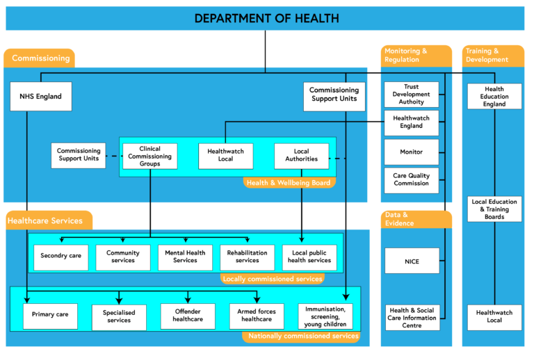
NHS England (2014) – click on the image to expand size.
However, notice the links in this diagram are mostly linear (more like a traditional organisational chart). Therefore, this is provided just as a representation of the structure of the NHS without showing much of the complex dynamics and interactions with components and actors within the system – something we’ll look at in more detail in the coming steps.
Watch the following video to learn more about how the NHS in England works (transcript is available on this webpage).
This is an additional video, hosted on YouTube.
Your task
Having looked at the various maps of the UK healthcare system, discuss how this compares to your own country’s healthcare system (if you reside outside the UK).If you are UK based, share your experience of your local healthcare system.
References
Gareth, I. (2017) NHS in 2017: The Long Arm of Government [online] available from https://www.bmj.com/content/356/bmj.j41.abstract [22 April 2020]
NHS England (2014) Understanding the New NHS [online] available from https://webarchive.nationalarchives.gov.uk/20170504162917/https://www.england.nhs.uk/wp-content/uploads/2014/06/simple-nhs-guide.pdf [22 April 2020]
Understanding Systems Thinking in Healthcare


Understanding Systems Thinking in Healthcare
Reach your personal and professional goals
Unlock access to hundreds of expert online courses and degrees from top universities and educators to gain accredited qualifications and professional CV-building certificates.
Join over 18 million learners to launch, switch or build upon your career, all at your own pace, across a wide range of topic areas.


