
Introduction to line plots
So far, you have been learning exclusively about scatter plots. However, of course, Seaborn also supports other types of plots. Let us investigate how Seaborn makes your life easy with line plots in this step as well.
Line plots using Seaborn
If you remember, line plots are presented when you want to show continuous trends over a given period of time or equal intervals. Typically, we use line plots when we have a smaller set of values to display.
For depicting a line plot in Seaborn, we will be using the lineplot() function. Do note that, similar to scatter plots, the lineplot() function also takes its arguments as keywords.
Some of the common arguments are as follows:
-
data: the Pandas DataFrame that you want to plot. -
x: the name of the column in the DataFrame to source x-values from. -
y: the name of the column in the DataFrame to source y-values from.
That’s all that’s required to draw a line plot for now. However, we will introduce you to other arguments as and when we use them.
Line versus scatter plots
As a rule of thumb, we must use a line chart when the data has categorical data or variables such as age group or sex that is limited or usually fixed in number. On the other hand, we use scatter plots for numerical variables such as scientific or statistical data.
Here are some more points of difference between both the plots:
| Scatter plot: | Line plot: |
| plots large sets of both numerical and categorical values | plots a small set of categorical values |
| expresses the outliers and trends as a distribution | expresses a time series trend connecting with a line |
| compares for understanding a correlation among the variables | compares drastic changes in the trend among the variables |
Demonstration
Let us use a data set of number passengers taking flights in the years 1949 to 1960. Each row of data contains the number of passengers in that month.
Follow the steps below and create your line plots:
Step 1
First things first, import the Pandas and Seaborn libraries if you haven’t already done that. Next, read the flight.csv file extracted from the zipped folder previously to load the data. (You can adjust the size as per the requirement of your plot.)
sns.set(rc={'figure.figsize':(10,8)}) # make the Figure a bit smaller
flights = pd.read_csv("flights.csv")
flights.head()
Step 2
Let’s draw a line plot from this data, with the year on the x-axis and the number of passengers on the y-axis.
Code:
sns.lineplot(data=flights, x="year", y="passengers")
Output:

You probably notice straight away that it has not only drawn a line, but also shaded areas around it.
Why is this? Because we have multiple values for the number of passengers for each year – one value for each month. Seaborn will therefore aggregate the lines as the mean of the values and the shaded area as the 95% confidence interval. The line we’re actually seeing is the mean number of passengers per month.
Step 3
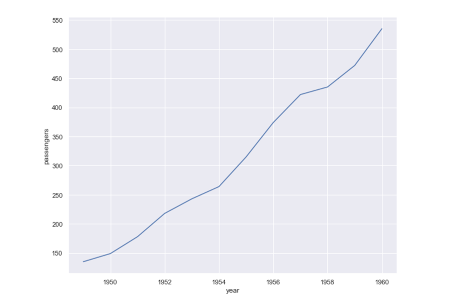
These shaded areas will not be shown when drawing data where there is only one y-value for an x-value. For example, if we first filter the data so we only have the month of June in the DataFrame, we will just get a line with no shading.
Code:
june = flights[flights.month == "June"]
sns.lineplot(
 data=june,
 x="year",
 y="passengers"
)
Output:
We’ve seen how, by default, the relplot function will draw scatter plots. But, it can also draw line plots. If we set its keyword argument kind to "line", we will get line plots drawn instead.
Step 4
Here’s how to draw our data as a line plot with each month at a different column, using the relplot function. We also pass in col_wrap=3, which means we’ll have a maximum of three columns and then a new row will start. Note that this is different from setting row=variable, as that would put a new data series on each row; it’s a layout option only.
Code:
sns.relplot(
 data=flights,
 x="year",
 y="passengers",
 col="month",
 kind="line",
 col_wrap=3
)
Output:

We could also take advantage of the row and col arguments to relplot if we had another dimension we wanted to compare to.
For the full lineplot documentation, click on the link given below and familiarise yourself with some more arguments and features.
Read: Line Plot documentation [1]
References
- Seaborn.lineplot [Document]. Seaborn.pydata; [date unknown]. Available from: https://seaborn.pydata.org/generated/seaborn.lineplot.html
Data Visualisation with Python: Seaborn and Scatter Plots


Data Visualisation with Python: Seaborn and Scatter Plots
Reach your personal and professional goals
Unlock access to hundreds of expert online courses and degrees from top universities and educators to gain accredited qualifications and professional CV-building certificates.
Join over 18 million learners to launch, switch or build upon your career, all at your own pace, across a wide range of topic areas.


