
Working out yields to profit
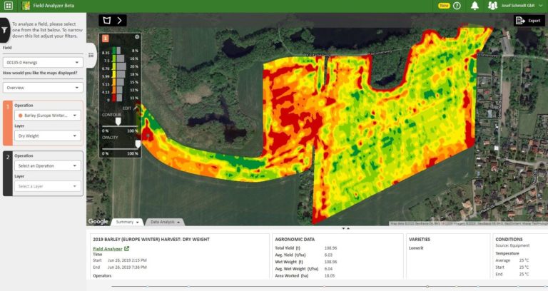
As you saw in the previous Step, yield maps can be created to show the heterogeneity in production across a field using various tools. Here we’ll use some example screenshots from the John Deere ‘Field Analyzer’ tool to help you become familiar with yield map outputs and how to interpret them. In the example below, the high yielding areas of the field are shown in green whereas the low yielding areas are shown in red (the scale bar is on the left of the map).
Whole field yield map for winter barley (2019) (agronomic data table shows the Average Yield of the whole field was 6.03 t/ha). ©John Deere. Click to expand.
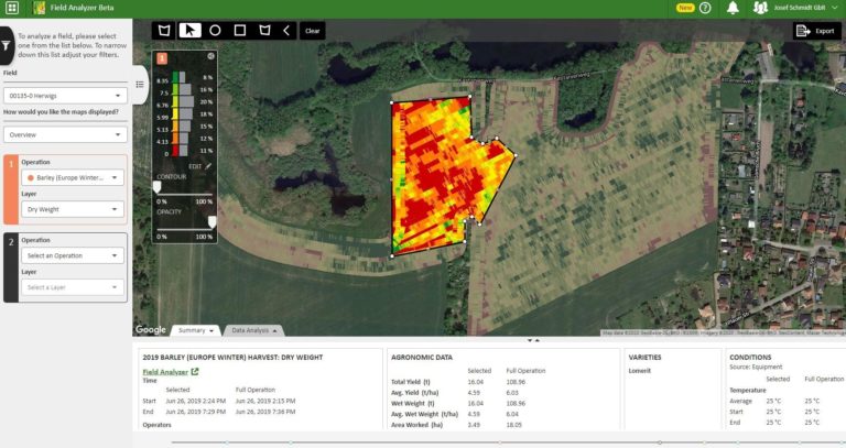
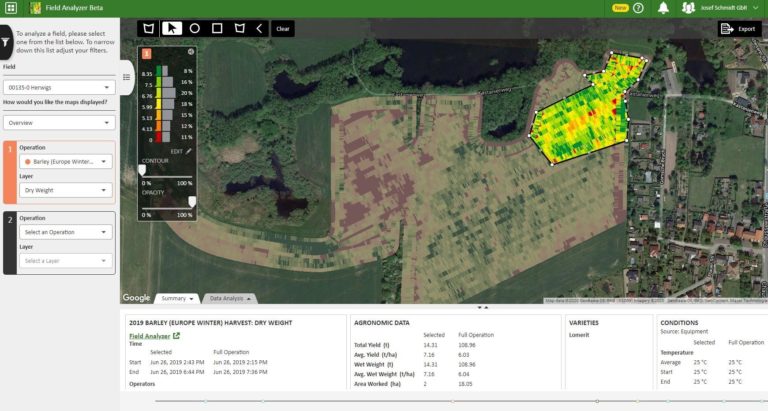
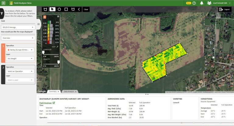
Individual zones (low and high yield zones) can be selected and the agronomic data for each section compared with that of the field as a whole. This shows the impact of within-field heterogeneity on the overall yield.
Area of the field showing high yields (agronomic data table shows the Average Yield for the selected area of 7.16 t/ha). ©John Deere. Click to expand.
Second area of the field showing high yields (agronomic data table shows the Average Yield for the selected area of 7.36 t/ha). ©John Deere. Click to expand.
Area of the field showing low yield zones (agronomic data table shows the Average Yield for the selected area of 4.59 t/ha). ©John Deere. Click to expand.
In this example, the barley yield varies from an average of 4.59 t/ha in the low yield zones to 7.36 t/ha in one of the high yielding zones. A difference of 2.77 t/ha between sections shows that it’s worth finding out the cause(s) of the yield variations and carrying out site-specific management of this field.
Would this kind of information help you improve the yields of your fields? What additional information would you need to decide what site-specific management changes could be beneficial? Please share your thoughts in the comments section below and take a look at what other Learners have said. They may have ideas that you could use or adapt for your own situation.
Innovation in Arable Farming: Technologies for Sustainable Farming Systems


Innovation in Arable Farming: Technologies for Sustainable Farming Systems
Reach your personal and professional goals
Unlock access to hundreds of expert online courses and degrees from top universities and educators to gain accredited qualifications and professional CV-building certificates.
Join over 18 million learners to launch, switch or build upon your career, all at your own pace, across a wide range of topic areas.


