
Making Simple Plots in R
Introduction
The majority of us have long been in the habit of using Excel to make plots. This is still fine for some small data sets, but for large data sets, it is really complicated to load data in Excel and manipulate it. Moreover, Excel is prone to errors when manipulating the data when it comes to filtering, arranging, or querying complex data. This is without even mentioning the complexity of generating and arranging plots in a publishable way.
In a world where information is mainly visual, whether science, journalism or even social media publications, R can rapidly and efficiently meet our needs. We will see here how very basic functions in R can make your life easier !
We encourage you to find more information on plotting data frames from files in the following links: https://cran.r-project.org/doc/manuals/r-release/R-intro.html and/or https://rpubs.com/moeransm/intro-iris and/or https://hbctraining.github.io/Intro-to-R/lessons/basic_plots_in_r.html
Import and read data from files in R
Step 1. We recommend that you work in the same working sub-directory that you created previously, using one of the following options
Before launching R
$ cd exerciseR
$ pwd
/Users/imac/Desktop/exerciseR
$ R
After launching R
> setwd("/Users/imac/Desktop/exerciseR")
> getwd()
[1] "/Users/imac/Desktop/exerciseR"
Step 2. Import or load the iris dataset we want you to work on
From your computer
> Iris <- read.table("iris.txt")
From the available data sets in R
> library(datasets)
> data(iris)
Basics of plotting graphics in R
Introduction
The principle of plotting using R commands is to provide generally 2 main information types: (1) the data we want to use, and (2) preferences or options for display. This information should be provided as individual elements, that will be interpreted in R as arguments. They are interpreted as layers of information.
Simple basic graphics in R
Basic graph types found in typical spreadsheet software also exist in R, such as histograms, barplots, scatterplots or boxplots. These can be generated using commands or functions such as “hist()”, “barplot()”, “plot()”, “boxplot()” respectively. Many others exist, all as part of the ‘base’ graphics package of R, but we will only cover examples of graphs generated with “hist()” and “plot()”. For a full list of variants, use
> library(help = "graphics")
Making simple basic graphics in R
The structure usage is function(data, options)
Whatever is specified after the command is called arguments. Each command or function has its own set of arguments, but they will all follow the same structure.
Please note that:
-
- Some plotting functions in R can be used with either a whole data set, or specific data from a data frame (such as “plot()”), but others need data to be specified (such as “hist()”)
-
- you can also provide your data with no options. This will generate an automatic graph of the data and will use the default options of the command.
Histogram with function “hist()”
Step 1. Why choose histograms to represent your data? Generally because you want to show the distribution of numerical data. To see examples of graphs you can generate with “hist()”, use the function “example()”
> example("hist")
Step 2. Usage:
hist(x, …)
example of possible arguments (https://www.rdocumentation.org/packages/graphics/versions/3.6.2/topics/hist)
hist(x, breaks =, freq =, probability =, include.lowest =, right , density =, angle , col =, border =, main =, xlim =, ylim =, xlab =, ylab =, axes =, plot =, labels =, nclass =, warn.unused =, …)
Note . We need to specify which specific data from the iris data set we want to represent. The x corresponds to the data to represent. The following arguments are generally parameters that impact the graphical output.
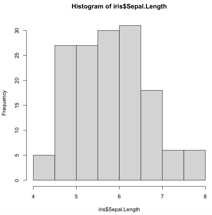
Step 3. Let’s generate a histogram of Sepal.Length using default (only the data is specified) or advanced arguments.
Default arguments will output a histogram in a simple format (default naming of axis, colors, font…), but note how the axes have been optimized for the data.
> hist(iris$Sepal.Length)
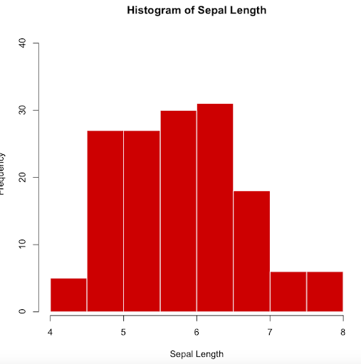
Using advanced arguments can allow you to customize different features in your output.
The following options will rename the x-axis (xlab), give a title to the graph (main), color the borders (border), color the bars (col), and modify the y-axis limits (ylim)
> hist(iris$Sepal.Length, xlab="Sepal Length",
main="Histogram of Sepal Length", border="white",
col="red3", ylim=c(1, 40))
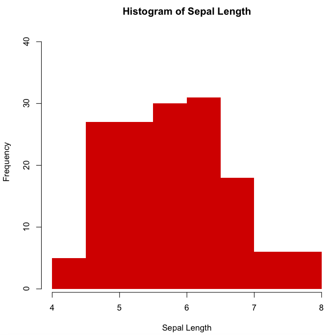
Note. Colors can also be specified using the HEX (hexadecimal) color code. You can find more information on HEX color codes in https://www.color-hex.com/
Histogram of Sepal.Length with the same arguments as before, except that we will remove the borders and color the bars with the same red colour but using now the HEX color code
> hist(iris$Sepal.Length, xlab="Sepal Length",
main="Histogram of Sepal Length", border=FALSE,
col="#CD0000", ylim=c(1, 40))
Plot with function “plot()”
Step 1. As you can imagine, plot is a generic term to design a wide range of graphics. The function “plot()” allows us to create many different plots
> methods(plot)
Step 2. Usage:
plot(x, y,…)
example of possible arguments (https://www.rdocumentation.org/packages/ROCR/versions/1.0-11/topics/plot-methods)
plot(x, y, type=, main=, xlab=, ylab=, pch=, col=,…)
Note. Here type specifies the type of plot that can be generated and are of many types such as “p” (points), “l” (lines), “b” (both), “o”, (both overplotted), etc
Step 3. With “plot()”, you can either use by default the whole data set or specify which specific data from the iris data set we want to represent.
Scatterplot of the whole dataset
> plot(iris)

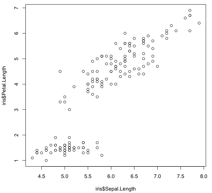
Scatterplot using specified data (Sepal.Length vs. Petal.Length). Remember that these are continuous numeric data. You can test how to produce the same output with:
Option 1
> plot(iris$Sepal.Length, iris$Petal.Length)
Option 2
> plot(Petal.Length ~ Sepal.Length, data=iris)
Option 3
> plot(Petal.Length ~ Sepal.Length, iris)
Option 4
> with(iris, plot(Sepal.Length, Petal.Length))
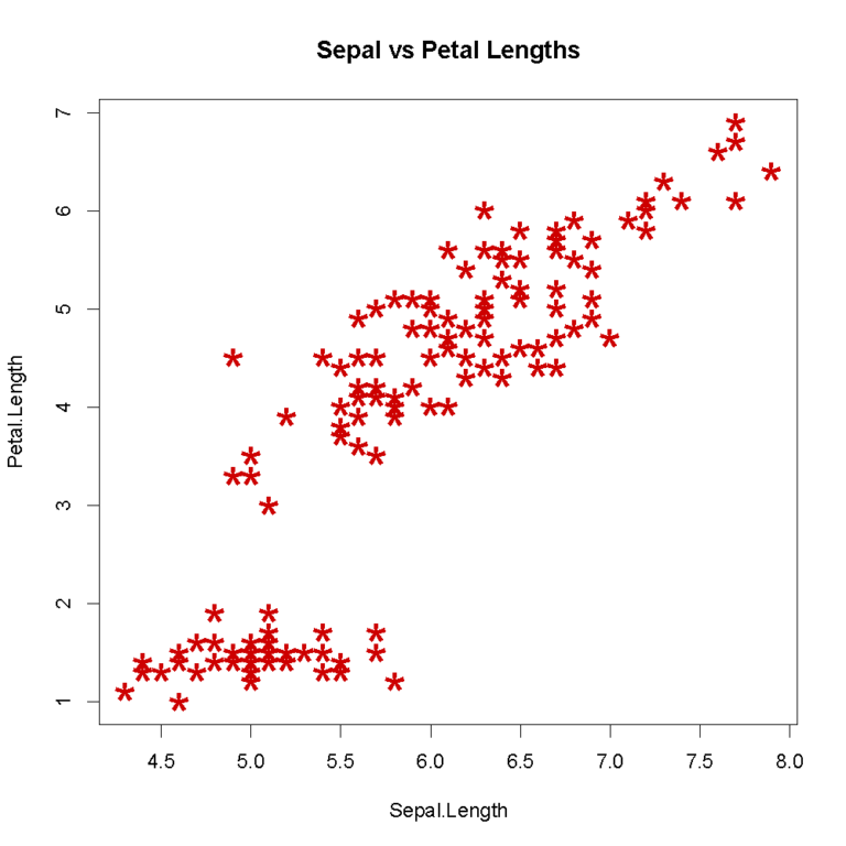
Scatterplot using specified data and options. We will shape the points with pch, change their size using cex, and their color using col
> plot(iris$Sepal.Length, iris$Petal.Length,
main="Sepal vs Petal Lengths", xlab="Sepal.Length",
ylab="Petal.Length", pch="*", cex=2.0, col="red3")
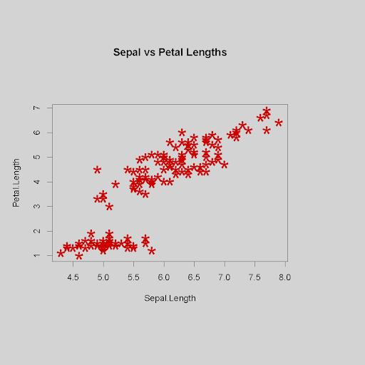
Scatterplot using specified data and options to change the background color and margin sizes with “par()”, a function used to specify general graphical parameters such as bg (background color), or mai (margins in inches for bottom, left, top and right)
> par(bg="lightgrey", mai=c(2,1,2,1.5))
> plot(iris$Sepal.Length, iris$Petal.Length,
main="Sepal vs Petal Lengths", xlab="Sepal.Length",
ylab="Petal.Length", pch="*", cex=3.0, col="red3")
Note. You can quit these global graphical options by using “dev.off()”, or closing the graphical display
Saving a plot
By default, any plot you generate will be displayed in your graphic device window. To save a plot, you will have different options.
Option 1. First choose the output format (such as jpeg, png, pdf…), name your plot, generate it, then escape by closing the file. You will find the saved file in your working directory.
To make and save a file using default options
> pdf('test_hist.pdf')
> hist(iris$Sepal.Length)
> dev.off()
To make and save a file using advanced options, such as width and height (in inches)
> pdf('test_hist.pdf', 7, 10)
> hist(iris$Sepal.Length)
> dev.off()
Option 2. If you already generated your plot, and forgot to create the output file first, you can still use the “dev.copy()” command, with both the default or advanced options
> hist2(iris$Sepal.Length)
> dev.copy(pdf,'test_hist2.pdf')
> dev.off()
Note. These options will work with any OS (Linux, Mac, Windows). Some OSes offer the possibility to save the graphic window that opens with the “Save” or “Save as” option.
Bioinformatics for Biologists: An Introduction to Linux, Bash Scripting, and R


Bioinformatics for Biologists: An Introduction to Linux, Bash Scripting, and R
Reach your personal and professional goals
Unlock access to hundreds of expert online courses and degrees from top universities and educators to gain accredited qualifications and professional CV-building certificates.
Join over 18 million learners to launch, switch or build upon your career, all at your own pace, across a wide range of topic areas.


