In the workbook you downloaded for this week, you will find a worksheet named Chart template data. You can use the data in this worksheet to create and save a …
Using the scatter charts you created in the last step, you can now add some formatting and a trendline. Explore all the formatting options to make sure you are familiar …
You will find the data for this video in the workbook you downloaded at the start of this week. The week 3 workbook. Make sure you can practice along with …
Use the comments section below to record your key takeaways from this video. recording your takeaways in the way will help to reinforce the learning. List out as many limitations …
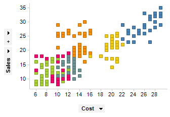
What are Scatter Plots? A Scatter plot is used to visualize relationships between two or more variables. A relationship between two values is known as correlation. You can have a …
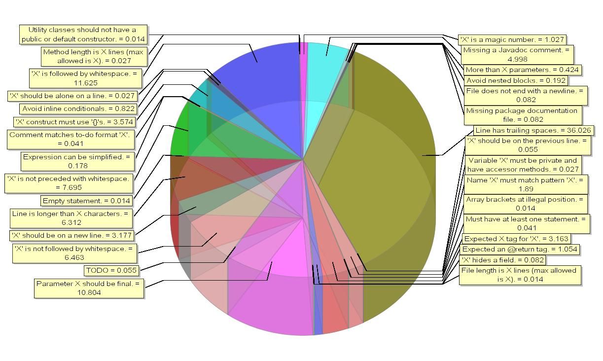
This pie chart was used in a presentation to show the US smartphone market share. Apple and the iPhone at the time having 19.5% of the market share. However, when …
A good visualization is one where the user, without any prior knowledge, can quickly understand the story it is telling. Get the visualizations wrong and the user will not be …
A waterfall chart is used to visualize how the starting value of something (say a bank account) gets to the end value (balance at the end of the month). This …
These articles are from the online course:
Introduction to Excel Charts for Data Visualisation