What is data visualisation? A beginner’s guide to bringing information to life
We take a look at how data visualisation is changing the way we process information, and how you can get started with this valuable tool.

We live in an increasingly data-driven world, where we have access to and create huge amounts of information. Managing these large data sets can be difficult, requiring detailed analytics and lots of processing power. One way of making such information easier to understand is through visualisation. But what is data visualisation? And how can it help?
We explore the basics of data visualisation, looking at why it’s so useful, as well as some of the different types and tools available. We’ll also explore how you can get started learning about data visualisation and outline some expert data visualisation courses to help you build career-ready skills.
What is data visualisation?
Data visualisation is about displaying data points from a dataset or collections of data points in some graphical representation format. This representation format could be points on a map, slices of a pie chart, or a line along data points over some time period.
It’s an interdisciplinary field that draws on a variety of other areas, such as big data, statistics, data science and more. The applications of data visualisation are also vast, and industries such as finance, education, logistics, retail and more all make use of the discipline.
You’ve probably encountered data visualisation many times in your day-to-day life. Whether via news stories, social media posts, or websites, you’ve likely seen infographics, graphs, charts and similar examples of data visualisation.
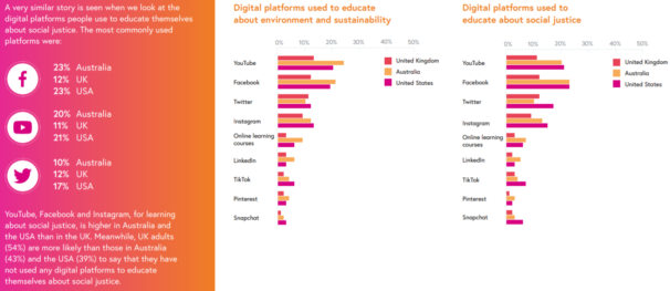
You can see an example of data visualisation below, as taken from our Future of Learning report:
Why is visual analytics important?
So, we know what data visualisation is, but why is it important? First, let’s think about the amount of information we produce. According to data experts Domo, we each create, on average, around 1.7MB of data every second. This is the equivalent of the average mobile web page.
This rapid creation of data is also occurring at a nearly exponential rate, meaning that almost 90% of all data has been created in the last two years. When we think about the purpose of visual analytics and data visualisation, it’s to help us manage, understand, analyse and convey this information.
Data visualisation is often closely linked to big data analytics. The various tools and technologies used for presenting information in a graphical format can make it easier for us to comprehend. You don’t have to be an expert to look at data visuals to identify trends, patterns, and outliers within large data sets.
For organisations, decision-makers, and all kinds of analysts, data presentation helps people understand vast amounts of data. When it comes to making data-driven decisions, it can be a valuable tool.
The benefits of data visualisation
Data from Statista shows that in 2021, the global big data market is predicted to be worth $64 billion. Clearly, the processing and analysis of data is a thriving industry. But why do organisations, educators, and individuals use a visual medium when presenting information?
Below, we’ve picked out some of the benefits of data visualisation that apply to many uses of this practice:
People can process it faster
One of the main benefits of using visuals for data is that people can often process it faster than if it were in its raw form. There’s no evidence for the popular claim that ‘visuals are processed 60,000 times faster in the brain than text.’ However, a 2013 study by MIT neuroscientists found that the human brain can process entire images that the eye sees for as little as 13 milliseconds.
Data visualisation allows people who aren’t familiar with exploring large data sets to extract information and draw conclusions.
It can help with learning
Presenting data in a visual format can help with learning. Research has shown that using visual aids as a teaching method stimulates thinking and improves learning environments. It helps to clarify content and make it more engaging.
It can help identify trends
One of the central aspects of data visualisation is presenting data in easy-to-understand formats. Not only does this allow for non-experts to assess the data, but it also makes it easier to identify trends and patterns within the data. Rather than rows on a spreadsheet, for example, you can get a visual representation that highlights trends.
It can help with productivity
Using data to make forecasts and business decisions has become commonplace. Modern data visualisation tools can help to process large amounts of information, allowing businesses to make informed and quick decisions, helping with productivity and efficiency.
Are there any downsides?
So, clearly there are some advantages of using data visualisation techniques. But are there any disadvantages to data visualisation? There are some issues worth thinking about when we consider how we present data:
- It lacks finer details. Because data visualisation is often an overall representation of complex data, it can sometimes lack the necessary depth required to give the full context of the information. However, adding interactivity can certainly help with this.
- It can be interpreted differently. When you use data visualisation techniques, you may find that your audience may try and interpret the information in different ways. Similarly, choosing how to present that data can leave room for bias.
- It can miss the core message. Again, using graphics to display a big data set can mean that the emphasis misses the core message.
Where is data visualisation used?
As mentioned, you’ve probably already seen examples of data visualisation around you in everyday life. News stories will often rely on them to present information in a succinct way, such as the BBC’s coronavirus visualisations, as demonstrated below:
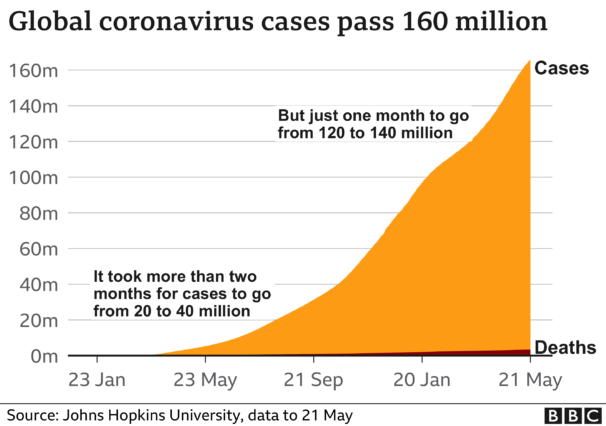
So, any such charts, graphs, maps and similar can be used to display information. So what are some industries that use data visualisation? We’ve picked out some further data visualisation examples below:
Big data
Perhaps one of the fields that benefits most from data visualisation is that of big data. Although not related to one specific industry, it’s a discipline that’s become increasingly important. We’re now able to create and analyse more data than ever before, making it essential that we have ways to easily display this information.
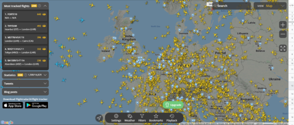
A good example of this is Flightradar24, which is a global flight tracking service. It gives real-time information about aircraft across the globe, presenting all kinds of data points at the click of a button.
Business intelligence
As we explore in our ExpertTrack on data visualisation, it’s possible to use analytics to build and review business strategies. There are various options, such as Tableau, that can make business intelligence more accessible as a decision-making tool.
BI analysts will often pull together various data feeds (such as Google Analytics and CRM data) to create interactive dashboards that provide insights into how certain campaigns and projects are performing.
Healthcare
Detailed data can prove crucial in the realm of healthcare. The more information that’s available, the easier it is to spot trends and draw conclusions. Whether on an individual patient level or with more macro trends, data visualisation can help in all kinds of ways.
With our course on AI and big data in global health improvement, you can find out how healthcare data is shared globally, and some of the benefits and challenges that come with it.
Finance
If there’s one industry where large and accurate data sets are essential, it’s in finance. Many institutions use graphs, charts, and other forms of data visualisation to track elements such as budgets, expenses, liquidity and cash flow.
As we explore in our ExpertTrack on innovations in fintech, a data-driven approach has become crucial to managing wealth and money. Accurate ways of displaying this information plays a vital role for analysts and clients.
History
Perhaps a surprising industry that can and has relied on visual representations of information is that of history. Long before the first computers were invented, experts still relied on visualisations to express data.
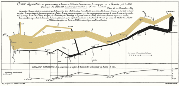
Perhaps the prime example is Charles Minard’s 1869 chart tracking Napoleon’s 1812 campaign in Russia. As you can see from the infographic below, taken from Edward Tufte, there are various data points captured. It shows the diminishing number of soldiers, the temperature, geography, and historical context all in one graphic.
The different types of data visualisation
So far, we’ve seen a fairly wide range of examples of data visualisation, but is it possible to split these into different types? Well, there are a few ways we can do so. The first is to look at some of the ways of presenting the data, while the other goes into the levels of visualisation:
Ways of presenting data
This is perhaps the easiest way to divide the different types of data visualisation. Some common formats and types of graphs for presenting information include:
- Bar graphs
- Column charts
- Line graphs
- Pie charts
- Scatter plot charts
- Heat maps
- Arc diagrams
- Bubble charts
- Radar charts
- Candlestick charts
Of course, there are many different ways of dividing and expressing data, and the above are just a few examples to show the range.
Four levels of data visualisation
In our open step from our Big Data and the Environment course, Professor Min Chen explores the four levels of data visualisation. In brief, these include:
- Level 1: Disseminative Visualisation. This is where data is used as a presentational aid for disseminating information or insight to others. An example might be a way of showing how the global average temperature is changing.
- Level 2: Observational Visualisation. Here, the visualisation is an operational aid that enables intuitive and/or speedy observation of captured data. A good example of this in action is a live data stream from a sensor measuring air temperature.
- Level 3: Analytical Visualisation. At this level, the data becomes an investigative aid for examining and understanding complex relationships (eg, correlation, association, causality, contradiction, etc.). A good example is shown in our open step on the BOUNTY visualisation project.
- Level 4: Model-developmental Visualisation. This is where the visualisation is used as a developmental aid for improving existing models, methods, algorithms and systems, as well as for creating new ones. An example here is given as a data visualisation used to analyse and diagnose complex simulations of Earth systems (eg. the atmosphere, or oceans).
-

 CloudSwyft Global Systems, Inc. Data Visualisation Fundamentals for Absolute BeginnersIT & Computer Science,Business & Management2 weeksFind out more
 -

 FutureLearn Data Visualisation: Data Visualisation with Tableau FundamentalsBusiness & Management,IT & Computer Science4 weeksFind out more
 -

 FutureLearn Data Visualisation with Python: Bokeh and Advanced LayoutsBusiness & Management,IT & Computer Science4 weeksFind out more
Popular data visualisation tools
With the amount of processing power available to use in the modern world, it’s easier than ever before to turn large quantities of data into meaningful graphics. Of course, you’ll need the right data visualisation tools to do so.
Below, we’ve picked out some of the most popular data visualisation tools available at the moment. These cover a range of different functions and needs, as well as levels of technical ability:
- Tableau. This business intelligence tool aids professionals in visualising and understanding their data. It allows you to design elements such as interactive graphs and charts, as well as dashboards and worksheets.
- Weka. Those who are interested in data mining will find the visualise panel in Weka to be a useful tool. You can find out more about visualising your data with Weka in our open step.
- Python. The programming language Python has all kinds of open source libraries that can be useful for data visualisation. Whether you want to create live, interactive, or customised plots, tools such as Matplotlib and Pandas Visualization can help.
- R. As we explore in our open step on data visualisation in R/RStudio, the programming language makes it possible to easily use basic plotting functions, or apply more advanced functions through packages.
- Excel. If you’re looking to create simple charts and graphs, you can easily visualise your data in Excel. Many people have skills in this area already, making it a quick solution.
How can I get started with data visualisation?
If you’re interested in learning data visualisation, there are several ways you can get started. In years gone by, it was a highly specialised area, where a degree in data science or programming was usually required. Nowadays, there are a variety of tools that can help, meaning it’s possible to learn data visualisation online.
Below, we’ve picked out some of our data visualisation courses and ExpertTracks that can get you started. Of course, you can also experiment in your own time and pick up the skills as you go. However, these learning opportunities give you a structured way to study data visualisation:
- Data Visualisation ExpertTrack. Supercharge your business problem solving through better data insights, analytics, and visualisation.
- Data Visualisation with Python ExpertTrack. Learn to leverage Python libraries to conduct data modeling and build compelling visualisations.
- Introduction to Process Mining with ProM course. Learn how to use the free, open source process mining framework (ProM) to analyse, visualise, and improve processes based on data.
- Data Mining with Weka. Discover practical data mining and learn to mine your own data using the popular Weka workbench.
Final thoughts
Data visualisation is a fascinating field that can make large and complex data sets understandable for people from all backgrounds. In the modern world, information plays a huge role in keeping us informed and helping us make decisions. With the different types of visualisations available, this information can be broken down and analysed to help with both.
If you’re looking to learn data visualisation skills, there are plenty of ways you can go about it. Whether for your own interest or to pursue a career in data analysis, these valuable skills can help you make sense of the world around you.


